Slope of Hope Blog Posts

Slope initially began as a blog, so this is where most of the website’s content resides. Here we have tens of thousands of posts dating back over a decade. These are listed in reverse chronological order. Click on any category icon below to see posts tagged with that particular subject, or click on a word in the category cloud on the right side of the screen for more specific choices.

Great Bonds of Fire

By -

It wasn’t that long ago that I didn’t even pay attention to the bond market. Since 2018 began, however, I have followed it constantly, since I believe a sea-change in bonds (and, thus, interest rates) is the only thing left that’ll break equities. If nuclear war can’t do it, maybe soaring interest rates can.

It’s been dicey lately, since bonds have been so strong, but as I pointed out late last week, we were once again getting terribly close to both the topping pattern and the broken trendline:

bigbond (more…)

3 Amigos (SPX/Gold, Long-term Yields & Yield Curve) Updated

By -

It has been a while since we’ve had a 3 Amigos update because a) Italy and global tariffs noise aside, nothing much has changed with the macro and b) I felt my ‘image-based metaphorical content to straight content’ ratio was getting a little excessive. So I gave it a rest.

Now it is time again for an update of these important macro riders in order to touch base with their signals. As always, I’ll remind you that there is much more to the macro market backdrop that NFTRH manages on an ongoing basis, but these three are important.

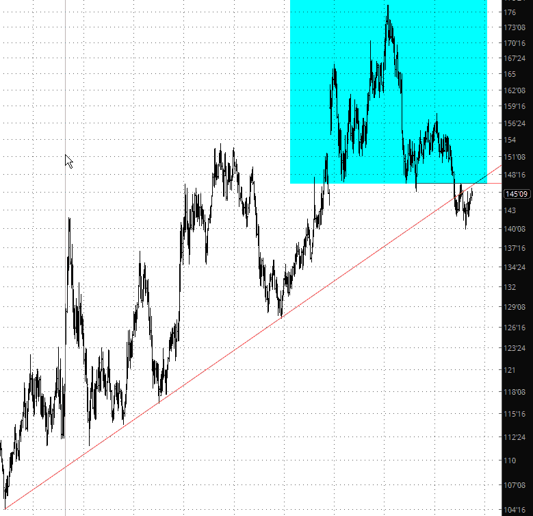
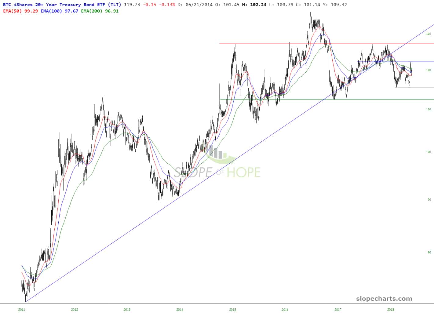
The quick answer is that only Amigo #2 (long-term yields on a rise to our preset limits) has reached destination. I marked up the graphic as he was approaching our targets.

Note: The monthly charts driving the view that current trends remain intact can be considered big, dumb (i.e. not overly sensitive) indicators. Shorter-term views of these and other indicators can be used to gauge signs of oncoming changes. As one example, if daily SPX/Gold were to take a hard plunge on any given day or week (as was the case in February and March) we’d pay close attention as we did then before the larger trends ultimately took over again.

Amigo #1: Gold vs. the S&P 500 (or stock markets in general)

The theme for this Amigo is that the stock market (cyclical, risk ‘on’) has been trending up vs. gold (counter-cyclical, risk ‘off’) since 2011 in order to close out the negative cycle that completed that year. (more…)

Embracing the Below Average

By -

Holy MOSES what a boring day! As I’m typing this, the ES is up .12% and the NQ is down .12%. Average ’em out, and you get…….a Saturday trading session. So I’ll just put up the good ol’ TLT chart, which is utterly core to my options portfolio (two positions – TLT and XLU January 2019 puts).

As shown below, it broken its trendline ages ago, and it’s about 90% done with what could be (if complete) one of the greatest topping patterns ever.

slopechart TLT (more…)

Steady Progress

By -

Since early last week, it has been heartening to see bonds resume their downward trek. Not only has the progress lower been steady, but the “lower highs” are getting weaker each time, not even mustering a tag of their resistance trendline anymore. My TLT and XLU puts are counting on a long-term erosion. I also continue to hold the view that rising interest rates will sink real estate prices (Palo Alto notwithstanding).

zb (more…)