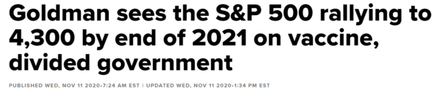
This is the week when the good folks at Goldman offered this completely unbiased statement:
Here is the Wilshire 2500 index. Yep, looks like an amazing buying opportunity to me, and at a fabulously safe price:
(more…)Slope initially began as a blog, so this is where most of the website’s content resides. Here we have tens of thousands of posts dating back over a decade. These are listed in reverse chronological order. Click on any category icon below to see posts tagged with that particular subject, or click on a word in the category cloud on the right side of the screen for more specific choices.
This is the week when the good folks at Goldman offered this completely unbiased statement:
Here is the Wilshire 2500 index. Yep, looks like an amazing buying opportunity to me, and at a fabulously safe price:
(more…)Firstly my apologies for the wait since my last post. I’m currently getting divorced, which isn’t much fun, and the presidential election was so polarising in the US that I was getting the impression that if I mentioned that the weather was getting chillier as the season changed, then some would feel that was a comment on the election and get offended. The election is finally over….ish, and I think it’s safe to start writing again about markets.
So in my last post I was writing about the bull flags that would likely deliver retests of the all time high as and when they broke up. Those evolved into larger bullish patterns, a bull pennant on SPX, a bull flag on INDU, a possibly still forming bullish pattern on NDX, and on Monday those broke up into new all time highs on SPX, Dow 30 and RUT, but not so far on NDX. Equity indices are still retracing from those Monday highs, so what should we expect next?
(more…)Let’s suppose you were about to head outdoors, and you asked me the temperature so you could dress appropriately. “It’s thirty-two”, I tell you. So you slip on a thick coat, a scarf, and a hat, then you head outside.
After you shut the door behind you, the hot air hits you, and you immediately come back inside, furious with me, and change into something more comfortable. I was telling you the truth – – the temperature was, in fact, 32. Celsius. In other words, you should be wearing a short-sleeved Tommy Bahama top and not a thick coat.
Similarly, you might ask me what my father’s salary was when I was a kid. “Thirty-five thousand dollars.” Wow, pathetic, right? How did he support a family of six, and we lived in a nice house? Well, the salary I am telling you about was from decades ago, and it was pretty good money back then.
(more…)First off, be sure to read the prior post if you didn’t already, since it covers a variety of improvements here on good ol’ Slope of Hope.
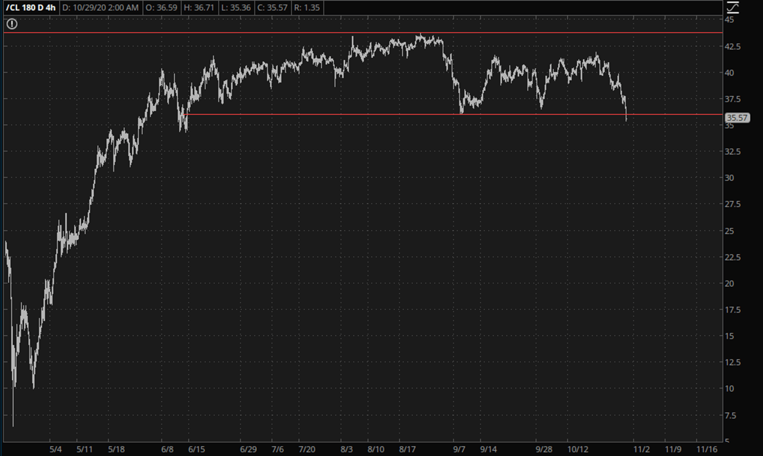
I’ve made no secret of my long-term bearishness on crude oil and the energy sector in general. Manipulation of markets comes in all forms, but crude is special, in that its price is artificially elevated by a successful global cartel. Crude is about $35/bbl right now, where economic reality should be placing it at, oh, say, about $10/bbl. Thus, there is a persistent tension between natural market price and synthetic cartel-sanctioned price. Observe how this strain is getting severe in the form of this absolutely gorgeous rounded top.
I’m planning to drop some COVID-19 info and updates into some of my posts, hopefully in a way that won’t get people thinking that I’m taking a position in the US election, as it is of vital interest for the economy going forward, and there was a time when that mattered for stock markets too, though that seems less certain at the moment.
I was giving the best guess mortality stats for the virus on Tuesday, and just wanted to break those down a bit further. The bottom line really is that, subject to some variations depending on race, sex and existing co-morbid health conditions, and in the event that anyone is actually infected, as many may well never be infected, then the death rate for those in the 12 to 40 age range is about 0.01%, or one in ten thousand, the death rate for people in the 41 to 60 range rises to about 0.1%, or one in a thousand, and the mortality rate rises sharply for those 60 or over to about 2%, or one in a fifty. That last stat is heavily weighted towards the oldest and least healthy in the population, to the extent that the average age of death from COVID-19 among white people in the Indiana study I was referring to was 78.9, with over half of all COV-19 deaths in Indiana among nursing home residents.
(more…)