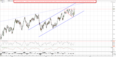
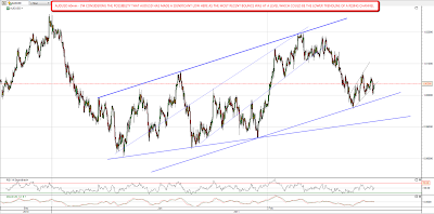
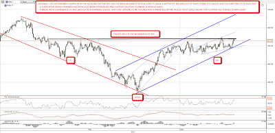
Equities gapped up and ran yesterday for the second trend day of the week. We'd normally expect to see a retracement for a day or two after a trend day unless the move is extremely powerful, but ES held the gains overnight so far, and I'm wondering whether we'll see that retracement today. I have a line in the sand on ES, as it has risen to declining resistance from the recent high, and it has held so far. Any move over 1334 would be a clear break up. The likely target of a retracement today if we do see one is the 1320 area:
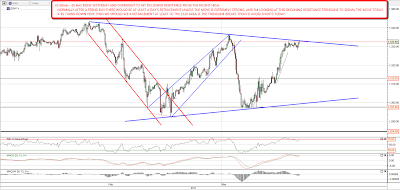
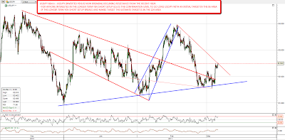
NQ was much stronger than ES yesterday, and blew through declining resistance before breaking the last high in the 2370 area. Overnight it retested the 2370 level and like ES the overnight action is looking a lot like a bull flag. If we see a retracement I'd be looking at the 2340 area as the most likely target:
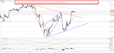
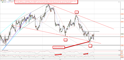
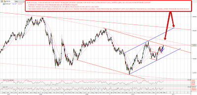
The copper IHS is still looking good, though I've been playing around with the neckline a bit as it's hard to pin down exactly. The retracement yesterday has confirmed a supportive rising channel and I'm expecting to see more upside. Immediate resistance is at 454 and the next rising channel target is in the 467 – 72 area depending on when it is reached. Channel support is at 449.5 and key support is at 445. A breach of 445 support with any confidence would badly damage the bull scenario:
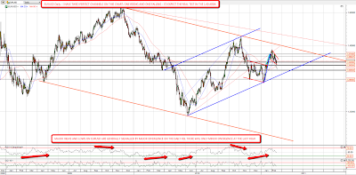
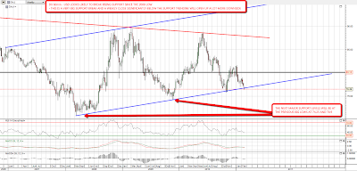
For any of you following the longer term Yen short setup, I was saying that USDJPY (inverted Yen) had most likely bottomed the other day. It went a little lower subsequently but has now broken declining resistance at 82.5 (since I did the chart) which confirms the short term low. I have longer term declining resistance at 83.8, the main target is in the 86 area, and if the full Yen meltdown scenario plays out to target, the potential move is to 124. An alternative play on Yen for anyone wishing to avoid USD is to short JPY using another currency pair, long EURJPY for instance:
EURUSD made my upside target yesterday, and is now testing this extremely important level. The level is so important because USD is now testing rising support from the 2008 low. A break above will open up a lot more upside on EURUSD with more declining resistance at 1.43 to 1.432, but my main target would be a declining channel upper trendline in the 1.517 area, if it is hit in June or July. I've marked the rationale for this target on the chart:
The last chart today is the DX weekly chart to look at the US Dollar. I'm not optimistic about USD here, as the last bounce up looks like a dead cat bounce, and with the US effectively printing 70% of the huge deficit over the last two years the downward pressure is obviously strong. If it breaks down here then there is some support at the previous lows at 74.25 and 70.9, but USD will essentially be stepping into the unknown and it could go much lower. USD is still looking good next to the Yen, but that's a race between two currencies competing to have the worst fundamentals of any rich world currency. That Yen looks even worse is no compliment to USD. If USD falls hard here, there is also the clear risk that trading partners will move into using more stable currencies as a reserve currency, and that could turn this retreat into a rout on both USD and on US Treasuries. Anyone wanting to see the effect of a currency losing reserve currency status should take a look at GBPUSD between 1945 and 1980 to see what that looks like. Not a pretty picture:
I'm leaning towards seeing some retracement on equities today unless ES breaks up through declining resistance, but the underlying picture here will look bullish to me unless SPX breaks the main support trendline on SPX since July. That trendline is in the 1305 SPX area today.