The Semiconductor Bubble is about over-valuation and momentum, outstanding fundamentals will not stop the correction to come
Note: Never will you read one word of my material that has been edited or altered, let alone written by, AI. It is unfortunate that this even needs to be stated, but it’s out there, folks. Content written by machines. Outside of ‘quant’, you cannot automate real market analysis.
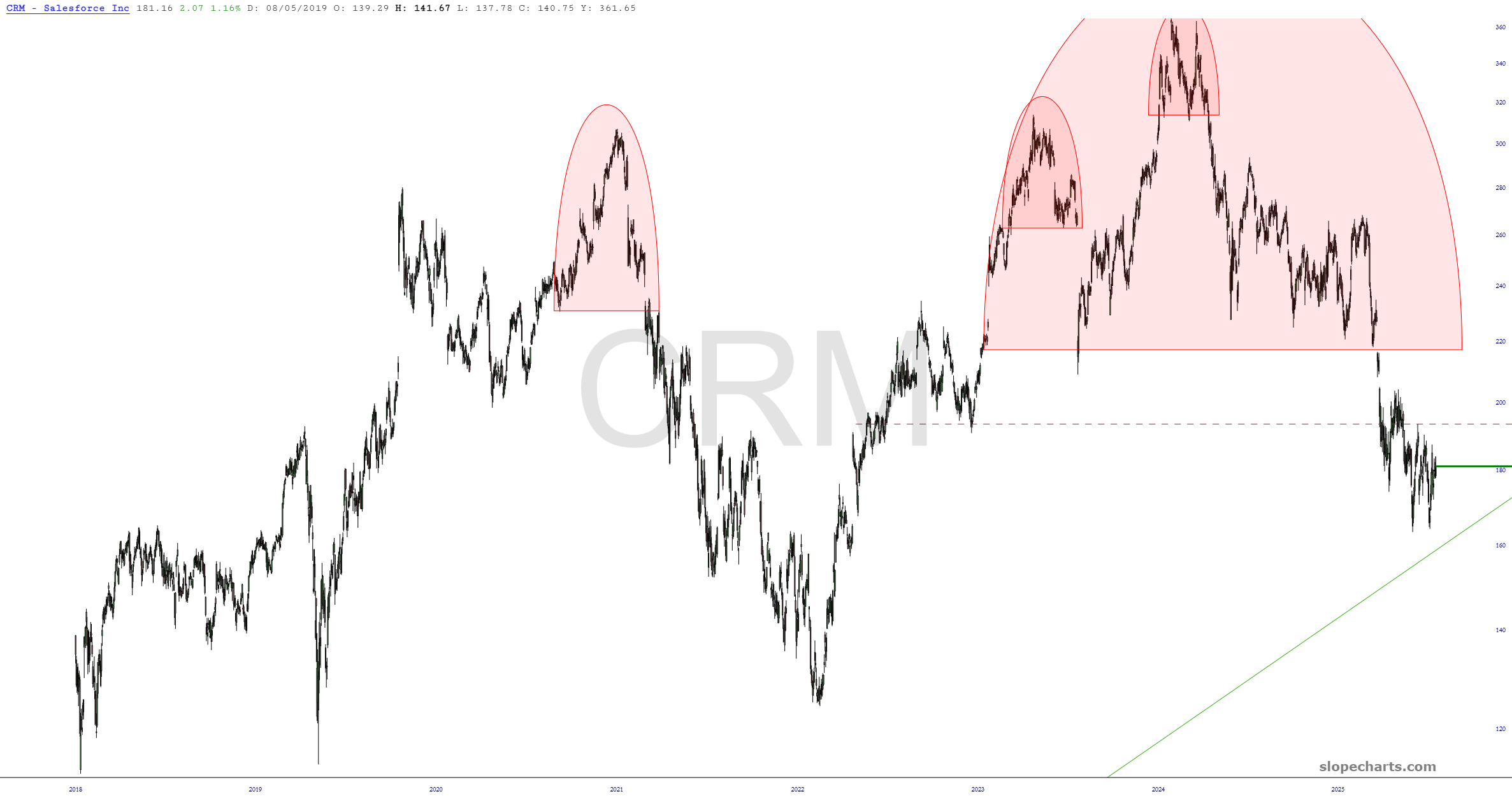
Harken back, if you will, to a time some hazy years ago that I sold Nvidia too soon and neglected to buy it back on its long journey upward, leading the Semiconductor bubble to come by a country mile. I since traded it a couple times, but the real money had been made by others.
(more…)