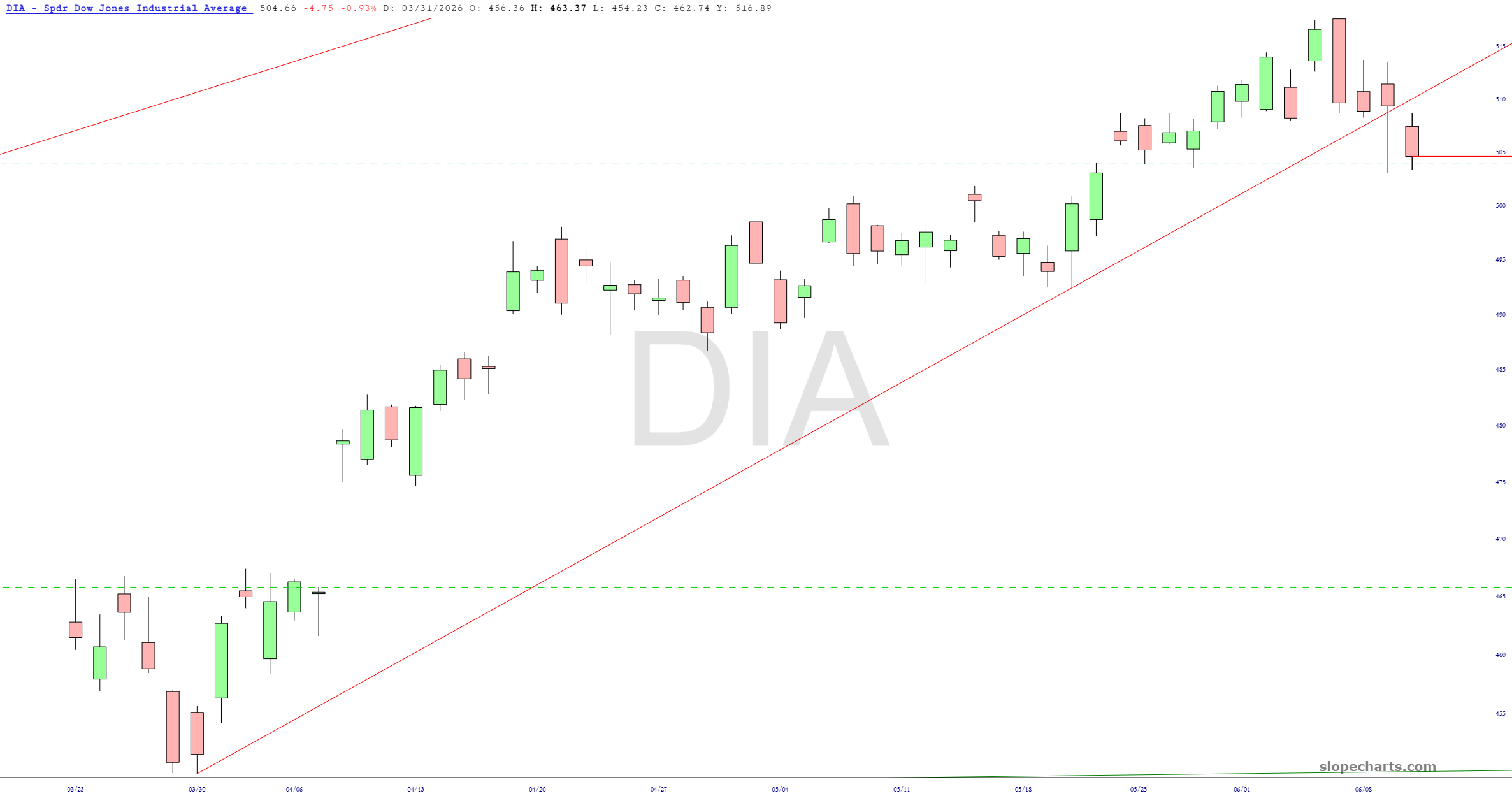
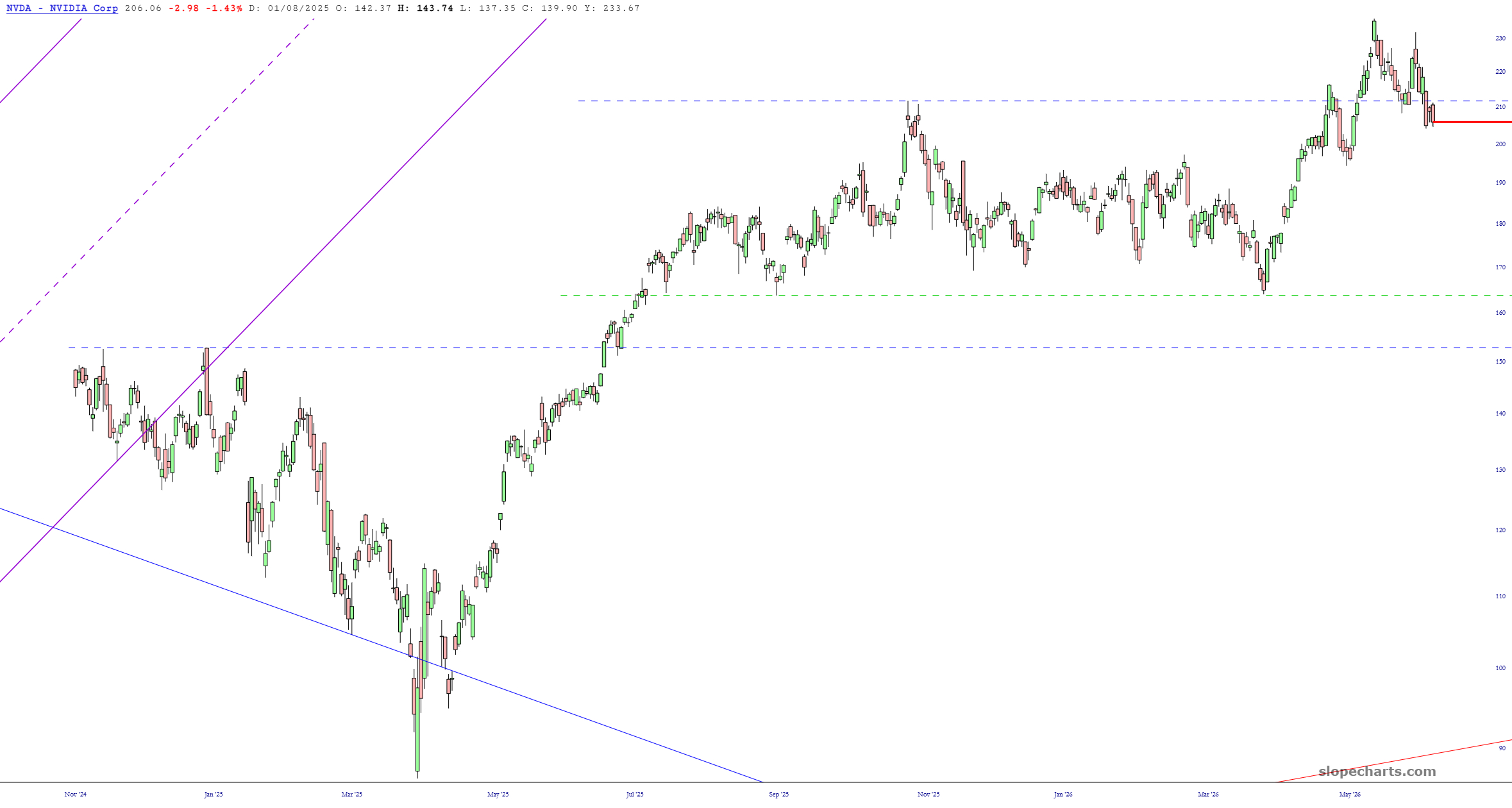
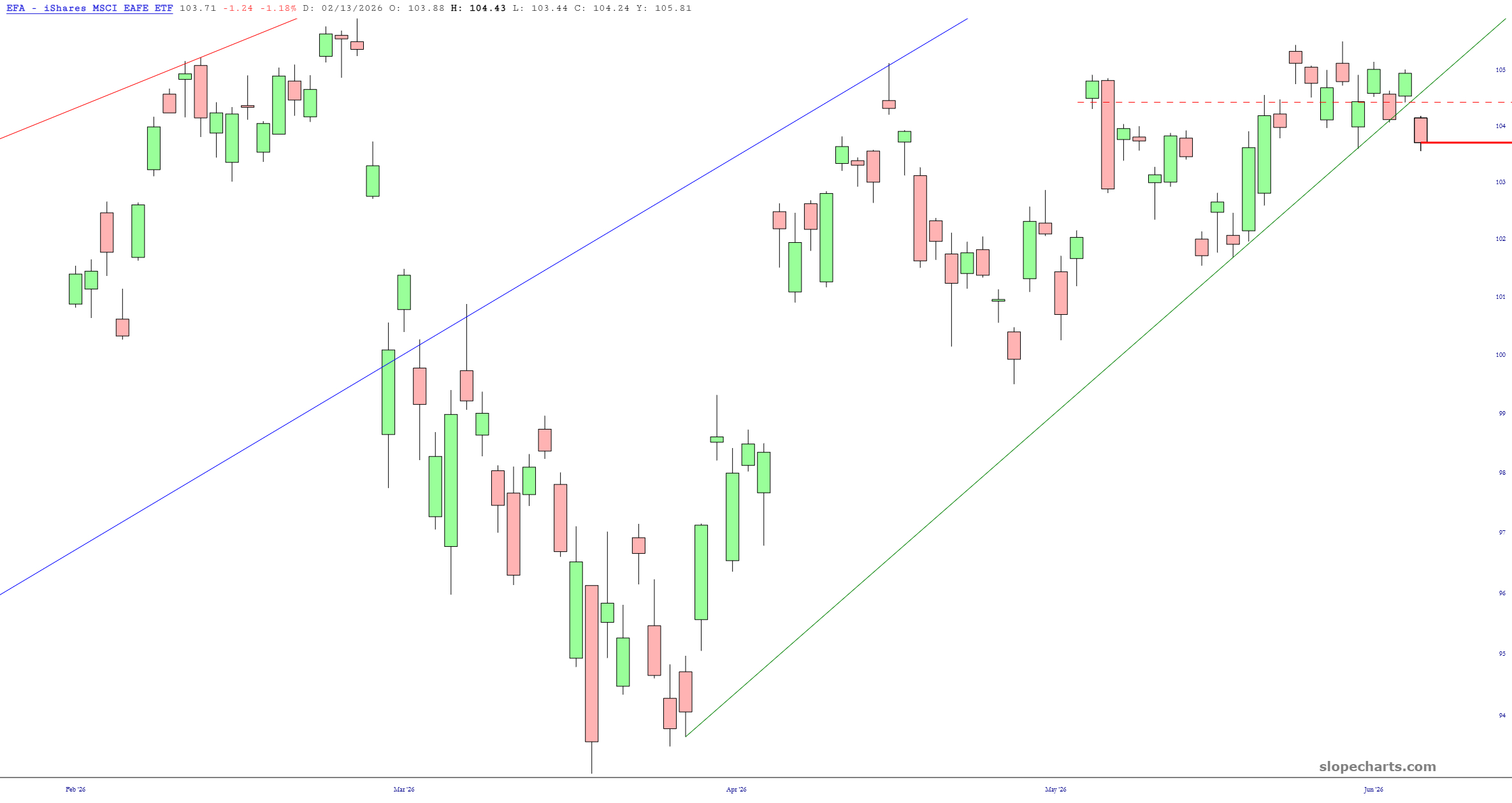
Now it’s all starting to make sense.

Slope initially began as a blog, so this is where most of the website’s content resides. Here we have tens of thousands of posts dating back over a decade. These are listed in reverse chronological order. Click on any category icon below to see posts tagged with that particular subject, or click on a word in the category cloud on the right side of the screen for more specific choices.
Now it’s all starting to make sense.

I’ve said it before, but I feel compelled to state it again: Dell Computer (DELL) is one of the cleanest head and shoulders reversal patterns I’ve ever seen. So much so, I’ve made it by far my biggest options position (June $130 puts).

If you ever need to describe to someone what utility chart patterns have, or even more specifically, you are looking for a great example of a basing pattern followed by a breakout, may I suggest GLD. This is one of the most fantastic examples of classic technical analysis at work that I’ve ever witnessed.

Below are seven important stock market indexes. I’ve put some remarks in the caption area of each chart.

There are plenty of risks in the equity and bond markets this year, and the Greenland drama over the last week has been a good illustration of that. There was a lot of political drama last year and so far this year it seems that might even accelerate.
Next year Donald Trump will probably be a lame duck President without control of the House (very likely) and possibly also the Senate (theoretically possible but unlikely), and that may slow the chaos down, though he will still likely have a lot more power than lame duck Presidents have traditionally wielded.
In my post on Monday 19th December I was looking at a setup for possible new all time highs on SPX, QQQ, DIA and IWM in the Santa rally, and some of that played out over the remainder of December.
(more…)