Slope initially began as a blog, so this is where most of the website’s content resides. Here we have tens of thousands of posts dating back over a decade. These are listed in reverse chronological order. Click on any category icon below to see posts tagged with that particular subject, or click on a word in the category cloud on the right side of the screen for more specific choices.
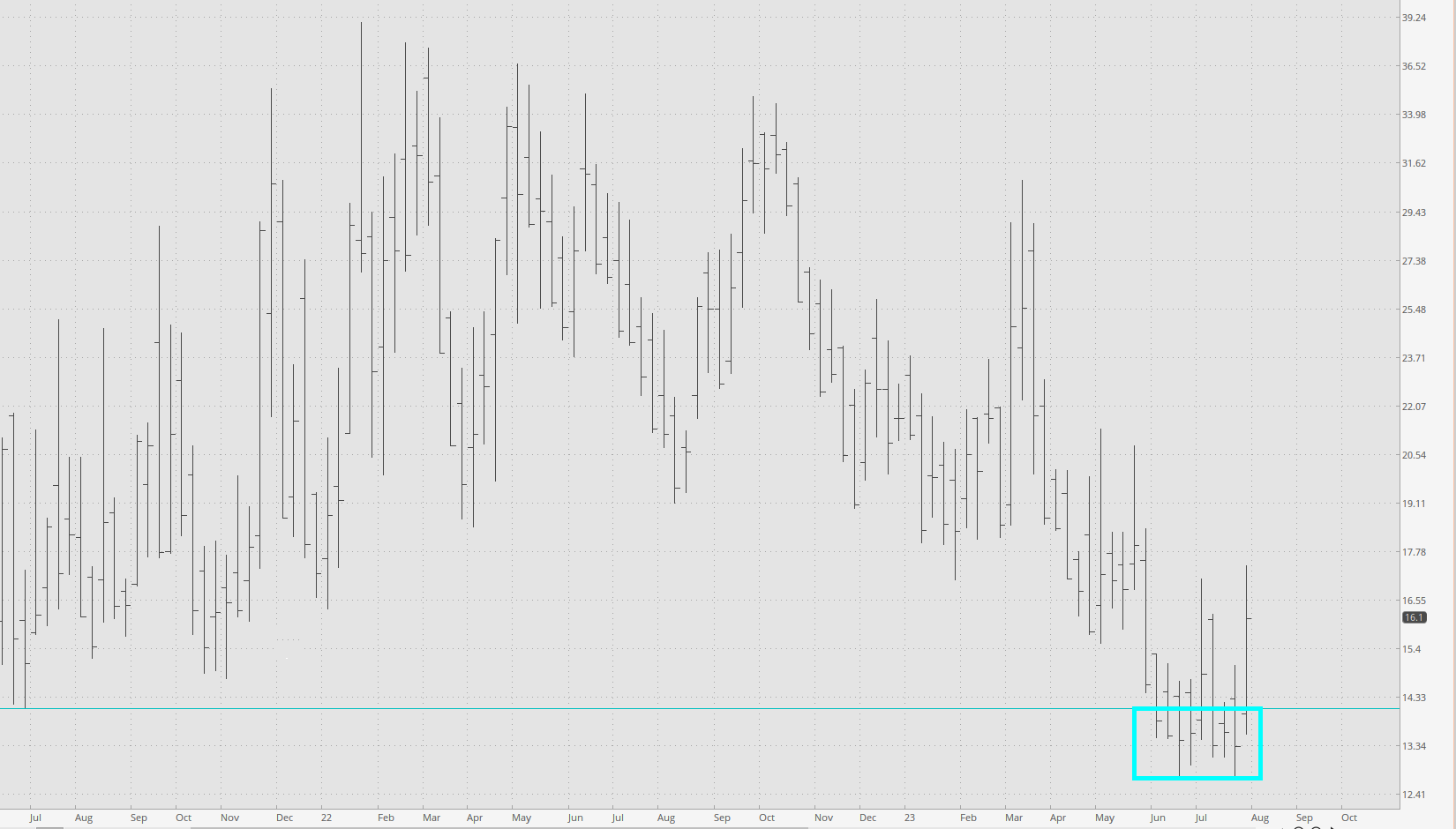
Good God, today is boring. I fear that we’re all going to be sitting around picking our noses until 48 hours from now when Powell deigns to tell us what’s next in our lives. As proof, below is the VIX, which is plumbing the same depths it was in 2019. Think about that. 2019. Think things were a LITTLE different four years ago, maybe? Like……...EVERYTHING?!?!?
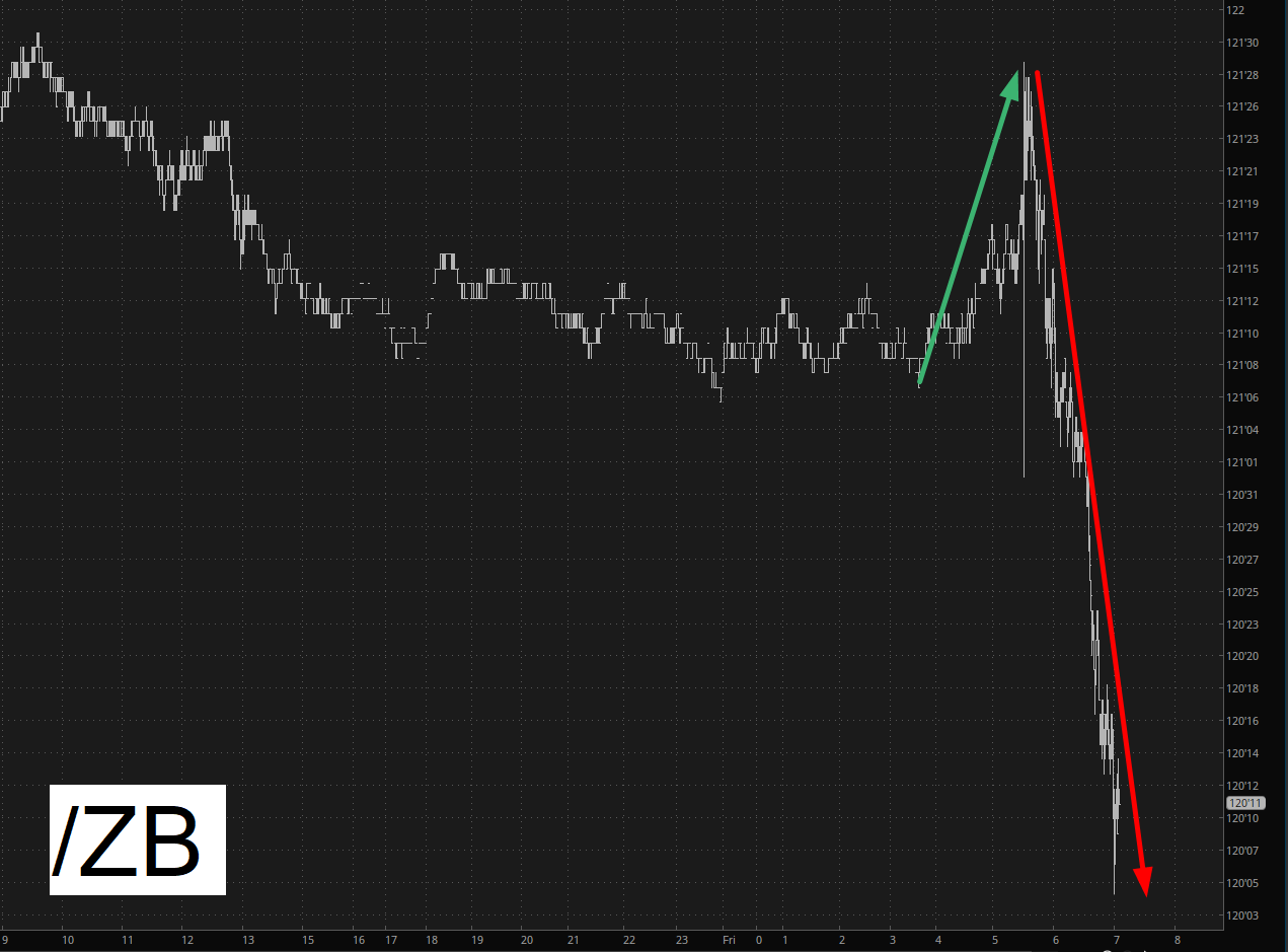
After the weak jobs report came out, all assets exploded higher. As I type this, about an hour into the trading day and about two hours after the data, every single stock index is still green (with the small caps up well over a full percentage point), but I’m intrigued by what’s going on with the bonds, which are NOT buying the “new bull market” schtick. Yes, they had a pop at first, but it was followed by a fairly meaningful drop.
Over the course of my trading life, I very slowly learned to pay attention to emotional extremes. When, for example, I am feeling arrogant, haughty, and indomitable, I had best closer every single position I’ve got, because I am about to get absolutely fried. Whereas when I am feeling hopeless, idiotic, and a fool, it’s probably a good idea to pour every penny I’ve got into my trading ideas.
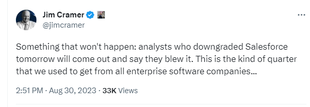
In a similar fashion, I’ve watched Jim Cramer’s emotions. I remember in the deepest depths of the financial crisis, he was being interviewed, and he sat with slumped shoulders, hands meekly clasped together between his knees, and he explained, “I would ask anyone I loved to be completely out of equities for years to come.” That was, of course, the exact bottom of the market.
Well, he’s doing the exact opposite now. His arrogance and bravado are off the charts.
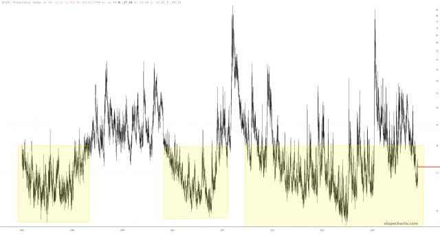
One of the countless features on Slope which doesn’t get the attention it deserves is the Time Perspective chart. Let’s use volatility as an example. Here is a historical chart of the VIX. Pretty boring, right?
The VIX spent eight full weeks dicking around below the horizontal line I’ve drawn, persistently trying to get volatility to stay in the sub-teens. I sure hope we’re done with that nonsense, because, let’s face it, a 12-handle VIX sucks!