The total stock market index went up .65%. Below are the sectors, sorted based on their weekly change.
I've prepared a full report of all of the DJ US Sectors that you can find here. Of the 164 sectors
- 73.8% were positive v. 76.2% last week
- Average increase was .6% v. 1.10% last week.
I wanted to append to this post a small blurb about why it is even important to look at sectors. I've limited my posting to just delivering the facts. However, today I wanted to give a little more of the "why" to the "what".
Many people only trade one index or another. If the S&P is your weapon of choice, then it is important for you to understand its composition. In fact, that understanding should also extend to any ETF as there are a handful of stocks that make up a large part of the weighting. Standard and Poor's has a very good website. You can find the daily composition of the S&P 500 here. Their website used to allow you to pick any single day in history and get the composition. Unfortunately they ceased providing that.
Nevertheless, I had some old data that I captured. I want to share with you a "Then v. Now" look. Below is a table of the S&P as of October 2008 by the market capitalization of its sectors. I've included a comparison as of EOD 03/19/10.
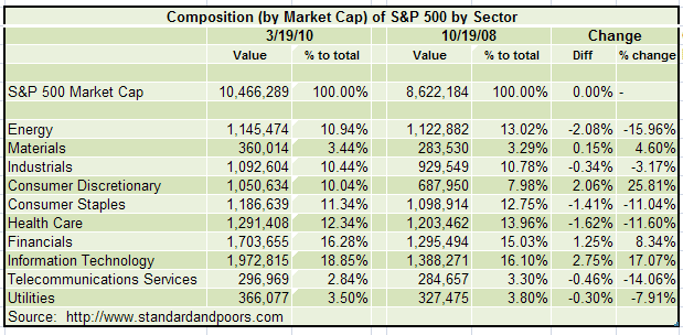
You can see clearly that the change in composition among sectors is material. Money flows in/out of stocks, stocks exist in sector, and the broader indexes are a composite of that underlying movement. The dynamic does not exist in the reverse. Accordingly, dull index action may belie exciting dynamics of underlying sector rotation.
While the above breakdown is for the S&P 500 to be illustrative of the material movements underneath the index, the sector information that I provide is for ALL US Stocks using the Dow Jones classification methodology/system (there are different classification systems). Different indices will select these based on market capitalization.
If these sector looks have created an interest on your part, I want to provide you with some resources:
- WSJ Industry Group Tracker: This source lists the daily performance in addition to other periodicities (e. g. weekly, 1 month, etc). I'm unsure if this is available to non-subscribers.
- FINVIZ: This site (FREE!!!) provides one of the best way to quickly see charts and other information on stocks in sectors. Unfortunately they do not have broad sector roll ups. You can use their tickers to easily upload sector charts into your software of choice for chart reviews. The information can also be downloaded into a spreadsheet.
- Yahoo Finance: Yahoo has broad sector roll ups, but some of the market capitalizations are incorrect (e.g. the foreign money center banks).
Your eyes might be crossed at this point, and you may well be wondering why any of this is important. It may not be important to you. But I believe that the sectors offer a dimension of information that informs whatever work you do on the S&P. And where opportunities are flat on the index because of underlying sector rotation, opportunities abound (long and short) among the sectors.
The presentation of my work here is to give you a divining rod for finding the flow of money beneath the surface. I tend to analyze from the top (broad sector) down (sub-sector, then individual charts). That is my style. It may not be yours. There are many ways to skin this cat, and however you do it you need a sharp knife and skill in which to wield it.
