Slope of Hope Blog Posts

Slope initially began as a blog, so this is where most of the website’s content resides. Here we have tens of thousands of posts dating back over a decade. These are listed in reverse chronological order. Click on any category icon below to see posts tagged with that particular subject, or click on a word in the category cloud on the right side of the screen for more specific choices.

Governing Fundamental Principles of Financial Markets (by George)

By -

I have observed that the Non-Farm Payroll economic release
and the FOMC Rate Decision are usually days that mark the end of the prevailing
stock market trend. I believe this is essentially a fundamental, rather than
technical, phenomenon.

The prices of the stock market are related to these five
essential macroeconomic factors: consumers spending and savings, the business
cycle, fiscal policy, and monetary policy. Of these, the market seems to
acknowledge consumer habits and monetary policy to be the most important
factors. The former is represented by payroll data, and later by interest rate
policy. (The weight of two of the ten leading economic indicators, related to
monetary policy, has accounted for 40-60% of the index.)

There is a consensus view of the employment data and the
rate decision, and as the release approaches, the market tends towards the
valuation “justified” by the coming data. This is just like a stock price
rising in anticipation of an earnings announcement. Once the data is released, “sell
the news”—the data becomes fully discounted and the trend towards the next
release, a month or quarter later, begins.

That is one very viable explanation for this trend reversal
phenomenon that occurs consistently in the stock market. That prices did not
reverse after last Friday’s payroll data, and will reverse at or near the Fed
announcement, tells me that the financial markets are currently more concerned
with interest rate policy than the economy. Changes in this policy can create a
change in investor mind-set that governs the next long term stock market trend.

Why is monetary policy so important? It affects the economy
and inflation, and also the supply and demand for investments—bonds versus
stocks. I will end this brief essay with an excerpt from a brilliant and
eye-opening passage, taken from the book, Inside
the House of Money
. Read it carefully, and many times, and return to it in
the future:

There is only one true macro
trade, and that’s the price of money. Everything else is a function of the
price of money.

Central
banks control the price of money and drive everything with their central bank
rate. They use monetary policy to get supply and demand moving in the economy
by encouraging people to move out along the risk curve. The risk curve, in
essence, is the credit curve.

There is
really only one central bank and that’s the U.S. Federal Reserve. The Fed sets
the price of money.

In actual
practice, the price of money is not the Fed’s overnight rate, but the interest
rate that corporations use to evaluate investment opportunities. I would argue
that’s the 18-month and two-year interest rate. From there, you move out along
the risk curve to government bonds, corporate bonds, and then to equities. At
the tail end, you have foreign exchange fanning out.

Swing Trade Basics (by Fujisan)

By -

This was brought to my attention during the week when somebody asked me how I swing trade.  Then, I realized that not many people are familiar with this concept, so I decided to give you an overview of the swing trade this week.

Swing Trade Basics

With the swing trade, you place a bet right above/below the previous swing point with an expectation of making 100% extension from the most recent swing low.

For those who have never seen the swing chart, here is an example of QQQQ daily swing chart.

Q_Swing
Volume Confirmation

If the previous swing is being taken out with much higher volume (typically, more than 10%), then, that's considered to be the volume confirmation and the probability of success is as high as 75~85%.  Here is the MA chart.

MA_SWING 
  

SPY & QQQQ Price Projections

As many of you may know, I used to make a weekly post at a different blog site, and as of June 6, 2009, I made the price projection as follows:

SPY Weekly Chart (as of June 6, 2009)

SPY 2009

QQQQ Weekly Chart (as of June 6, 2009)

QQQQ 2009 

These projections were made when the April swing highs were being taken out. 

In a retrospect, my projections were not that much off, but many people thought that I was totally out of my mind coming up with such price projections (remember, those were the times (and still are) that many were expecting "one more drop" to the downside).

This was the comment added by the blog host on the face of my weekly post:

"Although there is technically nothing wrong with Fujisan’s channels there are various sentiment indicators that have currently reached extreme readings and which therefore cast doubt on the notion that we’ll push all the way into 1100 on the SPX or 1640 on the NDX. However, it’s not impossible and if we rally higher from here (a very distinct possibility)"

(Note:  My intension is not to ding him.  I just wanted to point out the sentiments shared by many traders back then.  After 9 months, this sentiment has not changed.  Many traders still think that various sentiment indicators have reached "extreme" readings and there is a very distinct possibility that we'll push higher from here – although I admit that it's short term overbought). 

SPY Weekly Chart 2010 Price Projection

Now, as the most recent swing highs were being taken out this week, I am making the new price projections with an expectation of 100% price extension from the most recent swing low. 

I have already expressed my long term bullishness at my last week's post, but here is my intermediate market view based on the swing points.

As long as I can tell, SPY did not close above the previous high with the volume, therefore, a=c price structure is not confirmed.  However, there is a very good chance that it could go to the next swing point, and that's what happened in the previous leg up (it did not close with the volume but it went through many swings and sideway movements, and eventually made it through 100% extension). 

SPY_2010 

QQQQ Weekly Chart 2010 Price Projection

Just like SPY, QQQQ did not close the weekly candle with the volume, therefore, a=c structure is not confirmed.  However, once it closes above the previous swing high, it could go to the next swing.  Please note that 200 SMA and 50 SMA are about to cross.

QQQQ_2010 
  

IWM Weekly Chart 2010 Price Projection

Just like SPY and QQQQ, no confirmation on the volume, but the next swing point is almost as good as a=c price target, so, in a way, IWM will most likely complete a=c structure.  Please note that IWM closed above 200 SMA for the first time in 20 months.

IWM_2010 

If you think that my intermediate price projections are totally out of the question, just look at my June 09 price projections and see what happened.  If you just keep shorting this rally expecting a big drop, you are falling for the same traps.

How can we trade?

This tape will be very difficult to trade for both bulls and bears.  Unless you went long 1 month ago, it would be difficult to go long at this point and we may see many sideway price movements just like the past year.  Ok, so how can we trade?

1. Avoid the indices, especially SPX and INDU.  If you like to trade the indices, you would be better off by trading IWM and/or QQQQ.  Much better momentum.

2. Find the individual stocks that are moving.  There are many stocks that are breaking out of the current trading range.

3. Keep adding long positions on a dip and don't pay attention to the small price fluctuation.  You will eventually get there (believe it or not, this was the most effective trading strategy last year).

For those who are interested in accumulating the long positions over time, here is QQQQ Sep 45/50 bull call spread.  Just keep addding on the dip.  This is a theta positive position so you don't need to worry about theta burn.

QQQQ 

SPY Daily Chart Update

I was hoping to see some kind of pullback after SPY hitting my price target.  However, SPY did not sell off into the close on Friday and still closed above the previous swing high, so, I have to remain bullish until the price rejection.  With OPX and FOCM coming up next week, together with the quadruple witching, my bias is still to the upside.  It almost seems to me that all the major indices are waiting for INDU to make the new recovery high before a pullback.

SPY_Update

EUR/USD

Last but not least, here is my EUR/USD update.  You might like to pay a close attention to this pair, as it is right around "make or break" point.  Once it goes above Friday's high, this could be the break out of the current downside channel, which is positive to the equity market, and vice versa. 

Eur

Should Bears Beware the Ides of March?

By -

Things seem to be lining up nicely for a significant interim top to be made early next week. $BPNYA looks to be one bullish day or so away from hitting the top of the declining channel. This has been a very good indicator of significant recent tops and bottoms in recent months:

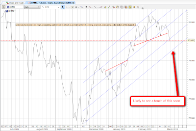
Similarly USD is only a short distance now from the bottom of the rising channel, and if it hits it, we should expect to see a new wave up in USD that should have a strong dampening effect on equities exuberance. Here it is on the DXM0 60min chart:

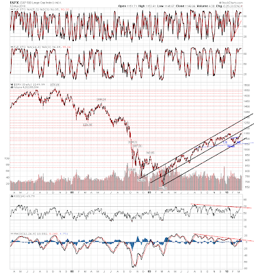
We are now only a few points away from the next serious resistance on SPX in the 1160 area. Here's the three year daily SPX chart showing the year-old rising channel with the significant support and resistance levels marked:

So everything is lining up nicely for the significant interim top that I have been expecting.

There are many saying though that we are on the cusp of a major rise in equities that will see us continue this already fairly long in the tooth upswing. Could it be so? Obviously it could. We are only ever weighing probabilities with market analysis. Lower probability outcomes are only ever just lower probability. What could make this potential parabolic rise a reality?

Well, these same three charts above could tell a different story. All channels break sooner or later, and every time that we reach the upper or lower trendline of a channel there is a significant risk that it will break up or down respectively. Equally, rising channels tend to break downwards just as declining channels tend to break upwards. There is obviously a significant risk that both the $BPNYA and USD channels will break next week.

The three year SPX chart tells a story too. If the strong resistance in the 1160 area is broken, the next really significant resistance level is in the 1200 area.

There is also a longstanding gently declining channel on the Vix. The lower trendline of that channel would be under 15 if we were to touch it in the near future, and a major push upwards in equities could make that happen. If so however, the very significant top at the end of that push upwards should be signalled by the Vix touching the bottom trendline of the channel, and we should at the least see a very significant retracement after that:

This parabolic rise to the next interim top could happen, but it isn't really any particular cause for alarm for traders. If this scenario were to play out we would know quickly as the 1160 resistance would be broken with confidence and most likely the USD and $BPNYA channels would be broken at the same time. Any rise would also still most likely be confined within the strong rising ES channel, which is sufficiently steep to be reasonably confident that when it breaks, it will break down rather than up:

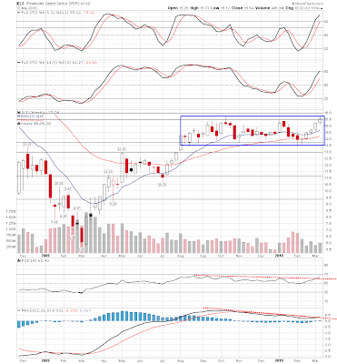
There is another indicator I will be watching closely as well, which is the very longstanding rectangle pattern on the weekly chart of XLF, the Financial Sector SPDR. At the moment it has made a perfect touch of the top of the rectangle and is back on the way down to the bottom. That is very bearish for equities generally in the near future. This is a particularly good example of a rectangle by the way, with perfectly exact touches of the bottom and top trendlines, a breakout either way has a good chance of making the rectangle target, and any close above or below the rectangle will be a very strong bullish or bearish indication for equities generally depending on the direction of the break.

However, the rectangle is of course a generally bullish pattern with 69% of breakouts to the upside, and upward breakouts particularly are often signalled by a partial decline in the rectangle before a second touch of the top trendline, so if we see the top of the rectangle touched again next week that would be a strong warning of a potential upside breakout with a target of 18.5, and to reach that target would likely require a major wave upwards in equities.

All in all though, there is a very strong probability that we are about to put in at least a significant interim top on equities. Oil and gold both broke downwards from their respective short term rising wedges on Friday, with targets of 72.5 and 1060 respectively, and while of course it is still possible that they will break back upwards, it is unlikely. Resolving to those targets would fit with a strong retracement in equities and that is what I think we will be seeing for most of the rest of March.