Slope of Hope Blog Posts

Slope initially began as a blog, so this is where most of the website’s content resides. Here we have tens of thousands of posts dating back over a decade. These are listed in reverse chronological order. Click on any category icon below to see posts tagged with that particular subject, or click on a word in the category cloud on the right side of the screen for more specific choices.

Weekly Sector Report | Expanded View (by Leisa)

By -

Perspective is everything, and we gain perspective by comparing one
thing to another. I wanted to build some sector and market perspective
for you. How? By providing you with the following:

  • time series of when different sectors peaked1
  • current retracement to peak in absolute terms1
  • percentage decline from peak to trough
  • percentage of points
    lost retraced
  • percentage retracement to trough

1
contained in Table 1 below

Table
1


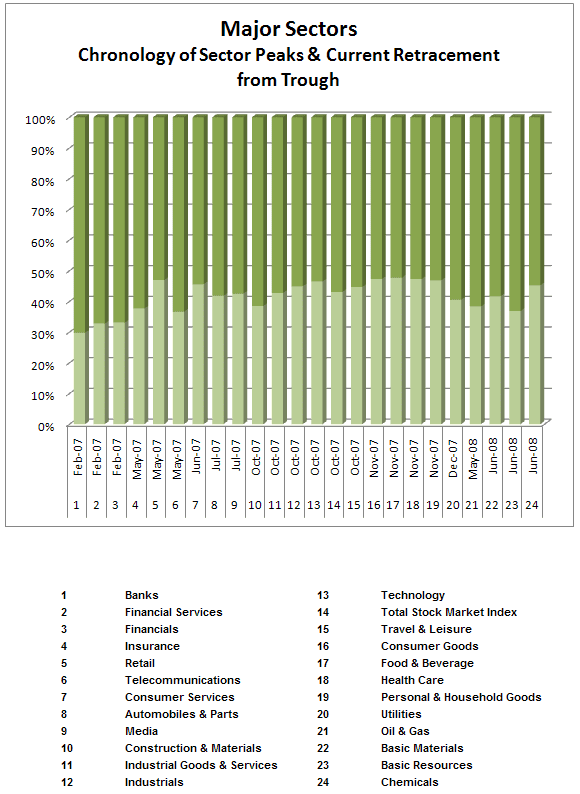
There are a couple of things that are notable from this chart

  • It has been more
    than three years since the financial sector topped
  • There was 16
    months from the topping of the first sector (Financials) to the last
    sector (Commodities)

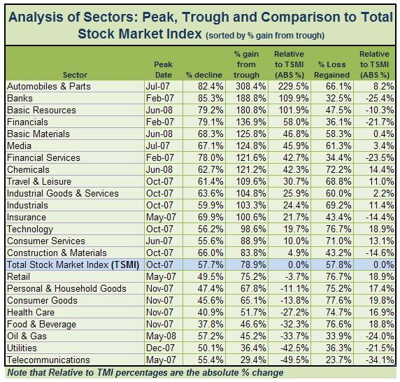
The next table, Analysis of Sectors: Peak, Trough and
Comparison to Total Stock Market Index (sorted by % gain from trough)
,
will give you view of the sectors that have recovered the most since
their trough:

Table 2


Now
that I've provided you with that, we'll return to our previously
schedule program. Below are the 24 Summary Sectors. You can find the
complete report on the 164 DJUS Sectors in addition to weekly + daily
chart books for the sectors below here.

I hope that you found this
expanded report helpful to providing to you some perspective on relative
time and price performance among the 24 sectors that I highlight for
you each week. You can also see the disparate nature of BOTH time and
price performance through a major cyclical decline and recovery. While
this information is unlikely to make interesting cocktail conversation,
it is a useful mosaic of information to inform your investing/trading
thinking.

I will post periodic updates to the peak/trough tables.

All
data courtesy of Stockcharts.com | Compilation and analysis courtesy of
me.

Three Short Flavors

By -

The markets in general aren't a very ripe place for commentary these days. So instead of talking about the indexes, I thought I'd share some thoughts on the kinds of short set-ups I'm seeing among individual equities.

The first is the "jump on the trampoline" play, in which value absolutely collapsed in 2008 and, from 2009 forward, sprang back to the failure point. I find these stocks quite enticing, since the security has tipped its hand about just how weak it can potentially be. I would caution, though, that some patterns like this have simply rolled their eyes and continued to soar right past their purported resistance levels. At least they make for relatively good risk/reward ratios.

0327-ain 

The second is the "close, but no cigar" play, in which a price hammers out what should be a powerful bullish breakout but winds up limp. A failure to breakout is a danger sign for the bulls on a particular security, and I think it provides another favorable risk/reward setup.

0327-crm 

Finally, there is the set of lower highs, as represented below. This is probably the least speculative of bearish plays, since the stock has already demonstrated its inability to climb progressively higher.

0327-pnk

I would close by suggesting that the grammar freaks on this board (such as myself) who also enjoy a rather NSFW-laugh might get a kick out of this. Bless the person that made it.