Slope of Hope Blog Posts

Slope initially began as a blog, so this is where most of the website’s content resides. Here we have tens of thousands of posts dating back over a decade. These are listed in reverse chronological order. Click on any category icon below to see posts tagged with that particular subject, or click on a word in the category cloud on the right side of the screen for more specific choices.

Meltdown Mondays a Fond Memory (by Springheel Jack)

By -

Well, it really did seem as though the expected interim top was in
and that the correction was starting on Monday morning. My ES channel
broke downwards overnight and it seemed we were away.

I wasn't too happy from an indicators perspective, as I had expected
a bullish Monday, and Mondays have almost all been bullish in recent
months. In the afternoon after the decline stalled I ran a line
parallel to the channel up from the 1085 low and it fit very well where
we had retraced to on Monday morning.

Looking at it now, it seems clear that the larger channel is the
correct one, so here is the updated ES channel, which has most
definitely not yet been broken:

100315C_ES_60min_Rising_Channel 

One of the indicators that I have been looking at carefully is the
bullish percent index $BPNYA. That made some progress today and is
near, or possibly even at, a level which should signal an important
interim top:

100315C BPNYA Daily Channel 

I was surprised to see USD push up sharply from Friday's close. I had
found an in-channel H&S pattern on USD indicating to the bottom of
the USD rising channel, and have found those very reliable in the past.
However USD does seem to have turned back up with some conviction now:

100315C_USD_60min_Rising_Channel

There is some good reason to think that USD may have turned back up
now. EURUSD broke through its channel late last week, but that may just
have been an overthrow, it has returned today and may now start another
wave down:

100315C_EURUSD_60min_Channels 

Gold and oil seem to have made interim tops already, which is a good
indicator that we may well see an interim top made on equities soon. Oil has broken
out of its rising wedge and is making good progress down towards the
wedge target in the 72 area:

100315C_Oil_60min_Rising_Wedge

Gold has also broken out of its rising wedge, but presents a more
intriguing picture as over a longer timeframe we may have a large head
and shoulder top on gold indicating to the 950 area, which is something
to think about.

It may not play out, there was another more recent IHS on gold that didn't
play out, but H&S patterns on gold form often and generally do play
out. There are three smaller ones marked within the large H&S pattern that
all played out:

100315C_GCM0_60min_Wedge_and_HS_Pattern 

I think that we're very close to an important interim top now, and I'm
fairly certain we'll see that this week.It is obviously quadruple
witching opex this week though, so we may have some more surprises on
the way.

COT Data and the Euro (by Trade Flight Plan)

By -

Eurodollar fans – here's an excerpt from our latest blog entry.

The weekly Commitment of Traders (COT) data
published by the Commodity Futures Trading Commission (CFTC) can be
useful in identifying larger trends that shape Euro futures contracts (6E or EC ticker symbol root).  There's a lot of great information
about the COT data on the web, so we won't go into details here.  To
net it out, the weekly COT data reports the net short and long positions
held by commercial traders (producers and consumers of commodities) and
noncommercial traders (speculators) for various futures contracts.

The weekly chart below shows some revealing trends experienced by the
Euro over the past five years.  The blue line shows the net position of
noncommercial traders (in this case, large speculators and hedge
funds).  The yellow line shows the net positions of other speculators
(in this case, non-reportable smaller traders).

Let's take a look at what happens when the blue and yellow lines
decisively cross above or below the zero line, implying speculative
traders are either loading up or unloading 6E, depending on direction.

For example, in December 2005, both the blue and yellow lines cross
above zero, suggesting large and small speculative traders are
establishing long positions on the Euro.  The net positions do not cross
below zero until May 2008.  A complex top forms with net short
positions crossing again in July 2008 (coincidentally just a few weeks
before the market implosion).  Smaller traders attempt to establish long
positions in November 2008, with larger speculators joining them in
late April 2009.

Significant turning points on 6E appear to take place when both the
blue and yellow lines cross meaningfully above or below zero.  The
smaller traders seem to serve as the canaries in the coal mine, with
further confirmation when joined by their larger speculative brethren.

Clearly, 6E trades cannot and should not be based on COT data alone.
However, COT data can serve as a useful tool when used with other
information.  For example, if we see noncommercial entities shift
positions from net short to net long, we'll think twice before heavily
shorting 6E.

Lately, the Euro has been suffering (or enjoying, depending on your
perspective) a period of notable decline.  In fact, noncommercial net
short positions are at their most significant levels in 10 years.  Does
this guarantee the Euro will continue its decline?  Not necessarily.  6E
can continue to sell off from current levels, or we could see a big
retracement. However, it is interesting to observe that noncommercial
traders crossed to net short positions in December 2009, with smaller
speculators piling on shortly thereafter.

Either way, we need to allow price behavior and support/resistance
levels serve as our guides.  And, we will definitely be paying attention
should noncommercial entities shift their positions to net long.

Correction Higher In Risk (by cantabnomad)

By -

Equities and other risky assets will likely sell-off hard fairly soon. I consider it highly unlikely that sustained upside progress can be made.

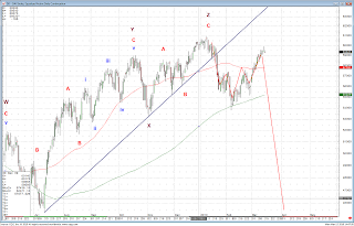
Below is a daily chart of the German DAX. This is my count and projections, unchanged from January 2010.

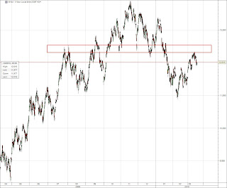
This is an hourly chart of mainland Chinese large caps traded in Hong Kong (the H-shares index). This index is weaker than the Hang Seng, and failed to take out the resistance highlighted by the red box. From Elliott Wave perspective, the rally from February lows has been corrective and is very likely over at current levels. This index is putting in a massive, massive top. All this for the companies that cater to the market that will save the world in 2010???