JUNE MACRO UPDATE –
I am back to publishing the macro update in one huge post again. I tried to break the data into several posts last month, and it just didn't work. To simplify life for readers and myself, I'll just post the whole enchilada here. If reading documents the size of the Magna Carta isn't your cup of tea, simply scan the pretty charts and view the trading wrap up at the bottom. If you desire more detail or Goatmug's take on the data, simply read the fluff.
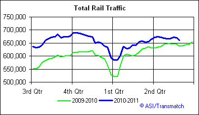
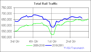
RAILS – http://railfax.transmatch.com/
Rail traffic in the US continues to push higher in year-over-year comparisons. We did see coal shipments under perform last year during this week. So far year to date, only food tonnage is down from last year at this time.

TOTAL RAILS
We continue to see the improvement over last year's shipments, while the economy has encountered a "slow patch" it will be important to follow the trend to see if we see a further regression toward last year's totals.
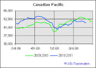
CP – Regular readers know that I often examine individual rail company delivery statistics to try to catch an edge on short term trades, especially to identify outpeformers and poor performers. Canadian Pacific continues to be a laggard that I'm watching. It appears as though railfax had some data issues because we don't see the chart populated for the last several weeks, despite that, I don't see much change in the information from other sources.
UNP is barely exceeding last year's hauling numbers so I thought it would be one to put on our radar. It is also notable that the only other rail that is showing negative y-o-y shipping totals is Ferromex which UNP owns a 26% stake in. Don't pull the trigger on this one, just add it to your watch list as a potential short.

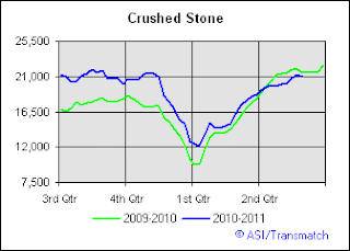
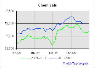
THE RECESSION INDICATORS – CRUSHED STONE AND CHEMICALS
Railfax continues to tinker with the information they provide and in fact are toying with the idea of limiting much of their data (boooo!). In the last couple of years we saw shipping information on autos, scrap metal, and timber, but this month we are back to Crushed Stone and a new one, Chemicals. Both of these metrics are good for gauging economic health. Crushed stone is used in the commercial real estate areas and obviously chemicals are used in manufacturing, agricultural, and energy applications. There is nothing shocking to report here.
MOODY'S/MIT TRANSACTION BASED INDEX – http://web.mit.edu/cre/research/credl/rca.html
If the Crushed Stone data didn't give us a tip off, the MIT Transaction Based Index sure will. Once again the index is showing that real commercial real estate transactions are losing ground and seller's positions are weakening. We note here that there was a 4.23% decline in March in the value of deals getting done.

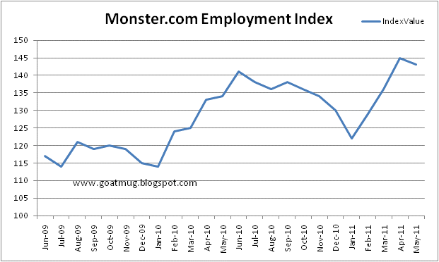
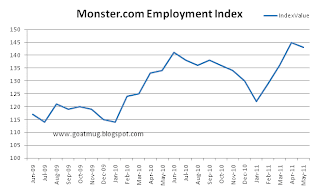
MONSTER.COM EMPLOYMENT INDEX – http://about-monster.com/employment-index
It all can't be bad right? Despite the poor jobs reports, Monster Worldwide is showing some pretty positive numbers in terms of the number of job listings on Monster.com. May dipped a little, but clearly April and May indicated that job listings are a a higher point than they have been for almost two years. I'm generally pretty skeptical and negative about this economy, but this is a good sign.
NAR – EXISTING HOME SALE PRICES – http://www.realtor.org/research/research/ehsdata
The average home price is finally moving up and we'll call this a trend. Yes, of course in some parts of the nation things are nasty, but overall we are seeing a pick up in the average home price. Pricing is still at levels that are equal to the "pits of hell" of late 2009, but at least we're heading higher. The recent drop in the stock market and resulting bid for treasuries may actually be a boon for housing data as mortgages rates are falling. Now, the only trick will be for those scrappy realtors to find quality buyers to scoop up all those deals! (I've had two conversations this week already with home sellers and realtors that have lamented about the inability of folks to actually borrow).

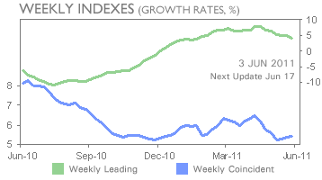
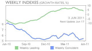
ECRI – http://www.businesscycle.com/resources/
I've decided to put the ECRI data back into the monthly packet, but have avoided populating my own graphs. I'll simply highlight their information here about the trends in home prices, and while real home prices continue to dip, leading indicators for home pricing seem to show that there is some rebound happening. This is of course backed up by the NAR data, which makes me feel better about the NAR data, because we've already seen that NAR economists are essentially an arm of the realtor marketing alliance. They would never, ever, ever, come out and say that it wasn't a good time to buy, would they? The area I live in has been totally insulated from much of the drop, so I feel like I live in some alternate reality where everyone I meet can afford a home that costs $1 million and more importantly can afford the $3,000 a month in property taxes that comes along with that house payment. In that price range, things have been fine in my town, but clearly other parts of the US have not been shielded by such fortune.

In addition, we find the ECRI Weekly Leading Index information showing a downturn for the fourth consecutive week. I think this is one data set that has the market spooked and this is really why I brought this back out. The "rate of change" is indicating that the "green shoots" are turning yellow and are wilting.
SCRAP METAL – http://www.scrap.net/cgi-bin/composite_prices.cgi?id=100000&num=5
Good old Alan Greenspan used scrap metal as a bell weather for the economy's health, however perhaps we should say he used it for a measure of the health of a bubble. If it's good enough for Uncle Al, it's good enough for the Goat! Scrap prices hit the skids since peaking in February. While the composite index has tried to build a base over the last two readings I am not sure that the downward trend has abated. Frankly, base metal prices and all commodity prices have been under attack since Ben Bernanke's declaration that commodity price inflation is "transitory", so the correction is not surprising. It is in the economy's best interest to see commodity input prices fall and relieve some of the stagflationary risks we are faced with presently.

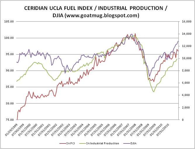
UCLA / CERIDIAN FUEL INDEX – http://www.ceridianindex.com/
I find the Ceridian / UCLA Fuel Index study full of information, however I despise that it offers this data with a two month lag. As I've often reminded visitors to the blog, this piece of data is great for confirming direction and slowdowns that have occurred in long term trends, we just have to deal with the dated data. The PCI (fuel index) seems to have peaked in March and turned downward. This study is so great because the PCI (fuel index) consists of real time (errr not so real time for us) data from commercial trucks. Each time they fill up, they transmit the amount of fuel they consume. This information gives us a powerful view into the real transportation activity and health in the nation's economy.

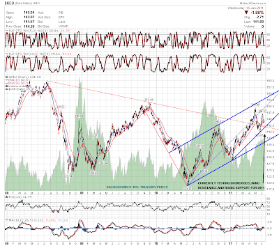
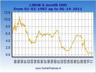
6 MONTH EURIBOR – http://www.homefinance.nl/english/international-interest-rates/euribor-rates-6-months.asp
Despite all of the tremors related to Greek insolvency and all of the undeniable issues with the PIIGS, we see that 6 month Euribor is just under 1.75%. Remember the amazing days when interest rates had a 3% handle on them? Rates have been climbing over the last couple of month and are up almost 65% since last September.

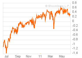
In contrast to those really expensive 1.75% Euribor rates, we see that the 6 Month USD Libor rate is down to an eye-popping .40%. Unlike our friends across the pond, our rates have about 15% since last September. Obviously "one of these pledges is not like the other". The divergence between the two sets of rates continues to illuminate how differently our central bankers have attacked these problems. Their leadership has attempted some sort of fiscal control and monetary restraint in an effort to actually begin steps toward normalcy, our guys have thrown caution to the wind and jammed rates lower and lower and lower.
I always find that Bloomberg's US Financial Conditions Index is one of my favorites. Yes, it has it's flaws especially since it is driven by liquidity flows and stock market gyrations, but despite that, it seems to tell the truth quite often. Over the last month, we've seen a total meltdown in the FinCon Index and it has steered itself toward a sub-zero reading. Anything below zero is a recession, while numbers above also indicate that there is growth. We are in that no-man's land area where we can't say one way or another where we'll end up, but if we are growing, it isn't overwhelming, that is for sure.
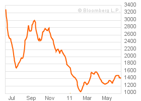
In a valiant effort, the Baltic Dry Goods Index has battled through May to just under 1400 again, where it looks as though it may drop.
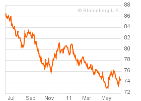
The USD has risen a point or so against an incredibly bad chart. The buck is in a make it or break it position here, and if it doesn't hold these critical support levels, we'll see commodities off to the races with $140 oil within striking distance. As we've discussed many times, the devaluation of the USD must be thought of as a dance, something that is choreographed and one that has a rhythm. Our leadership simply couldn't "crash"the dollar, they have to walk it down gently or else the entire scheme would fall apart very quickly.
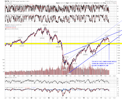
LONG TERM VIEW OF USD –
If you had any doubt that your purchasing power had eroded, look now further than this graph to clearly understand what Alan Greenspan and Ben Bernanke have done to your dollar, business, family, and lifestyle. In order to support bubble after bubble and keep interest rates artificially low, they have purposefully crushed the value of your currency. Isn't paper money great?

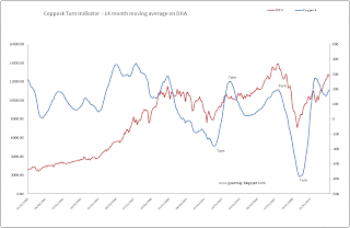
I've been keeping this one around for entertainment purposes only. As if right on queue as soon as the Coppock signaled a reversal and gave a buy signal, all hell broke lose! Interestingly, if the Dow Jones stays under 12,350 it will signal a SELL. Perhaps the indicator will redeem itself after all. Please note, according to Coppock rules, it is still in a BUY till the end of the month as these are monthly data inputs.
WHERE SOFT PATCHES BECOME HARD LANDINGS
William Dudley, NY Fed Governor said recently that "Despite our recent soft patch, economic conditions have improved over the last year." Typically Dudley, Yellen, and Bernanke are the only 3 Fed bankers that you need to pay attention to, because they are the driving force behind the Fed. As you might expect, they usually support the same positions and don't ever go "off the reservation" like some of the other guys. As many of you know, I believe the "other guys" are simply there to make it seem like there are honest discussions occurring at the Fed, when in reality all the other players matter little.
As I mentioned though, Dudley is one of the guys that matter, so I often make sure to read and re-read his statements because they are another read into Bernanke's views. In fact, they often use the same words and language to describe our economy and its challenges. In this case, Dudley gives us more of the reasoning behind the famous "commodity price inflation is transitory" because he lays out that our weakness in the economy is due to several key issues. He states that rising commodity prices, the Japanese earthquake, and severe weather are passing issues. Dudley goes further, just like Ben Bernanke and highlights that they can have faith in their notion that inflation is transitory because long-term inflation expectations are stable, BUT what is even more illuminating is that he says that these levels are now elevated and it does have the Fed concerned. This is much less confident of a statement than what we heard from the Chairman in April.
This is the rub. The Fed still believes that it is in control of the situation despite the fact that it is having funding issues, has tremendous balance sheet risk when interest rates rise, and is backed further into a corner when commodity prices rise. No wonder why we are seeing them impress upon us how small inflation is, how temporary it is, and how it really isn't anything to worry about. These comments are part of the PR campaign to make expectations a reality.
The problem with this "soft patch" is that many of the important metrics we are watching are still falling and weakening. If the continued weakening persists and they can't force oil, gas, softs, and other commodities lower to kill longer term inflation expectations they'll be at risk for driving us off a cliff. We've noted many times before that each basis point of interest rates cost us taxpayers billions, and this doesn't include all of the bad execution on treasuries we've bought at less than best prices. If this soft patch gets any worse, we'll certainly be in for a hard landing.
TRADING UPDATE
I have continued to hammer home the idea that we've lived through this before. We've endured the issues with falling economic metrics, a weak stock market, and political threats to collapse the financial world if the debt ceiling isn't raised. Couple that in with a few legitimate jitters over the status of the Greek bailout and you have a perfect storm for trading challenges. The question is really though, can the markets deal with it and still go higher?
Here are specific plays to think about over the next few weeks as you position your portfolio.
SECTOR ROTATION TRADES
Look, about 80% or more of professional money managers must be fully invested all the time. As they perceive areas like energy and industrials to be more risky, they need to rotate out to the next thing. In the sector rotation model I posted a couple of days ago we find that Consumer Staples, Defense, Utilities, and Healthcare are all part of that next step in the process. I personally love cash, so I view these trades differently, as usual we need to know the game that is being played by portfolio managers that are trying to beat the index. The gamble is that these defensives will lose less or outperform the risky stuff, therefore they can incrementally beat their benchmark and get paid their bonus. We on the other hand have cash as an option, I'd use it too.
PPA (Defense)
XLV (Healthcare)
XLP (Consumer Staples)
XLU (Utilities)
Oh yes, I'm short a few technology names in anticipation of the rotation out and a slow down. I'll highlight a few of these in other posts where I can give more specifics.
EUROPEAN COLLAPSE TRADES
GLD or physical gold would be the answer here. Everyone knows this will be the final outcome, no one wants to end up holding the bag.
SUMMER DRIVING SEASON AND MORE MIDDLE EAST UNREST
Gasoline has continued to be a tough trade that has been very volatile. I have closed this trade, but there is still a good potential for a move higher, one little hurricane in the Gulf of Mexico would move this solidly higher.
COLLAPSE OF THE DOLLAR TRADE (DEBT CEILING ISSUES)
EMLC – I like this play here, it is an etf constructed of sovereign and foreign debt in the local currency of the issuers. If Bernanke is able to slide the value of the dollar lower, you will gain in the currency play as well as the yields associated with these foreign bonds.
Physical gold or silver and GLD if you like fake paper stuff. My view on silver and gold is oddly different here, I am a long term holder, therefore this is NOT a quick hit trade like I usually focus on. Silver could easily test $32, but I still have a very large position in physical silver and it isn't going anywhere. Who knows, I may need to kill an intruder with a 40lb brick of silver if we go Mad Max anytime soon.
That's it for the monthly update, I'll do more in the coming days about specific trades mentioned here and also reveal other positions that I have on now.