Slope of Hope Blog Posts

Slope initially began as a blog, so this is where most of the website’s content resides. Here we have tens of thousands of posts dating back over a decade. These are listed in reverse chronological order. Click on any category icon below to see posts tagged with that particular subject, or click on a word in the category cloud on the right side of the screen for more specific choices.

Moving Average Dynamics and AAPL

By -

Id like to share a brief post to outline some concepts that I track on a daily basis.   I have found these concepts at work in all other issues I have tracked.  This particular one pertains to AAPL, the downtrend of late and some features that may be foretelling of a bottom in the stock.  Keep in mind this is a continual work in progress.  I hope you will find it of some interest, if only to see the inner workings of moving averages in action. I wrote the following on 4-1.

When charting in this way, some things begin to jump out at you.  I’ve tried to discover what’s important and what’s just a natural artifact of the laws of mathematics.  But in my mind, it becomes more important simply because of the HFT driven markets we trade. I will not be able to cover all things here, but Ill try to get a vague point across.
These charts are recent daily and hourly closing price data for AAPL.  Each chart is formatted exactly the same way.  The upper bands are current price (black), and its relation to both 50(yellow) and 200SMA(blue) drop-off prices which appear as a duplicate of the current price trend, but are offset into the future depending on the MA in question.  So if our 50 DMA is the sum of the latest 50 closes, then the drop-off is the 51st candle on the chart and the current price line will always be measured against that 51st candle.
The bottom bands are the result of the upper bands and their relationship to each other. When the current price line meets a drop-off line, the MA is at zero delta. Above or below it, and the MA is climbing or descending. You can visualize this better by looking at the upper bands every time a delta is on the Flatline. The goal to all of this is to find repeatable patterns to trade.  These lines can be very good leading indicators even though they are based on the past.  The theory is that a delta can only go so high/ low within a given period of time.  When you study these charts you learn that a delta peak is actually very predictable.
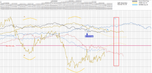
 AAPLdaily
Now lets look closer.  You can see that the 50DMA has been descending after crossing zero back in late October (shown as the yellow line below Zero).  Price crossed the 50ma drop off and its been below ever since.  The degrees have varied and interestingly, the 50 has been recovering to only a shallow descent (minus 1.55 on 4-21 to $453.55).  Closing near the 52w low again today, yet the 50DMA is falling only half of what it was in December with pps much higher.   Which brings me to a second observation.
On Dec 5, the 50dma was falling at its most rapid pace (-3.23), and pps was $539.  The price had fallen 40 dollars that day.  Why? Was it an important news story or did it have much to do with the fact that the pinnacle of the AAPL run to the 700s was precisely 50 days prior.  This was the point of max spread between current price and 50ma drop off price, creating the max descent condition in the 50DMA.   So what we then notice is that the top of the MA drop off line, tends to be the exact bottom of the MA delta line! This is evident in all ranges of data sample sizes.  You can see local peaks in the delta that coincide with the same lows in the DO price.  You can also see broad trends occurring as well. (I have outlined examples @ A-B and similar).
Now you may wonder if this has any real merit in trading. Afterall the MA is based on PAST prices and it goes up and down like clockwork. So what? Lets just look at Q1 earnings.  1. shows us that pps was nearing the 50DO line from below on Jan 23 the day of earnings.  This happened to be at a noticeable low of the DO line.  However on the 24th, it was met with a “new” price on the DO line.  A price recorded 51 days prior that was now missing from the average. The 200 DO line was telling its story as well. As seen in the chart, the 200 delta was about to reach its current bottom.  This appeared on 1-23 to be incomplete due to the still rising 200DO line.  There was a conflict happening at earnings release time. The only way in my mind to resolve it was for lower prices.   This was my cue to buy AAPL puts at the close of 1-23.
If you look at the latest 50delta indication, it appears to be at a local pivot low in regards to the upper bands. Another local low will be reached on Apr 5. (see 2. circled).  An interesting convergence comes about on Apr 8 which could trigger the 50ma into a new trend.  Apr 8 has the Q1 earnings plunge falling off the 50ma.  This in itself may not be noticeable except that the DMA will perhaps begin to right itself.  This may in fact be the bottom in the stock for awhile.  I’ve added projection lines that illustrate how the delta will want to trend based on this theory.  Again, its not a lock, but you can make a case that the trend appears to be UP in the 50DMA delta.
#3. is the most promising area to watch IMO.  This is centered around the current low in the 50DO line which should produce a peak in the delta on May 14.  Note that this coincides with a prominent low in the 200DO line, which should make for some interesting deltas in both MAs. Any conflicts in pricing will possible work out at this point, perhaps creating a trade.
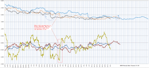
AAPLhourly
Another fascinating aspect of this theory is the role that the other time frames play in the equation.  Here the hourly data is working alongside the other charts.  Notice the rejection of price at the contact with the 50hour drop off line (1.).  This was happening in real time with the Q1 earnings release on Jan 23.  You have to wonder what companies are really up to when they schedule events. These data points and setups can be known well in advance as seen here.
2. is identified on the hourly chart at April 5, 8, and 9 to accent the feature on the daily chart.  Notice as well that this current downturn in the stock began exactly at the max spread of the 50 and 200 DO.
Well, I hope the Slope community will enjoy pondering this as much as I have.  I’ve wanted to share these concepts for awhile but honestly its difficult to do for so many reasons.  Partly I wonder if this is not already common knowledge being that MAs are nothing new.  Another part of me feels there is something more to it and maybe I can learn something from some of you.   Thanks for listening.
SPYmachine

Confirmation or Head Fake XLU : SPY

By -

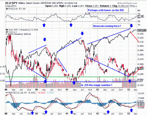
One day does not make a correction, but certainly a couple of weeks indicates that there is a slowing of the amazing tone deafness of the SPX to the movements in bonds and the emerging markets. Here is our old friend, XLU:$SPY which highlighted that investors were over allocating dollars to the defensive utility sector relative to the SPY.

Even though the SPY continued to move to “all-time highs” XLU began to beat the performance of the market in the last several months. I am now looking for a quick snap fall here over the next week, a display of resilience that powers us up to highs, and then a brutal fall through the summer.

ScreenHunter_01 Apr. 03 17.05

As you look at the chart that I posted many weeks ago, the XLU:SPY was signaling a turn way ahead of this weakness. We’ve been looking for a confirmation. The transports were battered, and perhaps have a bit more to go before reversing higher in the short term

ScreenHunter_02 Apr. 03 17.14

Goatmug is an investor that cares about you and your family. Goatmug’s Blog – Financial Perspectives From The Mountain Top is a collection of thoughts on our economy and how it impacts the lives of investors and average people. While several specific investments are named in many of his posts, these articles are simply invitations for you to do your own research and reference to these securities does not constitute financial advice. Your situation is complex and unique and you should seek professional assistance with your trading and investing. Please visit Goatmug and share your comments at http://www.goatmug.blogspot.com/

Small-Caps Lead in Today’s Weakness

By -

(Note from Tim: my “free month” of Slope+ is a big hit, but I wanted to move on to a real post; be sure to check out my special offer if you haven’t already; anyway, let me turn the microphone over to Strawberry Blonde…….”)

As of today (Wednesday) at 12:30 pm EST, the TF has broken through and is now trading below this year’s strong uptrending channel, as shown on the 4-Hour chartgrid below of the YM, ES, NQ & TF.

We now see a series of lower lows and highs on the TF, but not yet on the others. Any retest of and failure at the bottom of the channel by the TF will likely produce a drag (and possible pullback/correction) on the other three.

UPDATE 2:00 pm EST — The last swing low of 1552.50 (and uptrend) has now been broken on the ES 4 Hr. as it is approaching the bottom of its channel at 1546ish.

Celebrate with Slope+

By -

What a day!

I’ll put up a real post later, but I thought I’d celebrate a bit by offering anyone who wants to try Slope+ a free month on the site. You can learn about Slope+ here:

If you have no account on Slope of Hope at all (such as one you use for the comments system), and you are basically signing up from scratch, click here.

If you do have an account, and you’re already logged in, click here.

I’ve made a coupon that’s good for the next 24 hours, so enter 624F60A1 where it calls for the coupon code, and voila, the next month is free. Just because.

And now, to make a good day even better, here’s a completely gratuitous picture of Sherilyn Fenn.

0403-fenn