
Hi Folks,
It’s been said that prediction is difficult – especially about the future! Technical analysis is often mistakenly used as a predictive tool. Nearly all indicators used in technical analysis are lagging making them excellent at telling you what has happened (or is currently happening) but forecasting with them is a different matter entirely.
It is up to the technician to formulate a testable hypothesis based on what has happened or is currently happening and then to act on it. That is where the power of technical analysis lies – not with the indicator but with the analyst. I believe there is no indicator that can predict the future because if there was, it would become known and then quickly arbitraged out of usefulness. As I said in a previous post, it’s good to know which way the wind is blowing. But like forecasting the weather, forecasting the market is fraught with difficulty. The winds have been blowing in the long direction for quite some time. The pragmatist won’t fight this trend and the experienced trader knows that no trend lasts forever. This week, my charts show me that there have been gusts of wind in the short direction. The prevailing trend is long but a weather warning is now in effect.
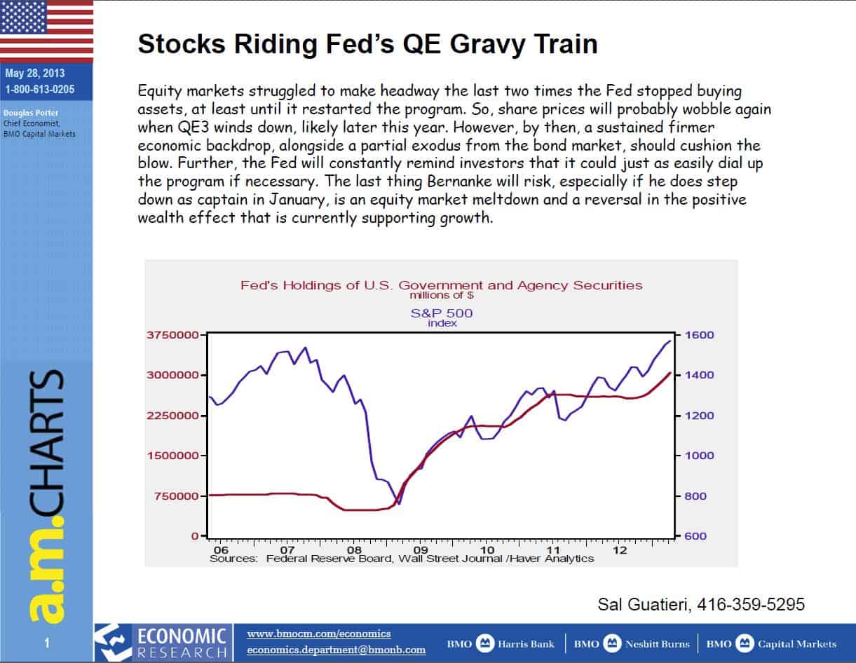
The first chart I want to show is the QE weather pattern. There is no doubt that the financial crisis was a severe storm and that government entities shored up the economy with a lot of liquidity. We will be debating the efficacy of QE for decades I expect. I make no judgments. I only observe that winds of QE have been powerful and it’s not something I want to fight.
(click for larger image)
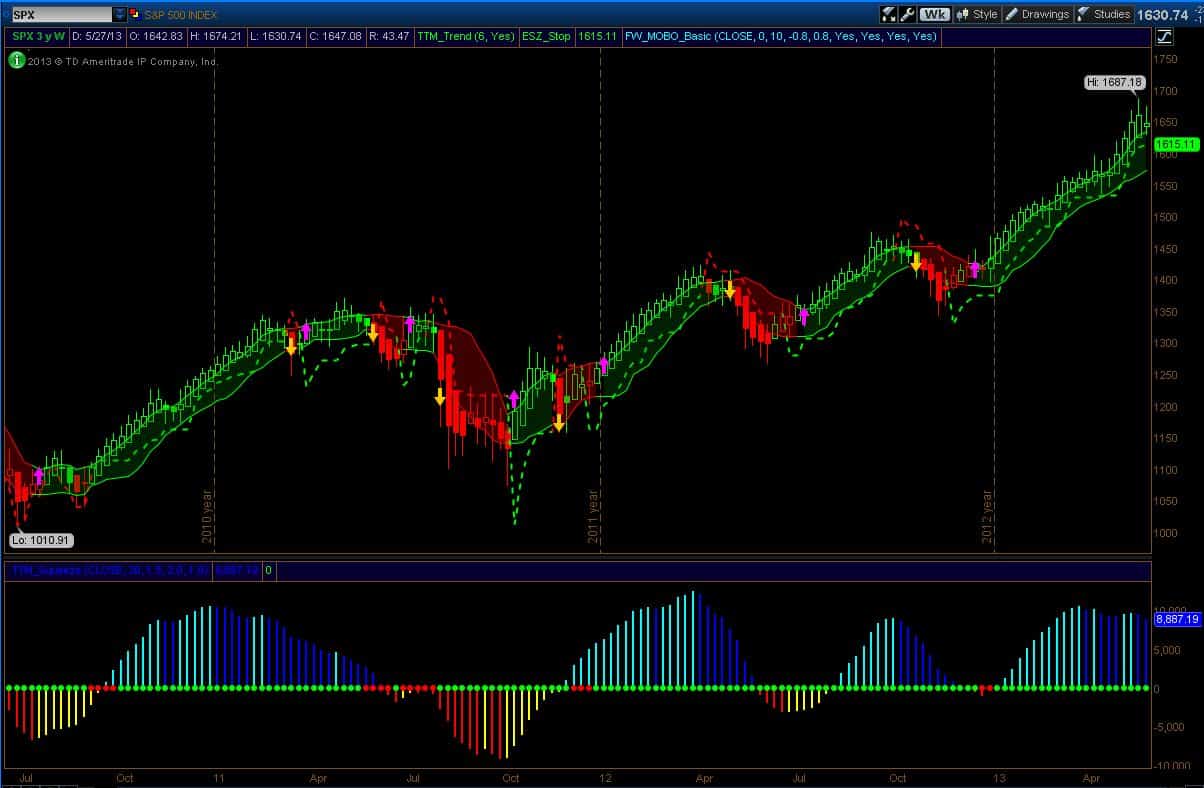
OK, let’s quickly look at the charts. The Weekly chart of the SPX is my main go-to for looking at the market. You can see from the chart below that the market has been in a powerful trend since the buy signals given last December. That’s not an easy market to sell and make money. The momentum bars in the lower panel indicate some weakness but the main thing here is that the last weekly candle (average bar) has a narrow body indicating a possible turn and the stop line has moved pretty close to the price action. However, there are no sell signals and so this market is still bullishly positioned on this time frame.
(click for larger image)
So why do I have a cautious stance here? Well, the run in trend has been pretty long but that’s an opinion and I’ve learned that the market doesn’t really care about opinions. I have two other charts to show. First, let’s drop down to the daily time frame of the SPX (chart show below). I don’t use this time frame very often but you can see that on a daily time frame, the SPX has issued sell signals this last week. This has happened before earlier in the year but those resulted in very shallow retracements. Indeed, since the begging of the year, the trend upward has been almost relentless (not the positive momentum indicator in the lower panel) but in this last sequence, the pace has picked up which could be climatic buying.

(click for larger image)
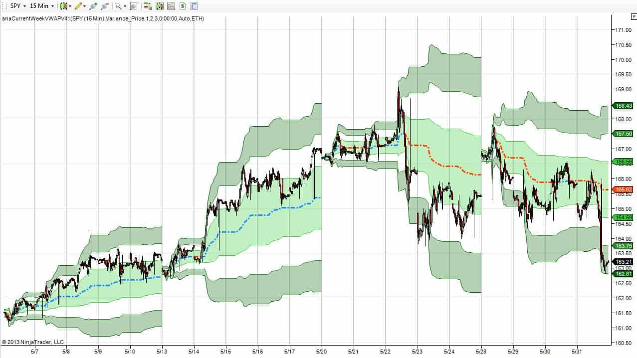
Second, below is a new chart. This is a chart that builds in real-time and does not have the lag associated with other indicators. It represents the weekly Volume Weighted Average Price (VWAP). This is an important indicator as it shows where value is. Value is the price where most of the market acceptance takes place. It doesn’t matter who is in the market (hedge funds, banks, etc.) or how often (HFT’s), volume indicates where big money is operating and that’s my value point. The center line is the VWAP (calculated starting at the beginning of every week). Blue mean the VWAP is rising and red means it’s falling. The bands around the price are statistical levels that I will discuss another time (but for now, you can see that mean reversion traders would fade the price at extremes and close out at value). This weekly VWAP chart shows a change in the character of the market over the last two week. Notice that the VWAP has steadily decline the last two week in a row. From the start of the year, there has not been a period with this type of price action has taken place. There have been down weeks and weeks with up and down (or down and up) price action, but not two weeks in a row of steady down action.
Now you can see why I am cautious. The trend is getting long-in-the-tooth, the daily sell signals will one day turn into weekly sell signals, the narrow body candle on the weekly chart may be signaling a change in trend and two weeks of declining value through the week are a different characteristic not seen in this bull cycle. So there are storm clouds on the horizon. They may dissipate or they may gather. I can’t forecast what comes next any better than I can forecast the weather.
So what to do? For those who are long here but nervous, you can close out the trade on a weekly close below 1615. This is hard to do since that level can be pierced but it won’t be valid until the weekly close is below it. You can buy some longer dated puts or sell some short term calls again the position – but don’t do that unless you know a lot about options (or your advisor does).
For those not in the market and are considering entry (a valid position given the strong weekly chart trend), you have great entry location. If your hypothesis is that this market is going higher, you can test it cheaply because you are presently below value (a nice place to enter long) and your risk is small with a stop so close by. Further, implied volatility is low so long calls are reasonable.
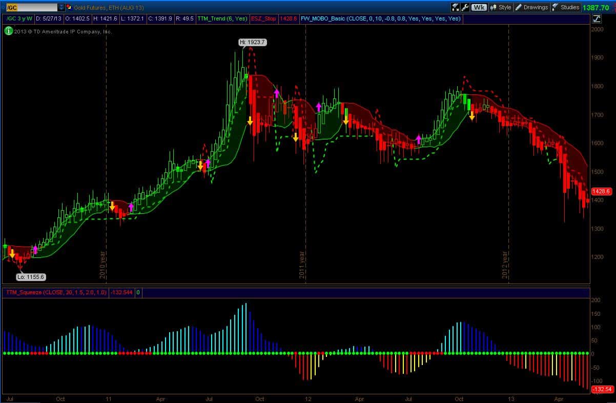
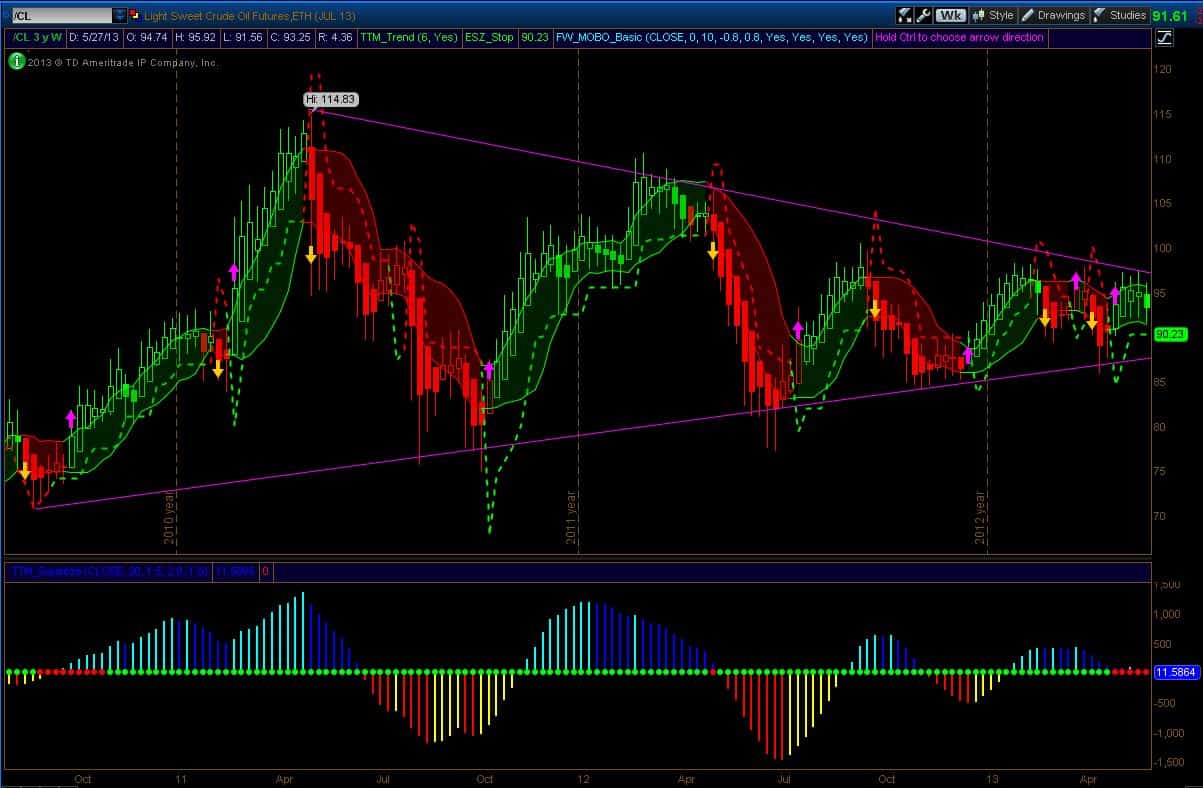
This post is already too long so I will just attach two other charts for your inspection: Gold and Oil. I will talk more about Gold tomorrow when I post the monthly charts but for this weekly chart, well, it’s been on a sell signal since October and selling momentum is still increasing. For oil, you can see what’s going on here. It’s in a long consolidation pattern and presently the weekly Squeeze dots are red meaning there is insufficient directional volatility.
(click for larger image)
(click for larger image)
Good Trading,
Dr.G
