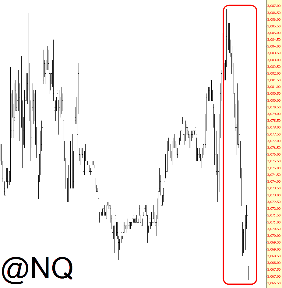
Are the bulls finally running out of gas? Good God, I hope so. Here’s the NQ so far…….
Slope initially began as a blog, so this is where most of the website’s content resides. Here we have tens of thousands of posts dating back over a decade. These are listed in reverse chronological order. Click on any category icon below to see posts tagged with that particular subject, or click on a word in the category cloud on the right side of the screen for more specific choices.
Are the bulls finally running out of gas? Good God, I hope so. Here’s the NQ so far…….
If you want a breathtaking view of how much financial stocks have strengthened, look no further than the chart of FAS below, which is the triple-bullish ETF. The interesting thing is that one didn’t have to be lucky enough to buy it in depths of the financial crisis for a bargain price; it was actually very depressed in October 2011, only a year and a half ago. It’s up 345% since then. I won’t show its opposite here, symbol FAZ, but it basically looks like a ski slope ever since its inception. (more…)
We’ve seen some really boring days on ES recently and yesterday was another of those, with ES spending the entire day testing the 50 hour MA from above. There was a slight break below that overnight but it didn’t hold. Here’s the ES 60min chart I posted on twitter last night after the close showing the narcolepsy -inducing action for the day. ES 60min chart: (more…)
Today (Wed 17th July 2013) silver was slammed down, so it time to review the dominant cycle to see where we are.
Silver Etf (SLV) has a very strong weekly 210 period cycle and it suggest that there is little down side to go, however SLV could still print between $15 and $17 in the near future. As always watch for a base to build before jumping in. (more…)
