Slope of Hope Blog Posts

Slope initially began as a blog, so this is where most of the website’s content resides. Here we have tens of thousands of posts dating back over a decade. These are listed in reverse chronological order. Click on any category icon below to see posts tagged with that particular subject, or click on a word in the category cloud on the right side of the screen for more specific choices.

Interesting Parallel

By -

This will be the shortest post ever……….a trading friend of mine just wrote me and shared this interesting article called The 64-Month Bubble Pattern. It matches almost exactly the thoughts I was offering in my Six Six Six post from last night. The funny thing is that I didn’t set out writing the post with a conclusion already in mind. I was merely curious, and I counted out the months and was a bit shocked to find such a similarity. Anyway, check out the aforementioned article, since it’s a pretty cool correlate to my own (independent! honestly!) thinking.

Possible High Forming

By -

Last Thursday I was outlining the two main options for the current move as I see them. The first option is failure at 2010-20 resistance to make the second high of a double top targeting the 1800 area. The second option is that SPX breaks over that resistance and heads to currently theoretical channel resistance (from 1343 low), somewhere in the 2060-90 area. I said then that I favored the first option, but obviously we might see a break up into the second.

So where are we now? Well we haven’t reached my resistance area yet, but we have a clear 70% bearish rising wedge established from the 1904 low, and increasing negative divergence on the 60min RSI 14, the daily RSI 5 and, always nice to see, the daily NYMO. We have a promising looking top setting up for that 2010-20 test, and the odds of a failure there are improving. SPX daily chart:

140825-C SPX Daily Trendlines BBs MAs

(more…)

Six Six Six

By -

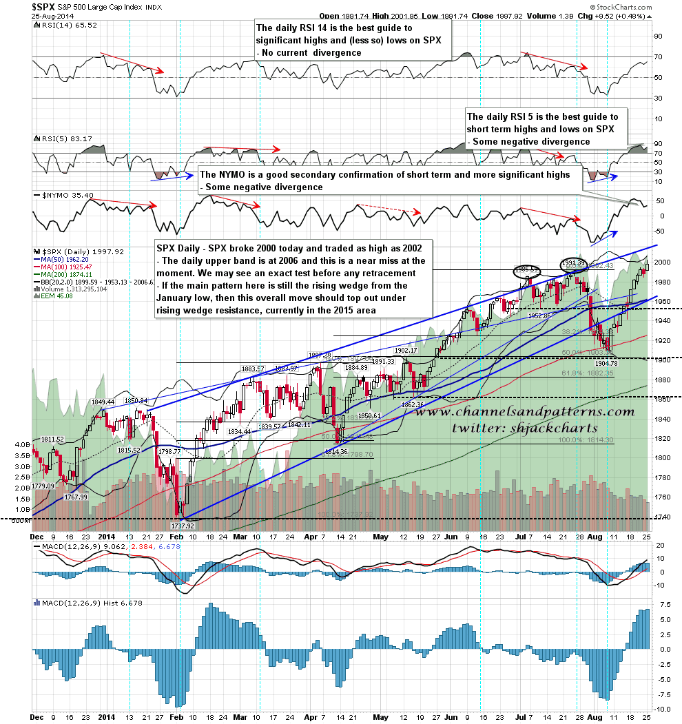
Well, today the S&P 500 finally did it: it pushed past 2,000, and it nailed a point value precisely three times – yep, 200% higher – than the March 2009 bottom.

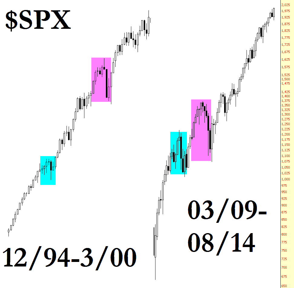
The ascent since March 2009 has been pretty much straight-up. I was looking at the long term monthly history of the index, and the only other occurence I see of this kind of behavior in the nearly 100 years I looked at was in the last six years of the prior century.

Simply stated, the almost-straight-up bull run in the past ran from December 1994 to March 2000. That’s less than six years (64 months, to be exact). The almost-straight-up market we’re currently in has been raging for……….65 months. How about that! Here’s the chart (which, as always, you can click for a bigger version). I’ve also tinted a couple of mildly-interesting parallels along the way.

0827-spox


The obvious conclusion? Buy everything you can! Yellen’s got your back!