The following 5-Year Daily ratio charts of the S&P 500 Index compared to Major World Indices shows that the SPX has underperformed all of them since the beginning of this year, and some for the past 1 1/2 to 2 1/2 years.
Slope of Hope Blog Posts
Slope initially began as a blog, so this is where most of the website’s content resides. Here we have tens of thousands of posts dating back over a decade. These are listed in reverse chronological order. Click on any category icon below to see posts tagged with that particular subject, or click on a word in the category cloud on the right side of the screen for more specific choices.
Set Em Up

Swing Trading Watch-List: CXO, DAN, NBL, OLED, WDC
A Morning at the Museum
My parents are celebrating their 60th (!) anniversary, so I’ve invited them to my home to stay a few days and celebrate. This morning, I’m taking them out to the Computer History Museum (one of the traditional ways to celebrate sixty years of marriage), so I’m away from the blog. But I haven’t forgotten you! Here’s a 4-part series I did on the museum which, in spite of the goofy still images below, is a pretty interesting piece:
Whippy but Bullish
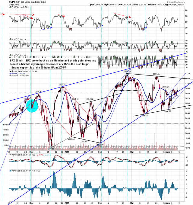
The action has been very whippy this week but the bottom line is that SPX broke back over strong resistance at the 5 DMA, 50 DMA, 50 HMA and the daily middle band, and has very thoroughly and successfully retested those broken resistance levels as support. While that remains the case the obvious targets above are my triangle resistance, still in the 2112 area, and the daily upper band, currently at 2109.54. SPX 60min chart:


