
[edit] the post started as a simple thing and ended after getting way too involved. so much the better…
An update of the situation on the Banks, the anti-Banks (gold) and the yield relationships that would help define their fates.
The Bank index is breaking through resistance this week while gold remains in Palookaville. Note to certain bloggers out there who would nitpick: the arrows are not meant to line up (green to red); they are meant to show support and resistance for the Banks’ lows and Gold’s highs, respectively.
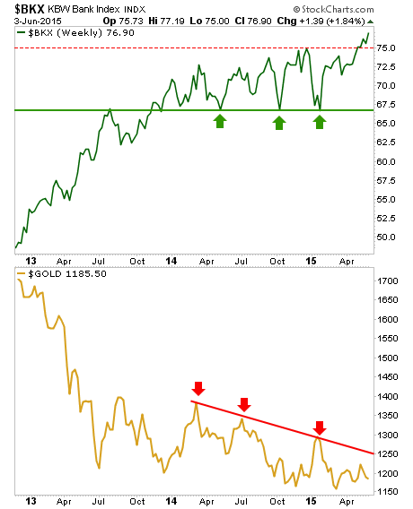
During the last interest rate mini-hysteria we talked about a possible return of a ‘carry’ trade involving the Fed’s oh so generous ZERO money at the discount window and the Banks’ ability to gorge on this, mark it up and spin it out into the economy. Presto… instant profit margins!
Many people talk about rising interest rates being bearish for gold and indeed, they can be. Here is the 30 year yield daily view… whoa, that looks bullish.

Now let’s add definition to the picture. Here is the same yield on the monthly time frame with the ‘Continuum’ © simply continuing. It can continue all the way up to 3.6% interest without changing a thing on the bigger macro.

At the beginning of the last hysterical bounce (that ended with the most recent red arrow) we noted the potential for a favorable ‘carry’ by the Banks. Then it all sagged like a bad souffle into the latest global deflationary sink hole from late 2013 to the end of 2014.
Not coincidentally, so did the Banks’ leadership to the S&P 500. A downtrend channel has been in play for that ratio ever since. The lower panel of the chart shows the nominal 30 year yield on a bounce. If it is to register the 3.6% target then BKX would probably break the post-2013 downtrend channel and resume market leadership.

As for gold, it can do well in a rising interest rate environment, but only if an inflation problem is implied by the rise in yields. One way to view that would be through certain inflation gauges, one of which is the spread between inflation protected US Treasury bonds (TIPS) and unprotected long-term bonds (TLT).
The bullish pattern looks an awful lot like the nominal 30 year yield (2nd chart above), which means that the rise in yields (drop in T bonds) is due to rising concerns about inflation.

“Rah rah sis boom bah!!” cheers the pom pom brigade in the gold community, “inflation is coming!”
Well maybe. That is the play on the short-term as we anticipate a potential ‘C’ leg up in the commodity complex and in the inflation case. But as it stands now, that ‘C’ leg could be the final bounce of a bear market rally. So maybe it is best for gold not to party with the hype of the moment.
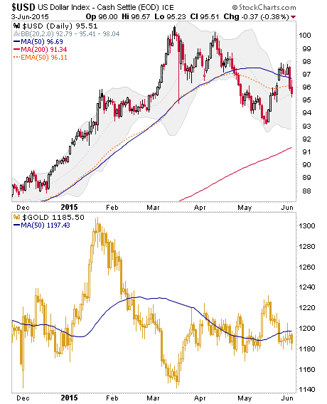
Here look, gold is actually weak and below its daily MA 50 just like Uncle Buck. This could imply that inflation is not the predominant theme and that the EMA 100 (red dotted line) on the Continuum chart above will hold once again, despite the hysteria.
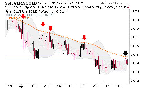
Silver vs. Gold is still below strong resistance. If it were to break upward we would be more than willing to switch to an inflation story, potentially benefiting many US and global asset classes, including the precious metals. But as of now it lurks below resistance and that resistance is strong and long-term in nature by this weekly chart. Flipping this situation over, the Gold-Silver ratio and the USD are the 2 Horsemen, who would ride together in an anti-inflationary environment of draining liquidity. Until silver breaks resistance vs. gold, the 2 Horsemen are still riding.
Meanwhile, a measure of the system’s stability is the spread between long-term (in this case 10 year) and short-term (in this case 2 year) yields.
There are no absolutes in today’s over stimulated financial world, but when this spread rises with nominal T bond yields rising, the implication can be for inflation (and risk ‘ON’). When it rises with nominal bond yields dropping, the implication can be toward deflation (and risk ‘OFF’). When the spread drops while yields drop the implication can be Goldilocks, with certain assets (hello US stock market) benefiting. When it drops while yields rise a normal or ate least sedate situation is indicated, as inflation is rising but to no alarming effect.
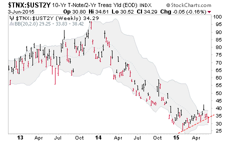
And in gold’s current suit, as a risk ‘OFF’ asset along with potentially the USD, “no alarming effect” is not what gold bulls would want to see.
When gold is ready, it is going to rise with other risk ‘OFF’ items, like the US dollar and Treasury bonds. Let’s watch 3.6% on the 30 year yield and so many other indicators going forward. Let’s keep perspective.
Thus ends another thoroughly confusing public post that is hopefully not so confusing to NFTRH subscribers since they have the pleasure of getting beaten over the head with stuff like this on a weekly basis. The macro environment is confusing. Beware easy answers, tidbits and sound bites. It is an evolving environment.
Subscribe to NFTRH Premium for your 25-35 page weekly report, interim updates (including Key ETF charts) and NFTRH+ chart and trade ideas or the free eLetter for an introduction to our work. Or simply keep up to date with plenty of public content at NFTRH.com and Biiwii.com. Also, you can follow @BiiwiiNFTRH.
