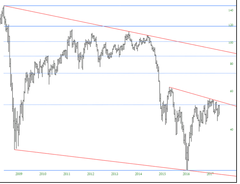
On the whole, the market remains incredibly and annoyingly stuck. One sector which has mercifully been on the move, and which has been my focus most of the year, is energy. The cool thing about crude oil is that, in spite of its big down-move today, the long-term chart on oil suggests there could be plenty more downside.
Slope of Hope Blog Posts
Slope initially began as a blog, so this is where most of the website’s content resides. Here we have tens of thousands of posts dating back over a decade. These are listed in reverse chronological order. Click on any category icon below to see posts tagged with that particular subject, or click on a word in the category cloud on the right side of the screen for more specific choices.
Swing Trade INFN IR FITB
Long Infinera (INFN)
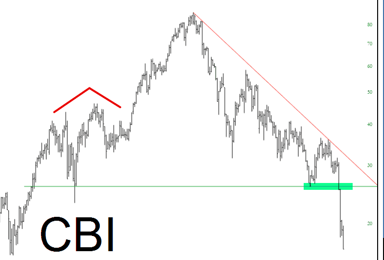
Broken Bridge
This is just a follow-up on Chicago Bridge & Iron, a chart frequently-mentioned here on Slope as a good short candidate. Well, so far, so good on this one, and I’m simply tightening up my stops along the way down. I think it’s got plenty more to go. (Note: this chart is even lower than when I screen-grabbed it this morning – – it’s doing just great).
A Bullish Chart I Love
Well, at least there is one strengthening chart around that I applaud, and that is the usage data for SlopeCharts. It’s getting stronger by the day, and I’m delighted to tell you that multiple new technical indicators will be announced soon, free to all users. I’m so pleased people are embracing the product. As I’ve said, I run a seven-figure portfolio based on nothing but SlopeCharts, so my trust for it is quite deep.
As for the markets, crude oil’s plunge this morning has been a wonderful elixir, turning an ugly loss into a nice little profit (at the moment). Let’s keep it going!
I presently have 66 short positions, 59 of which are profitable as of this writing.