
I have an extremely cool new feature for you SlopeCharts folks out there: earnings dates charts. This will be of particular interest to you options traders. Allow me to explain………..
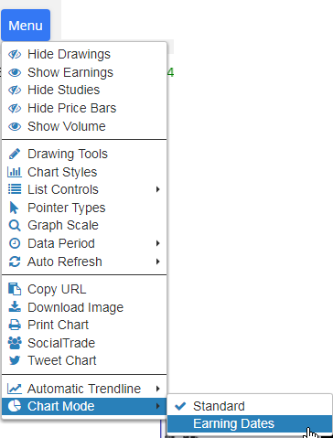
What we’ve done is merged together historical stock data with earnings announcements so you can see how a stock behaves as it approaches its earnings day. By default, we show you every day for twenty days in advance of earnings, as well as the day of and the day after earnings (you can change how many days via a dropdown). Using it, as with all things SlopeCharts, is simple. Just choose the Earnings Dates item from the new Chart Mode menu item:
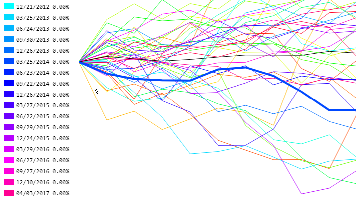
You will then see a chart similar to the one below. On the left side is a Color Legend showing you the earnings date corresponding the the line color. In the chart area is a series of percentage charts showing what the stock did as it approached “day 0” (the earnings date), with the black line being the average. As you move the cursor left and right, you can see the percentage change day to day displayed next to the legend.
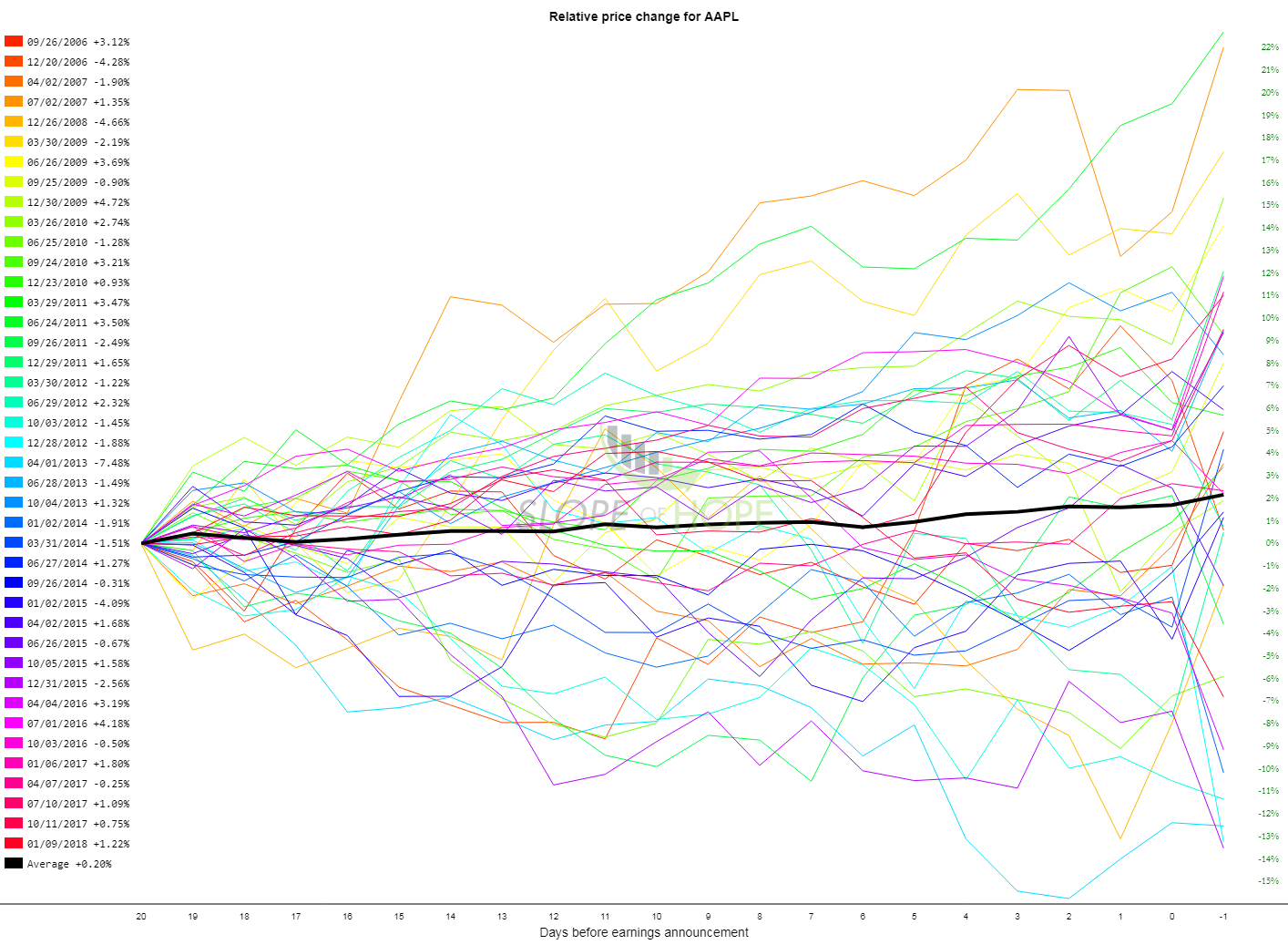
If you want to concentrate on any particular earnings, you can click on that item in the legend, and that particular percentage line will be boldfaced for clarity.
I think this is an exciting step forward for SlopeCharts, and I’d be interested in your feedback and/or problems (if any), which you should email to me if you find them.
I want to be straightforward you with, as I always am, and tell you that I don’t intend to let this kick-ass feature be here on the site free forever. It might change into a PLUS-only feature, or it might vanish completely onto a different premium service altogether. But it’s going to be here at no charge for a while, and I look forward to hearing what you think.
SlopeCharts…………always useful, and always improving!
