Slope of Hope Blog Posts

Slope initially began as a blog, so this is where most of the website’s content resides. Here we have tens of thousands of posts dating back over a decade. These are listed in reverse chronological order. Click on any category icon below to see posts tagged with that particular subject, or click on a word in the category cloud on the right side of the screen for more specific choices.

9-Year U.S. Bull Market Run: Will We See a 10th?

By -

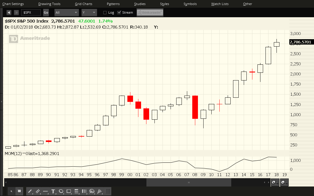
Each candle on the following five charts of the Major U.S. Indices represents a period of one year.

You can see at a glance that we’re still ensconced in a bull market that began in 2009 when the Fed first began their QE monetary policy.

In fact, both Tech indices closed at new all-time highs on Friday and haven’t experienced much of a pullback, so far, this year, compared with the other three relative to last year’s candle (thanks, in large part, to the FAANGs, as shown on the daily chartgrid below)…indicating that the bulls are still in charge of equities, overall.

(more…)

3 Amigos of the Macro, Updated

By -

You thought I was done with the Amigos shtick, did you? Not by a long shot ma’am. They are the happy-go-lucky riders in play as the stock bull market churns on. They are the rising SPX/Gold ratio and stocks in general vs. gold (Amigo #1), rising US 10yr & 30yr yields (Amigo #2) and the flattening 10-2 yield curve (Amigo #3). On their current trends these goofy riders have signaled “a-okay!” to casino patrons playing the stock market and other risk ‘on’ items.

Taking our macro indicators out of order, let’s start with Amigo #2, who we have been noting to be bracing for something…

(more…)