
I am very pleased to let you know of a couple of important cosmetic improvements to Slope.
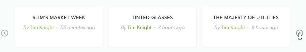
On the home page, we have always had a scrolling marquee showing the most recent blog posts. The trouble until now has been that it would just give the date of each post……….which, considering how I publish five to seven posts every single day, isn’t very helpful when you’re trying to decide what the most recent one is.
Now we’ve changed it so it shows the age of each post. It’s therefore extremely obvious what is newest.
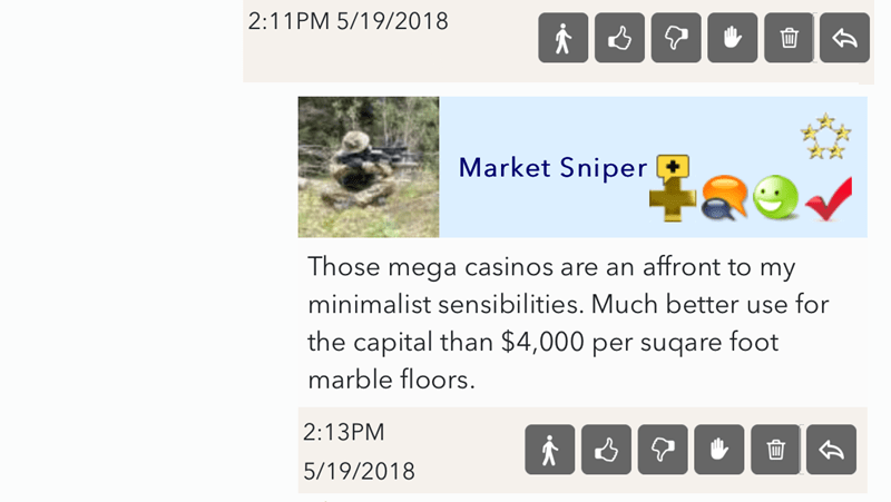
I’m also pleased to tell you the buttons in the ever-popular comments section are much smaller. One thing about Slope that is finally sinking in with me is that a lot of folks are on mobile. And, umm, this kind of thing can happen:

Even when viewed horizontally, it’s pretty messed up.
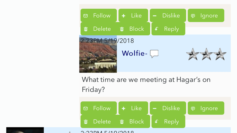
I had our graphic designer and also our comments god rework things so that the buttons are spiffy and compact. Thus, even on the tiniest mobile, it’s very reasonable.
I trust this improves the experience on Slope for everyone. We’re working on plenty else, including functionality and raw speed, but I’m trying to prioritize sensibly.
