By using the custom symbols feature in SlopeCharts, I’ve put together a series of interesting pairs charts (or ratio charts, if you prefer). Here are four up-to-date ones I think are rather interesting. I’ve made a few remarks in the caption of each one.
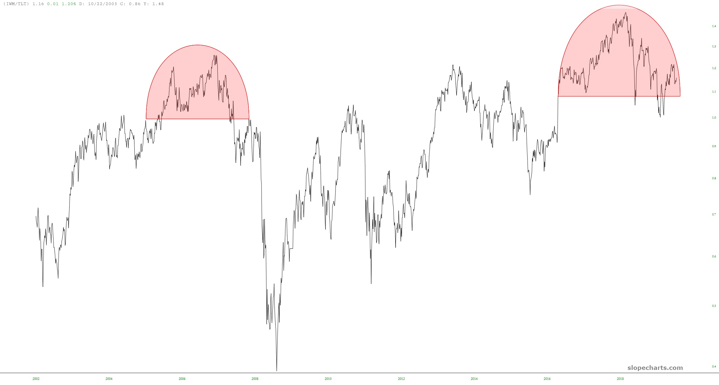
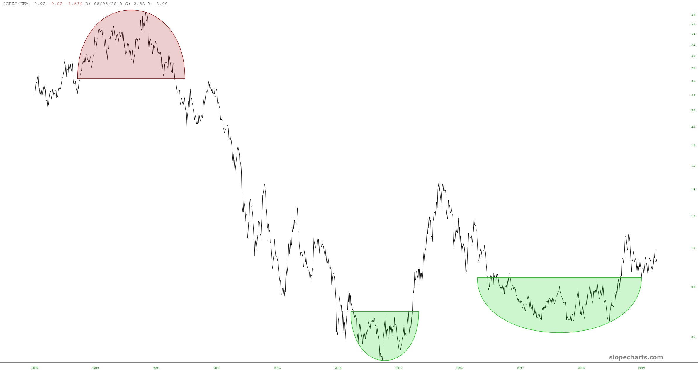
IWM/TLT which seems poised to go lower, suggesting lower small caps prices, higher bond prices, or some combination.GDXJ/EEM, which has a bullish formation, suggesting precious metals miners are going to go higher, emerging market equities are going to go lower, or bothThe same chart as the one above, except the symbols are flipped. This offers a different perspective.$RUT/$SPX which is my favorite chart of them all. Even though both symbols represent broad equity baskets, this strongly suggests small caps will be much weaker than the components of the S&P 500.