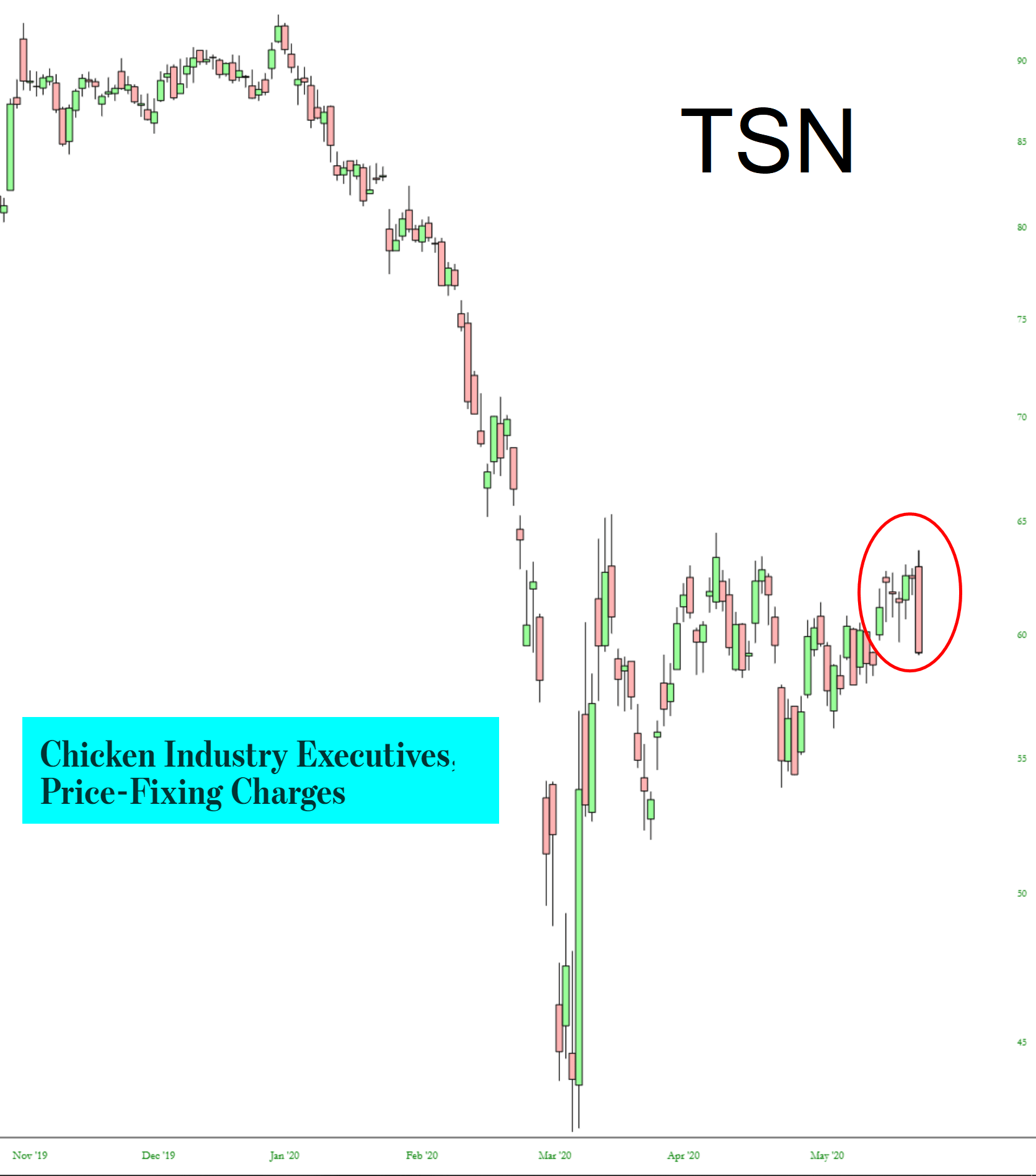
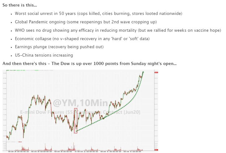
ZeroHedge put it just as well as I could………
Slope initially began as a blog, so this is where most of the website’s content resides. Here we have tens of thousands of posts dating back over a decade. These are listed in reverse chronological order. Click on any category icon below to see posts tagged with that particular subject, or click on a word in the category cloud on the right side of the screen for more specific choices.
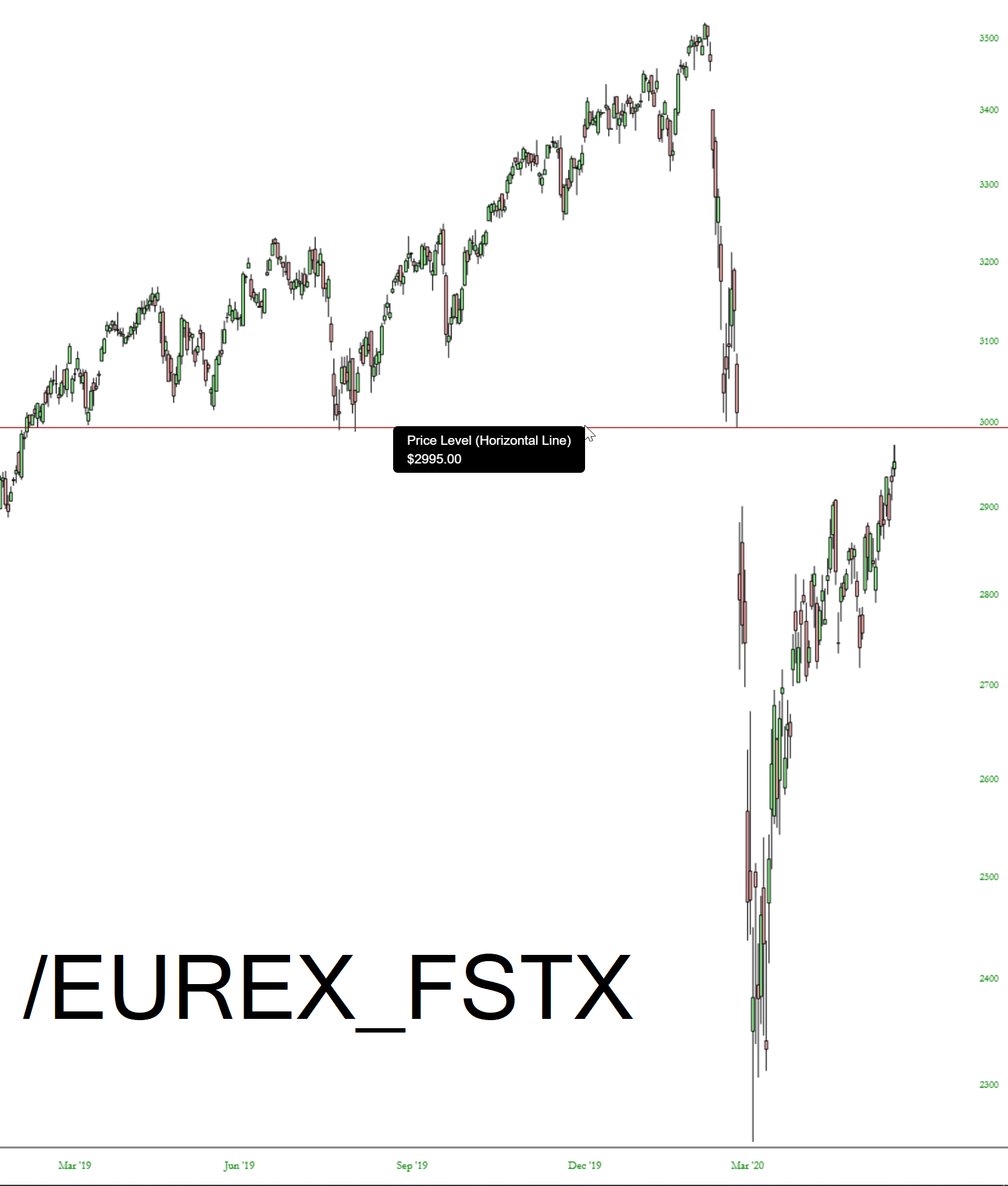
I don’t think many folks here trade futures, but SlopeCharts has a rich collection of futures charts, and I thought a few were worth sharing with you. First up is the FTSE 100 chart. Take note of that monstrous gap which is just about closed.
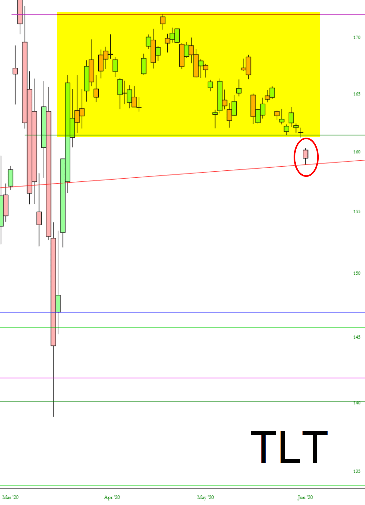
After months of forming the pattern, bonds (TLT) finally broke support today. It’s a clean little H&S pattern.
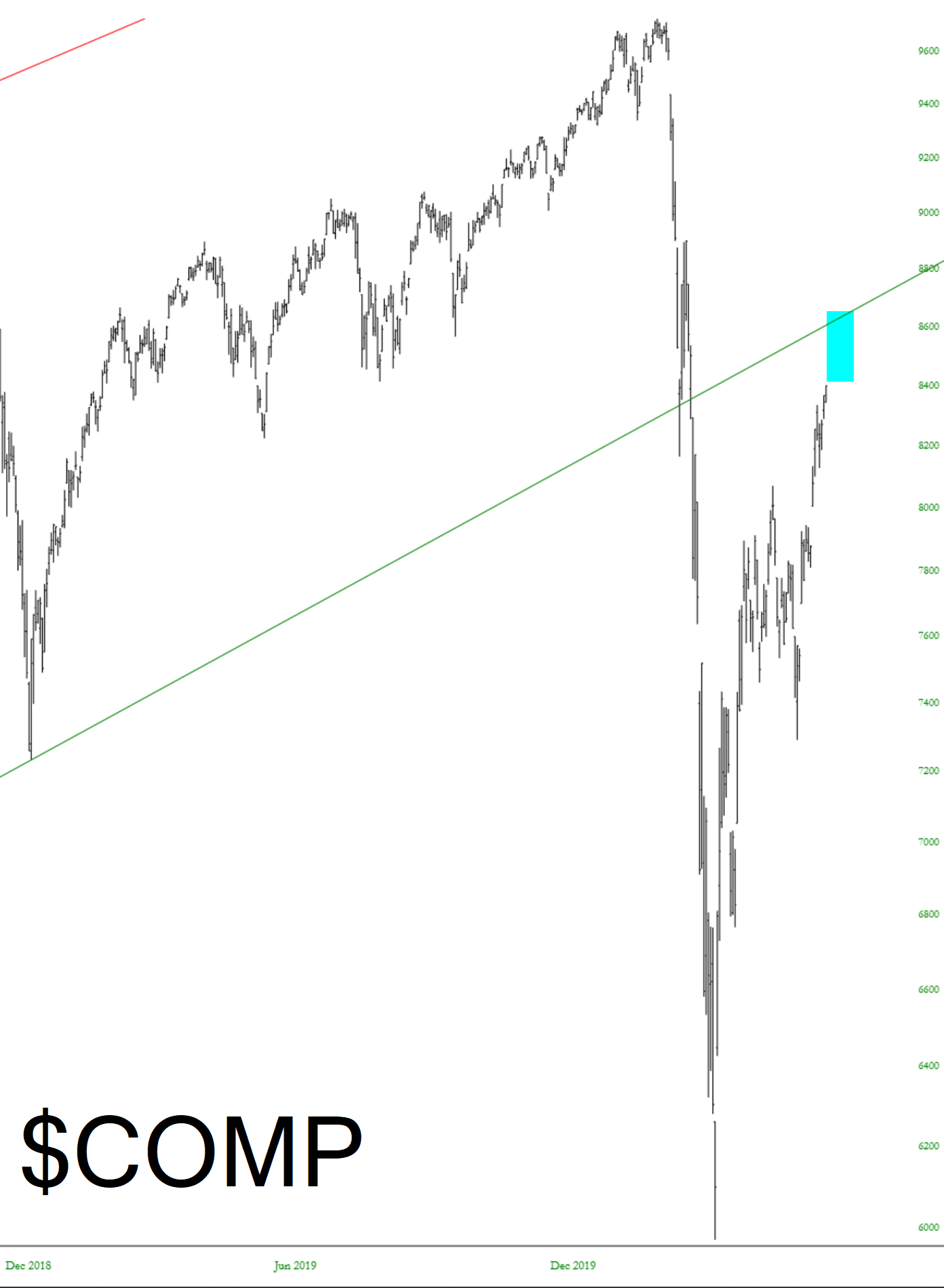
We are clearly into the manic phase of this ascent, as you can practically see people punching each other out of the way to press the Buy button. Here are a few major cash index charts showing that there is definitely more room to roam on the upside, and the next chart “event” to watch for is the underside of some massive, broken trendlines. I’ve tinted the spread between present price levels and those underbellies: