Slope of Hope Blog Posts

Slope initially began as a blog, so this is where most of the website’s content resides. Here we have tens of thousands of posts dating back over a decade. These are listed in reverse chronological order. Click on any category icon below to see posts tagged with that particular subject, or click on a word in the category cloud on the right side of the screen for more specific choices.

Slow Motion Train Wreck

By -

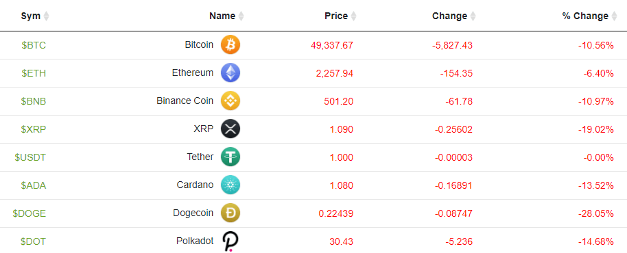
The most popular post on the CNBC website is about a guy who took his entire life savings, plus borrowed money, and put it into that most blue chip of conservative investments, Dogecoin. After putting $180,000 into it (which, again, was more than his entire net worth) he saw it explode higher, getting up to $1.7 million. Here he is (and just glancing at him, it’s hard not to think the words “cutting-edge financial genius“):

(more…)

PE and MA

By -

The economic data from the Fed comes tumbling in rather late, but the 4/1 data has been freshly served, and there are a couple of charts I wanted to share. The first one is the Schiller P/E ratio. Not surprisingly, we are at extremely elevated levels right now (bested only by the early 2000 peak). What I added here as a bit of a twist was a 400-day moving average. Check out the relationship that smoothed line has with decades of P/E data. It gives you a good sense of just how stretched we are.

slopechart MULTPL SHILLER PE RATIO MONTH
(more…)

Toggle Town

By -

One chart nicely sums up what this entire week has felt like: in spite of being in the maelstrom of the earnings season, the market has absolutely no sense of direction. Below is the XLF (the financial sector). This has “indecision’ written all over it, as each day seems to undo the day before. The price gap defined at that horizontal line is key right now.

xlf