
This is a good real-life example of how charting can be very helpful in giving warnings that something is going wrong.
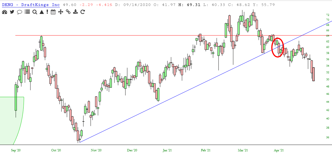
Below is the chart of DraftKings (DKNG) without the past couple of months. This stock was one of the very few SPAC offerings which was actually thriving. It had a nice saucer pattern, followed by a right triangle. The breakouts were clean, and the stock was making steady highs.

There were two big “heads up” that this bullish dream was failing. The first was when prices slipping below that horizontal breakout line. Take note that the support turned into resistance once it was broken. The second warning, which I’ve circled, was the break of the trendline. So even if you ignored the first warning, you still could have avoided a subsequent 17% decline in price (so far……..) with the second warning.
And, judging from the longer-term chart, I’d say DKNG is in a very dangerous position.

I bellyache a lot about charting not working in this market, but to be honest, that’s more of an expression of my frustration than a reality that charts actually have ceased to be useful. I wanted to offer this concrete example of how a stock was making clean patterns on the way up, and was offering clean warnings on the way down.
