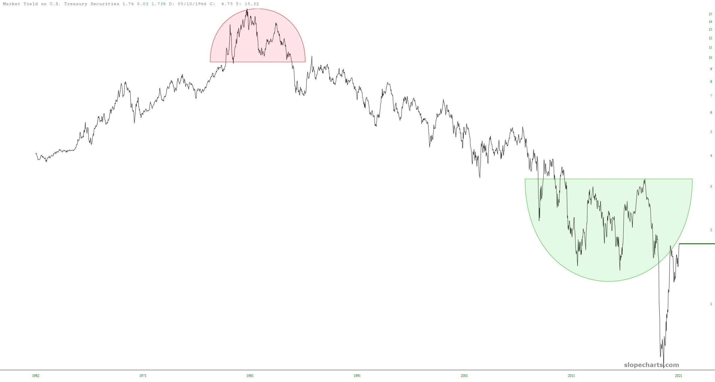
I have a watch list called Rates (note to Gold and Platinum members: you can access this at any time with the Shared Watchlists feature in SlopeCharts and see all my lists as well as my mark-ups), and this list contains a variety of very weird-looking ticker symbols that represent important interest rates. Here are a couple of them I thought were worth sharing. First is this chart of Treasury Rates. Take a look at how artificially suppressed they became, and they have “snapped back” to the underside of that now-broken basing pattern. It’s pretty cool how prices are interacting with at pattern (which I haven’t touched in months).