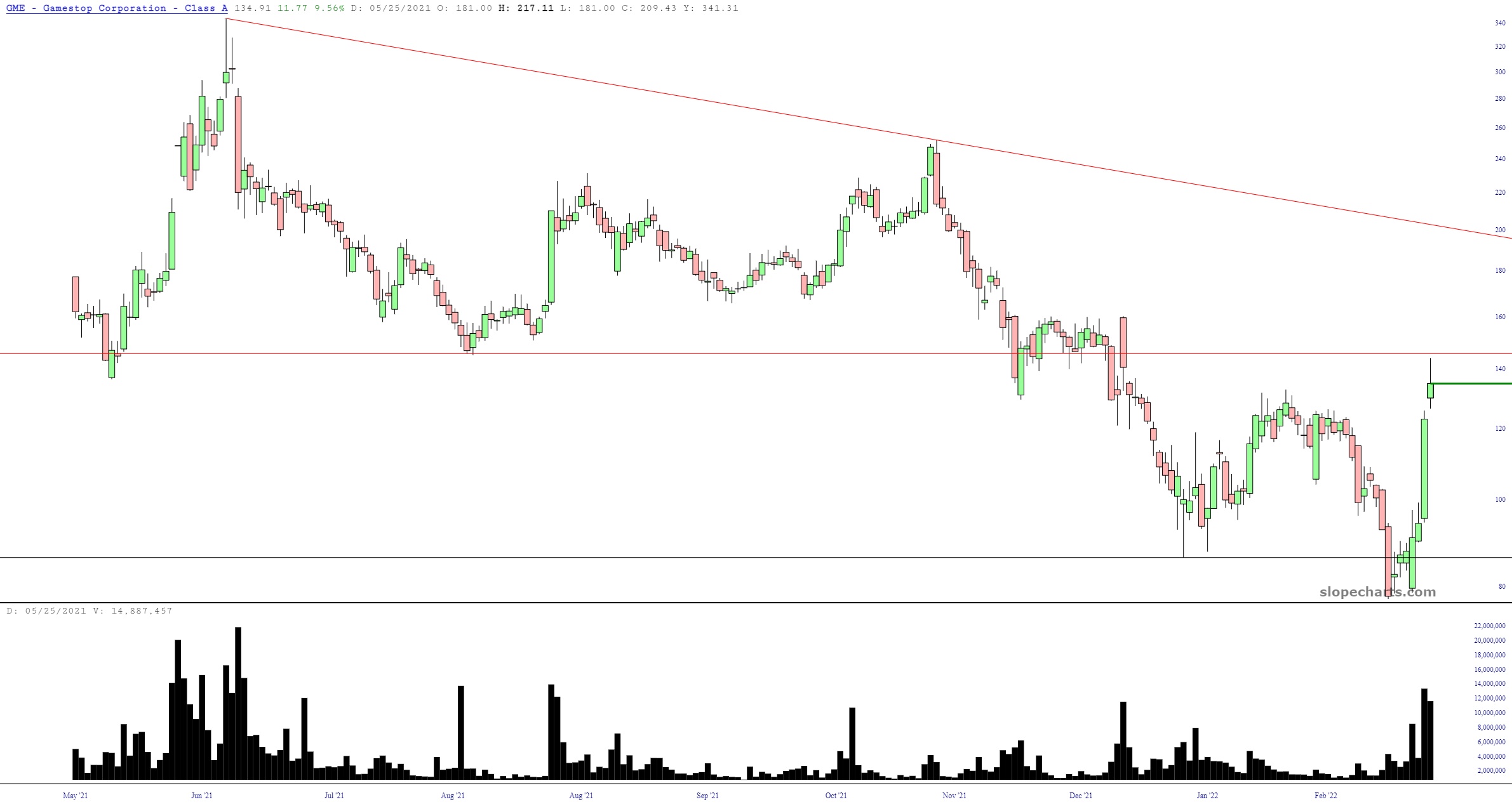
Well, the meme stock boys are back in force. Here we see GameStop (GME) which, in four days, has doubled in price based on the stampede of youngsters-in-basements getting their mojo back, having been obliterated for many, many months past.
Slope initially began as a blog, so this is where most of the website’s content resides. Here we have tens of thousands of posts dating back over a decade. These are listed in reverse chronological order. Click on any category icon below to see posts tagged with that particular subject, or click on a word in the category cloud on the right side of the screen for more specific choices.
Well, the meme stock boys are back in force. Here we see GameStop (GME) which, in four days, has doubled in price based on the stampede of youngsters-in-basements getting their mojo back, having been obliterated for many, many months past.
Good morning, everybody. Well, hey, how about that, some red on the screen. What a nice way to get things going. What I wanted to explore in this post is the persistent, and crucial, horizontal lines that are laid flat in just about every important index.
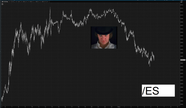
In spite of my utter exasperation with the mega-rise over the past nine days, I still consider this market to be very chart-friendly and, frankly, acting As God Intended. So let’s start to survey the scene, shall we? We begin with the /ES, which approached, and then sank away from, an extraordinarily important level for any surviving bears out there.
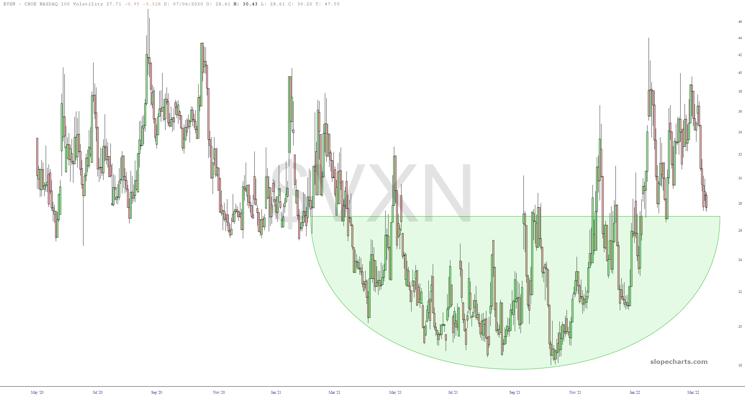
Well, I just finished going through 32 different index charts, and I’ve got to say, it cheered me up quite a bit. I wanted to show you some select charts which I think are worth a glance.
The first one is the NASDAQ volatility ($VXN) which I think we can agree has been absolutely smushed back down to its basing pattern. In other words, the froth has been completely blown off the top of this beer mug. Fear has exited stage right.
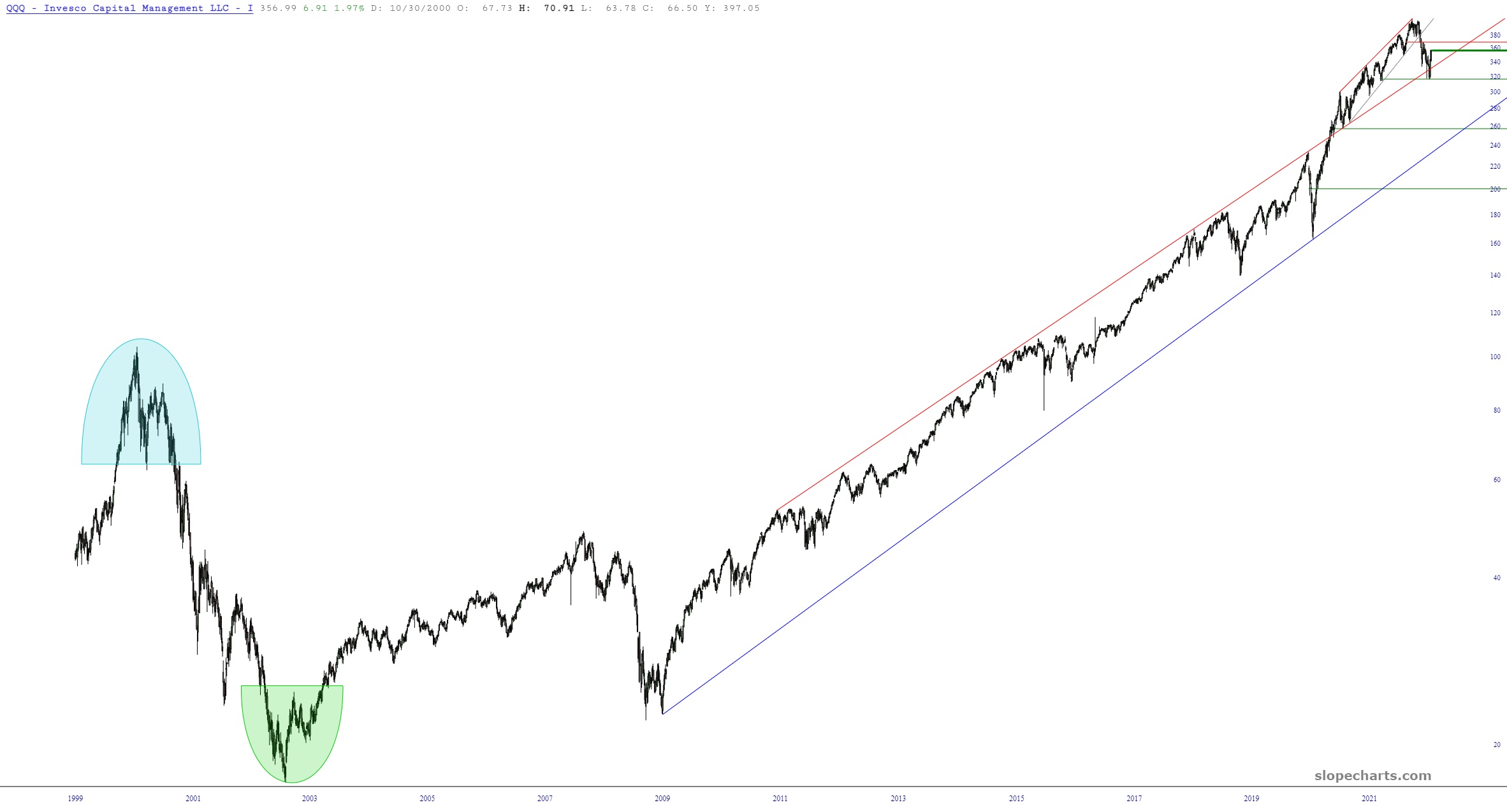
This won’t mean much to most of you, but to a few of you, it’ll be cool news – – for a while, our historical data has been surprisingly limited. The NASDAQ ETF (symbol QQQ) is a great example. Until yesterday, it only went back a decade. You will now find that our equities go back WAY farther now (QQQ is shown below, with its entire history since it was invented). Just sayin’!
Incidentally, if you missed my “Make a Wish” post, please be sure to read it.