How it started (“40% return every year for the next five years….“)

Slope initially began as a blog, so this is where most of the website’s content resides. Here we have tens of thousands of posts dating back over a decade. These are listed in reverse chronological order. Click on any category icon below to see posts tagged with that particular subject, or click on a word in the category cloud on the right side of the screen for more specific choices.
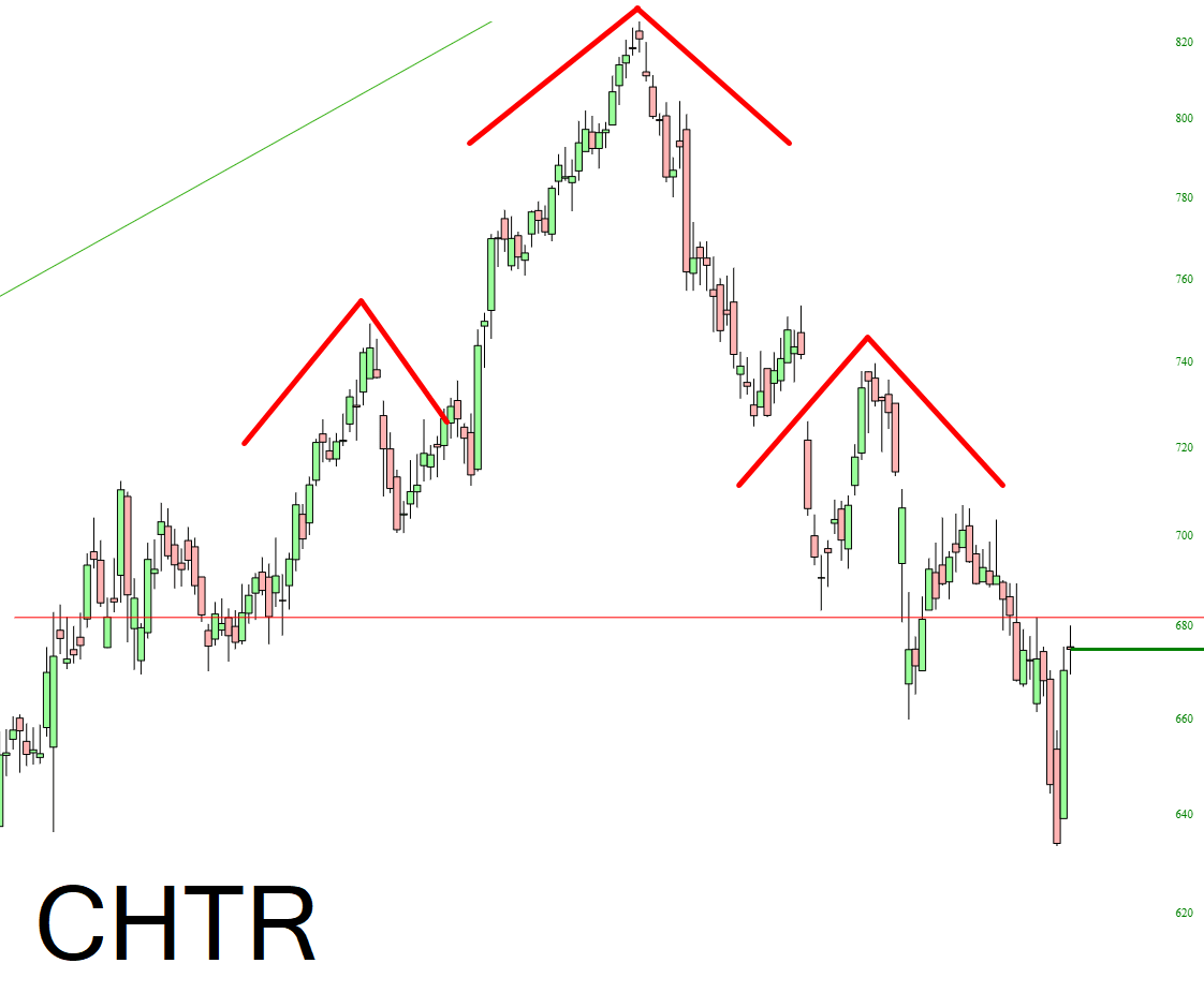
OK, sorry, I gotta do a little victory lap here. Back on December 2nd, I did a premium post simply titled For You H&S Fans, which simply pointed out what a gorgeous topping pattern Charter Communications had. Here is the chart I shared on that day:
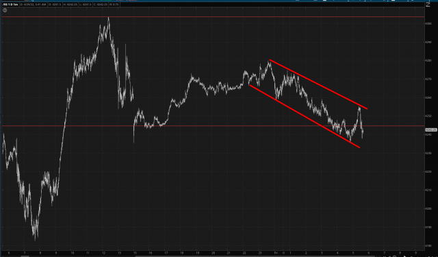
Once again, EFA proves itself to be the most chart-friendly creature on the planet. Take careful note of the blue trendline and how it repelled the attempt of the price to foolishly move any higher.
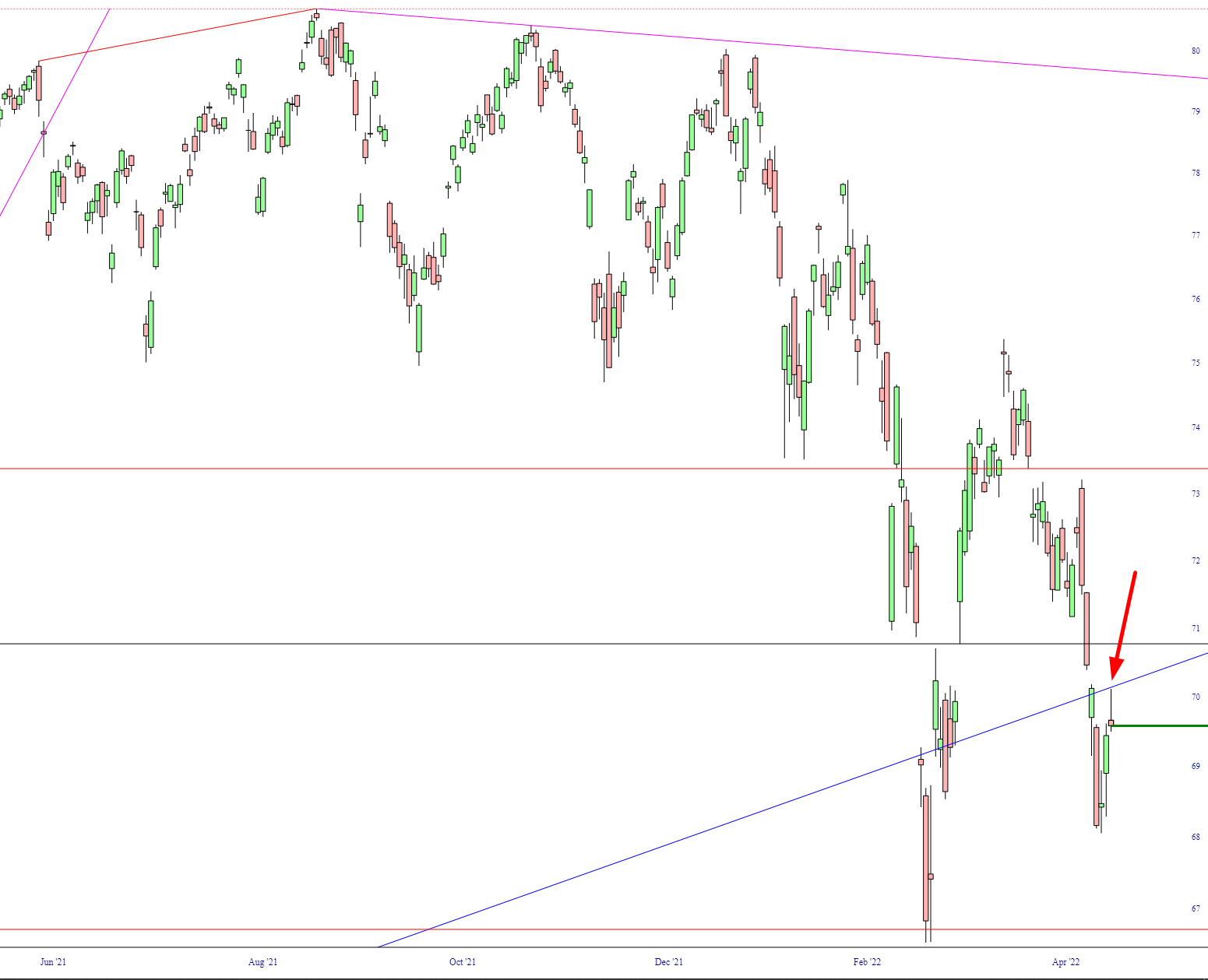
How pleased I was to wake up this morning and see that the redness of the market had defied all government interference and remained intact. I mean, look, people, I believe 80% of the price in stock indexes is completely fake and supported only by government fiat. I’m just trying to let the air out of the tires here.