Preface to all five HSE posts: My original idea was to have a series of bearish charts that were still intact and the formerly-bearish charts which had been wrecked. The vast majority are still intact, however, so I’ve instead broken up the ETF charts into five different categories, and I’ve included remarks in the caption of each chart (which, as always, can be clicked for a larger, more readable version). As for H.S.E., that stands for Hope Springs Eternal (in the bearish breast)………….
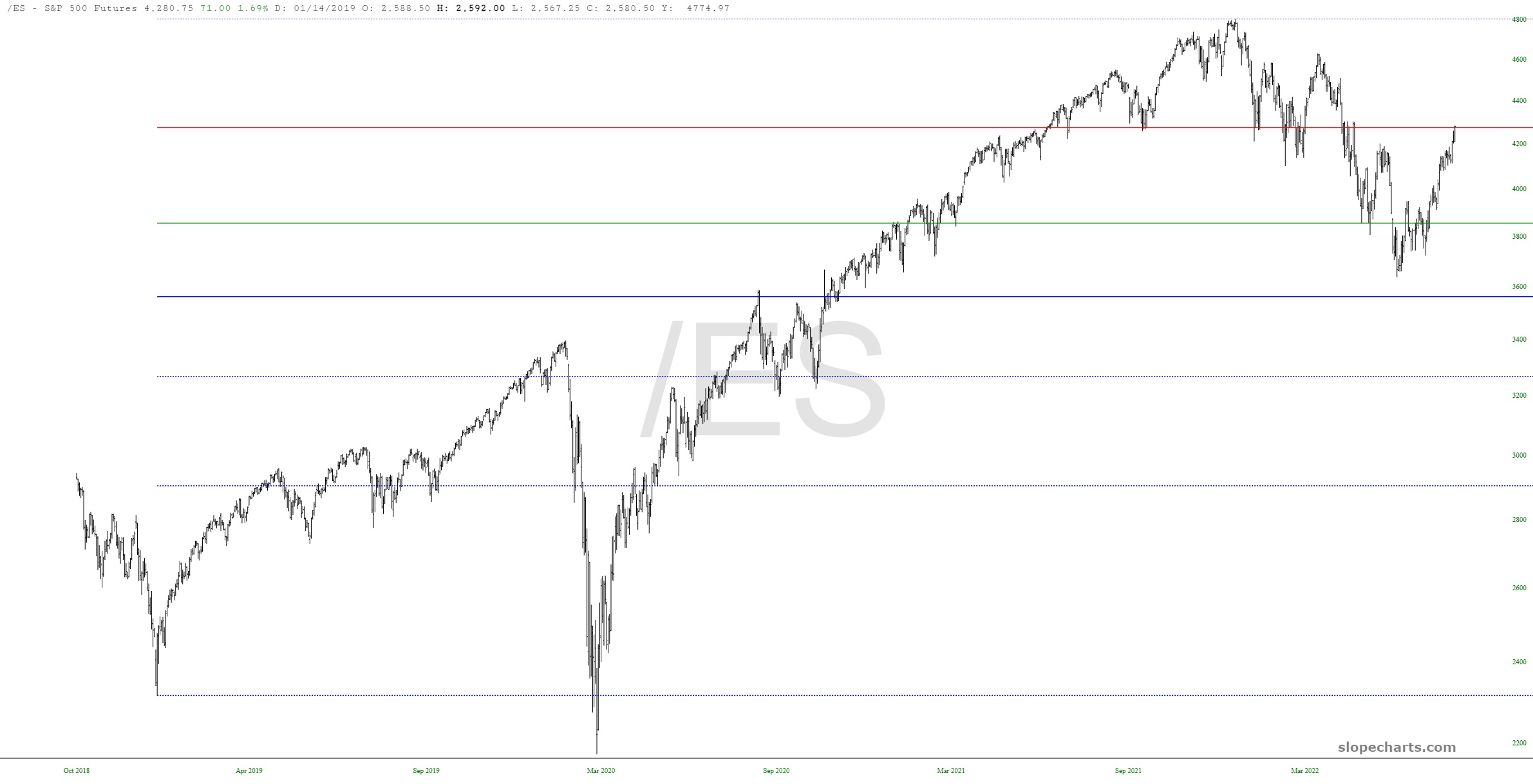
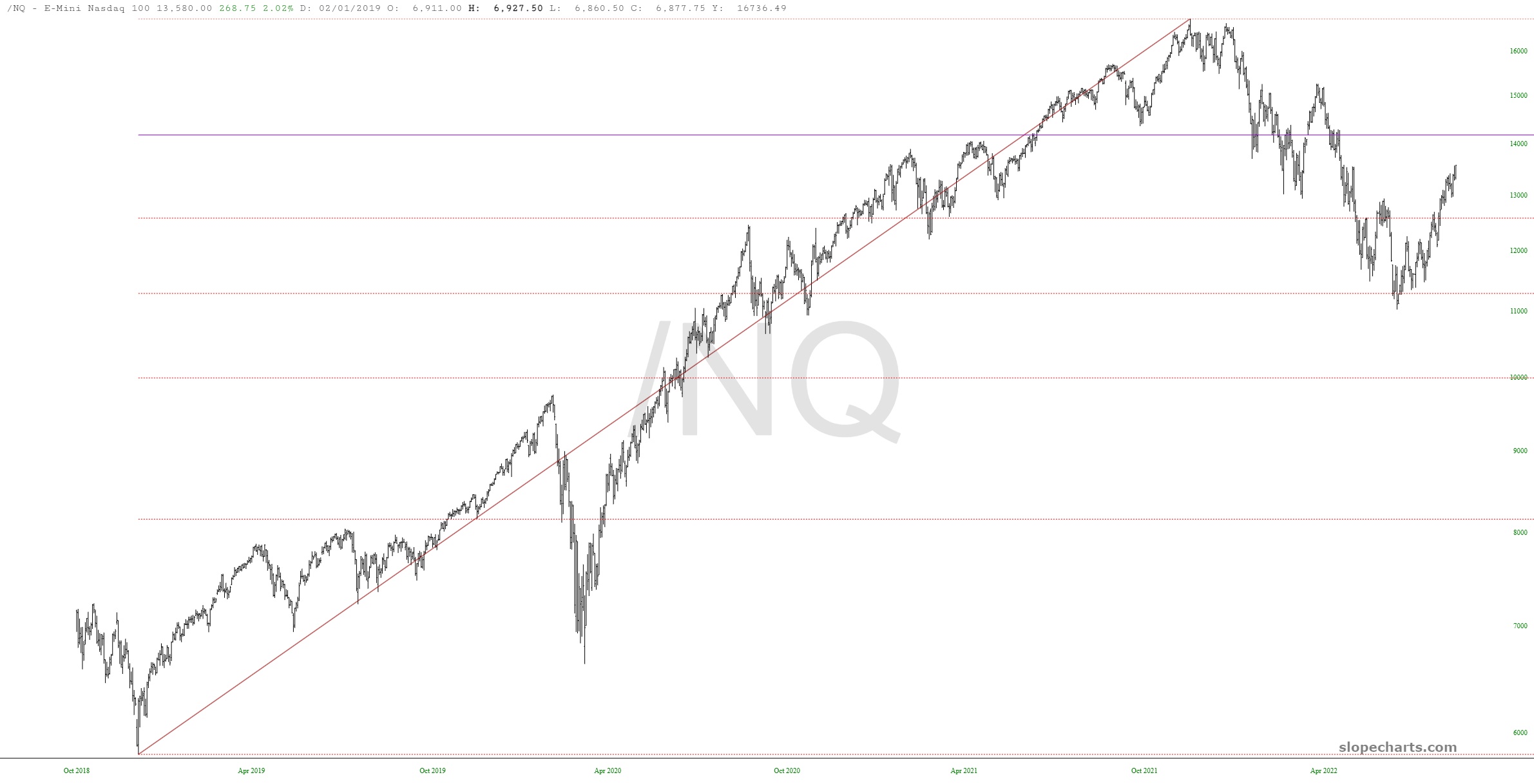
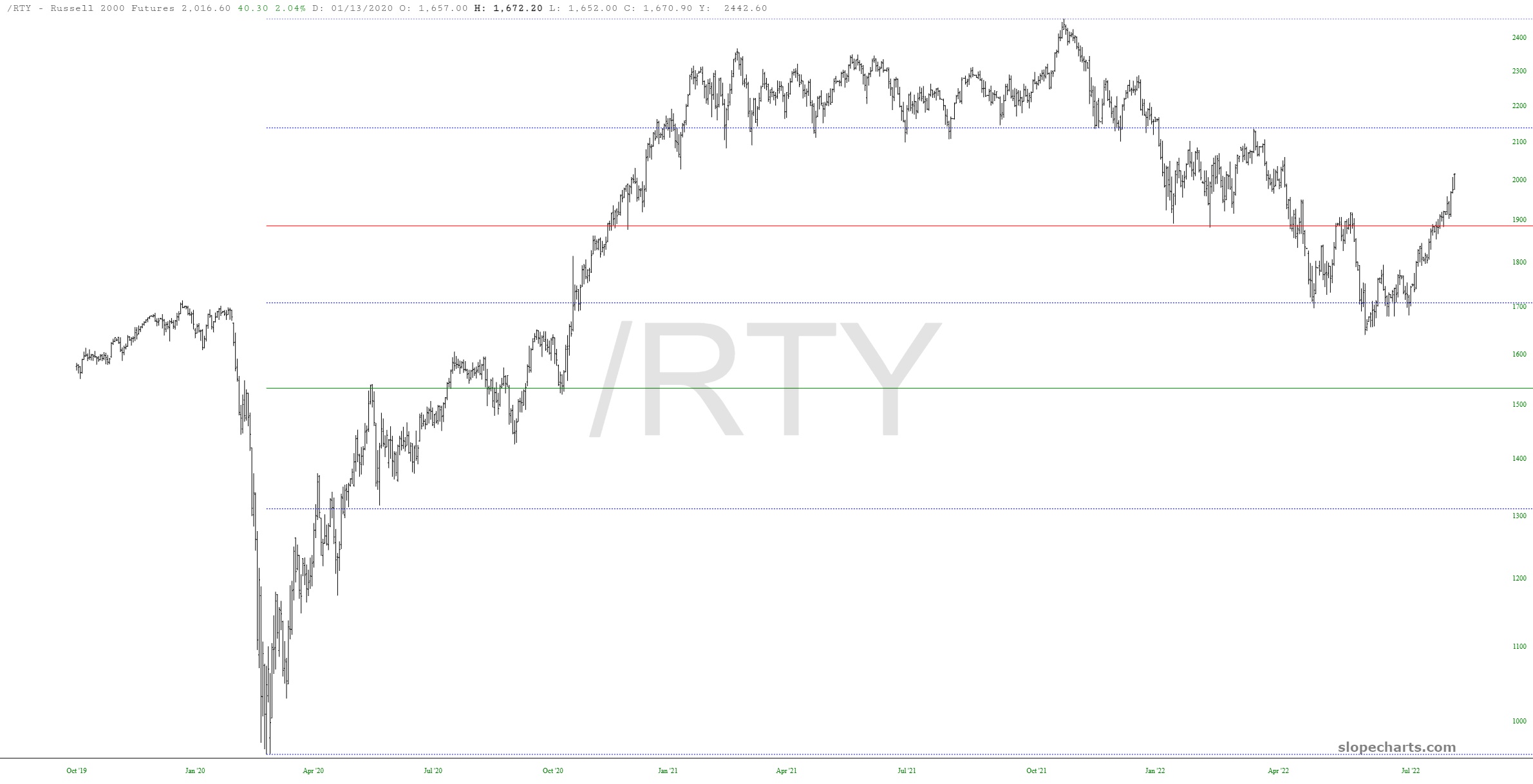
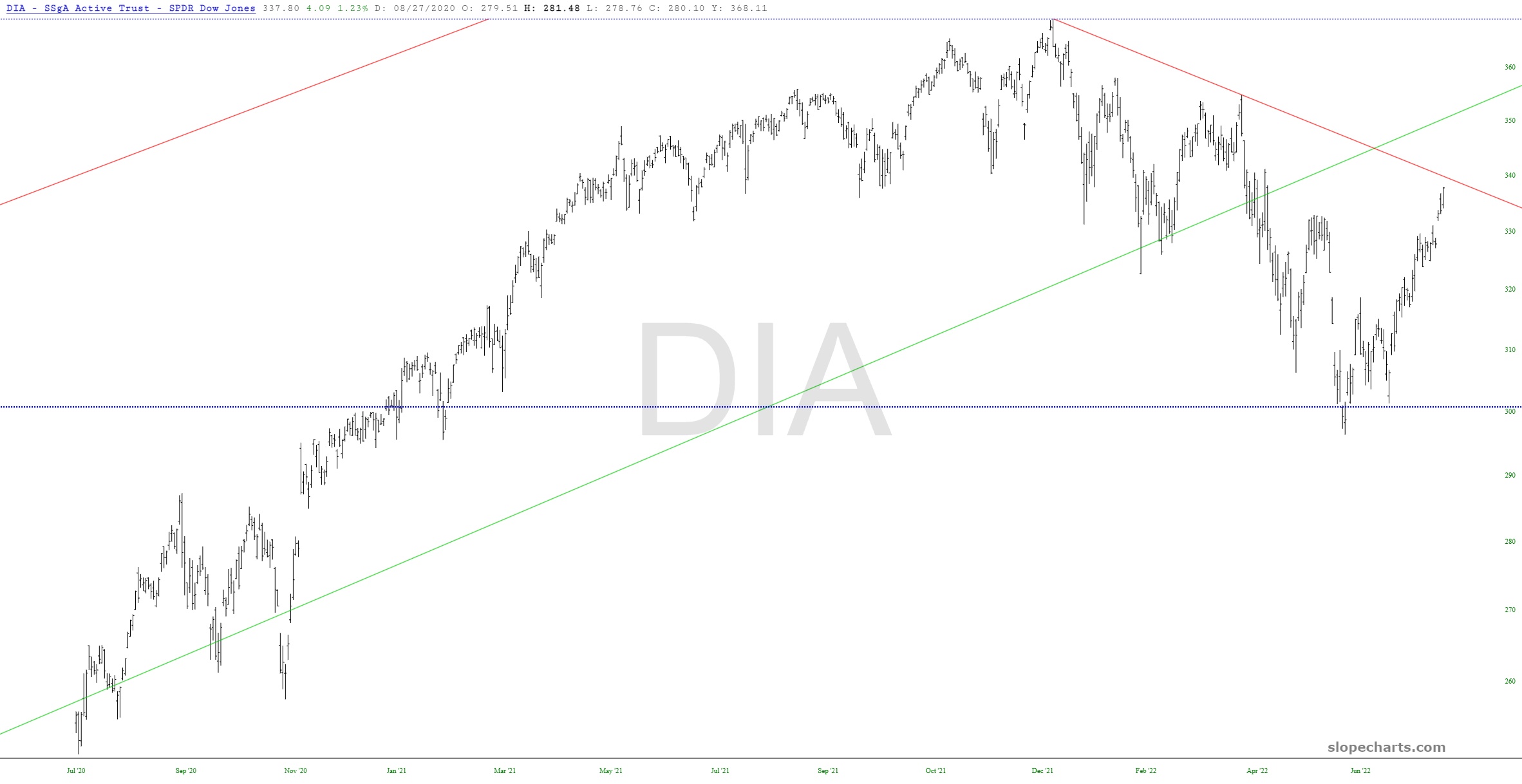
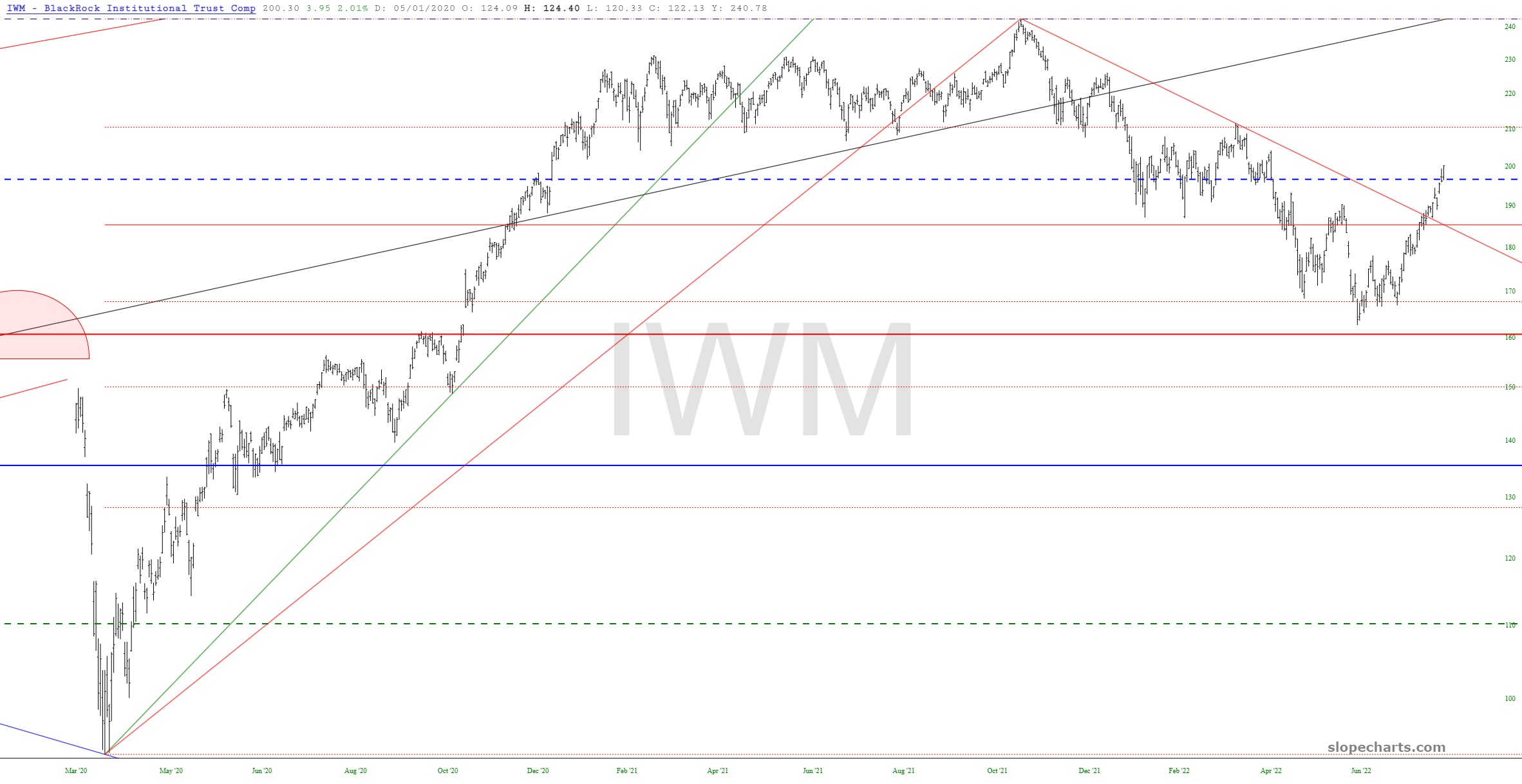
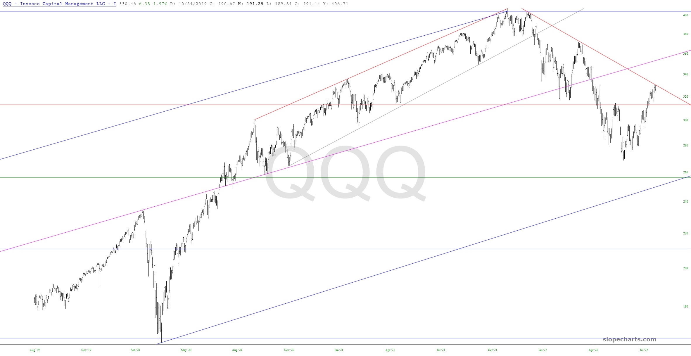
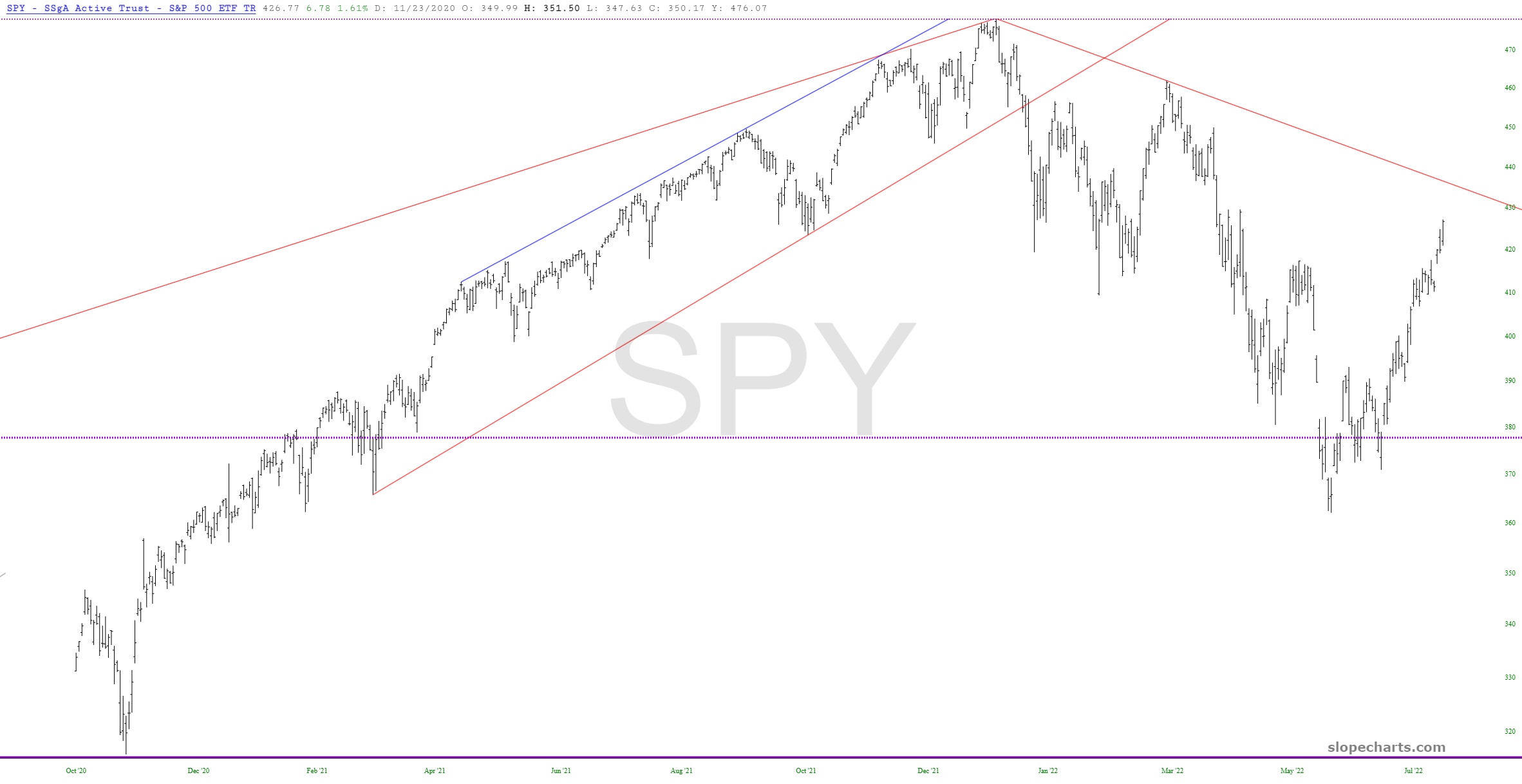
Fibonacci looks rock solid on this oneFibonacci is much messier on this one; lines don’t line up as wellRetracements aren’t great on this one either, in terms of clarity or precisionThe industrials have been very strong and are approaching important resistance lineSmall caps have broken their downtrend, which isn’t a good sign for bears at allThis has pushed much farther into the pattern than I would have likedThe NASDAQ 100 has also been dangerously strong, although it hasn’t broken its trendline (yet!)The S&P 500 is the same deal – – MUCH stronger than I would have liked to see, thus wrecking any clean neckline; the last hope for this is to stay under the descending trendline.