Yes, even on a Sunday during a 3-day weekend, the Slope of Hope keeps evolving and getting better.
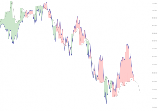
One of my favorite features that we’ve added is Layered Charts, and there are two important new improvements I wanted to describe. The first one is a new button called Spread:

What this does is color in the area between the two lines which constitute a layered chart. I think you can see instantly why this would be useful, because you can quite plainly tell how big the spread is, which “direction” the spread presently is going, and whether it’s converging or diverging.
The other improvement is more subtle but important, and it has to do with the Synch button. Back in the old days (that is, more than a few minutes ago prior to this deployment), when you clicked Synch, it would time-synchronize the charts ONCE and be done with it. Therefore, the moment you zoom in or out of either chart, you’re back to where you were, because the time-synch would be wrecked. (To be clear, there are in fact times you want to be able to do this, such as when you’re trying to find an analog).
More commonly, though, I suspect people will want the synchronization to be “sticky“, so we’ve changed this into something modal instead of a one-time thing. Therefore, now when you click Synch, it goes into that mode, so as you zoom in and zoom out, the other chart will tag right along for the ride.
Nifty, huh? Anyway, back to Labor Day…………