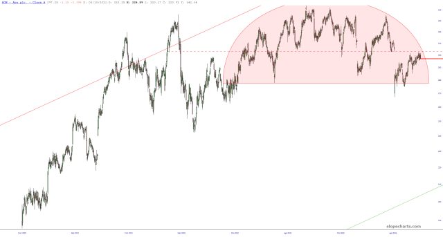
Here’s a new position for me: December puts on AON. The options are rather thinly-traded, but I absolutely love this chart!
Slope initially began as a blog, so this is where most of the website’s content resides. Here we have tens of thousands of posts dating back over a decade. These are listed in reverse chronological order. Click on any category icon below to see posts tagged with that particular subject, or click on a word in the category cloud on the right side of the screen for more specific choices.
Here’s a new position for me: December puts on AON. The options are rather thinly-traded, but I absolutely love this chart!
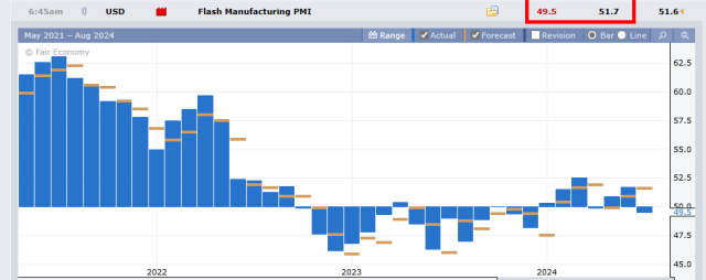
Below is the Manufacturing PMI, which illustrates if manufacturing in the United States is growing (above 50) or shrinking (under 50). The left side of the chart shows a steady, potent increase in economic strength. Notice a change over the past couple of years? Now this illustrates a coughing, wheezing, sputtering economy, month after month, whose latest data point was another big miss. And keep in mind, this is GOVERNMENT data. Reality is vastly worse!
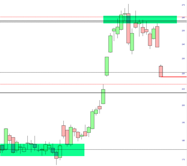
How relieved I am to have had the good sense to detect that, considering how a certain person was being a total douchenozzle privately this weekend, it meant something bad was coming. Yeah, I’m a chartist, but I’m also partly human. I can read people. TSLA is getting absolutely bombed, and I’m delighted my family can stand at a safe distance and watch the carnage. Those Fibonaccis have been working beautifully for MONTHS.
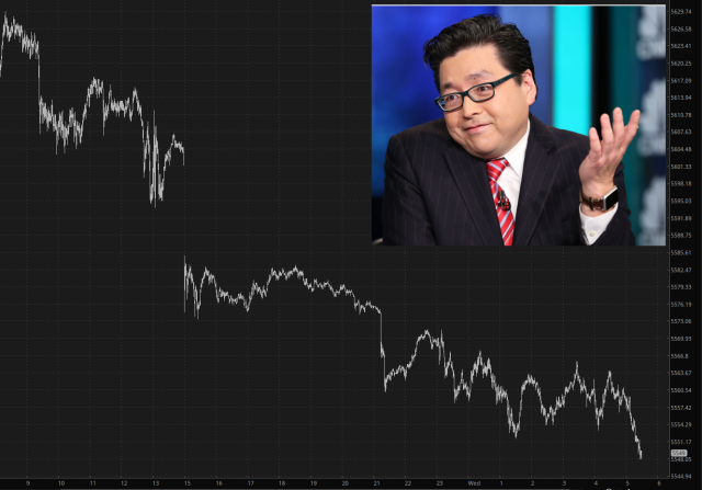
Things have changed very swiftly. Just seven days ago, it looked like this market would just go to 100,000 on the Dow without interruption, and all hope would be lost. As it is now, I think the price action forthcoming is going to make Tom Lee’s mascara run. It’s delicious.