
We’ve added Slope’s 300th feature! This is in SlopeCharts, and you can access it by right-clicking on any watch list. The new item is called Export Matrix.

So, what does it do, you ask? What it does is creates every possible combination of all the symbols in the chosen watch list so you can see what the ratio charts look like. It’s basically a great way to look at a random mishmash of combinations to see if anything amazing shakes out of it. I’m having a ball with it, because what else am I going to do with my spare time?
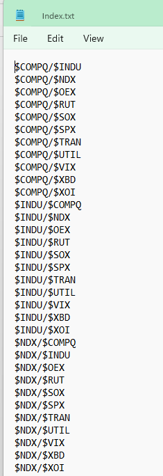
The exported file will look something like this:
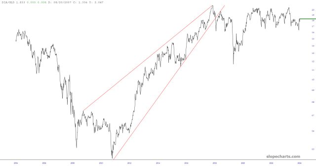
Which, in turn, you can import into SlopeCharts and start checking out ratio charts such as this one:
There are limits, of course. Given a watch list of “N’ symbols, it is going to generate a quantity of symbols equal to N-squared minus N. Thus, we are limiting it to the first 20 symbols of any given list, since that’ll create almost 400 combinations right there.
I hope you enjoy the latest spiffy cool feature from the Slope of Hope.

