
Let’s take a close look at the ratio chart $AW01//GC for a minute, which is the oft-referenced All World Index (equities) divided by Gold. I’ve shared this many times, and here’s the most up-to-date version:

I tend to be very exacting with my charts, and I was confused recently because it seemed to me that this massive (and I do mean massive) dome had completed, when in fact it hadn’t quite done so.
Let’s zoom in closer so I can explain myself.
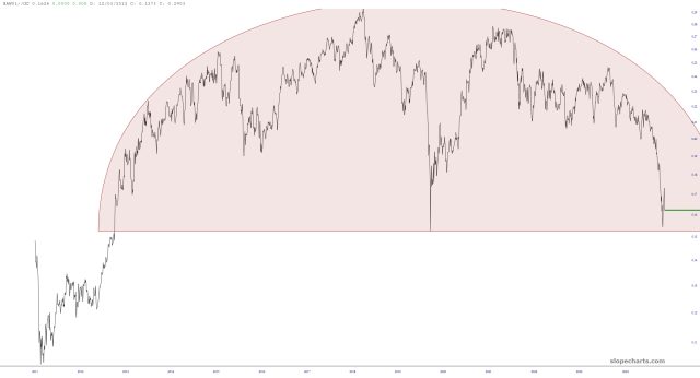
Notice that the March 2020 dip (in the middle of the pattern) dips ALL the way down to the pink area in the bottom chart but does not do so on the top chart.
This is a quirk of how the chart is rendered, because the zoomed-in version allows for finer granularity and more detail. The Covid Crash Low was extremely brief, and the very long-term chart doesn’t even bother showing it. Looking closer, however, it is there, and that low should be respected.
Having said (or typed) all of that, the point is that this is an amazing ratio chart with, I believe, life-changing implications. But it has NOT completed yet. It is very, very, VERY close, but it’s got a little way to go.
I stand by my long-term view that this chart will complete and usher in a long period of lower equity prices and higher gold prices.
