I decided to take a leisurely stroll through our economic charts, which you can find described here. Below are eight intriguing charts with relatively recent data, and a description of each is in the watermark.

Slope initially began as a blog, so this is where most of the website’s content resides. Here we have tens of thousands of posts dating back over a decade. These are listed in reverse chronological order. Click on any category icon below to see posts tagged with that particular subject, or click on a word in the category cloud on the right side of the screen for more specific choices.
Trump is badgering Powell relentlessly about interest rates. Aside from being great theater (of the absurd), the odds are near zero that the Fed will cut in June and very small they’ll cut in July. CME Group, which we have noted tends to be more of a windsock than an accurate prediction tool, currently sees the winds blowing to the tune of 97.4% “no cut” in June and 83.3% “no cut” in July. Come September they start to favor a .25% cut.
(more…)As cautious as I am these days, there are some setups which are too compelling to ignore. Two of these are closely related: Dollar General (DG) and Dollar Tree (DLTR), each of which are respectively shown below.

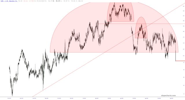
From time to time, I’ve mentioned Smuckers (SJM) as a short idea, although it was never that appealing since, let’s face it, the valuation of a jelly and jam company isn’t going to be as crazy as, let’s say, Palantir. In any case, SJM is getting hit hard this morning, down about 15%, showing that, jam or no jam, a good pattern should be respected.
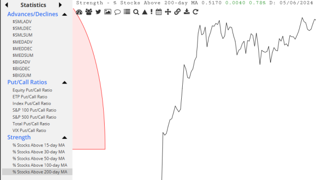
I’ll take this opportunity to remind you that SlopeCharts has a variety of interesting Statistics you can use to examine underlying market strength and sentiment.