The King of Oil
Slope initially began as a blog, so this is where most of the website’s content resides. Here we have tens of thousands of posts dating back over a decade. These are listed in reverse chronological order. Click on any category icon below to see posts tagged with that particular subject, or click on a word in the category cloud on the right side of the screen for more specific choices.
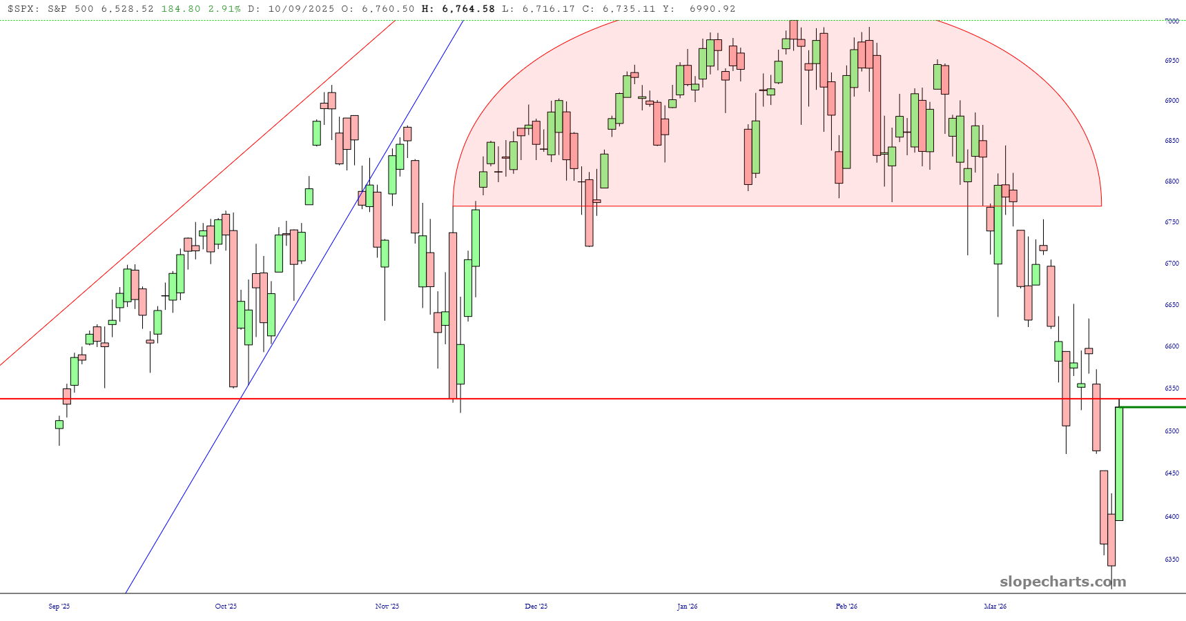
Here’s an interesting chart for you: the S&P 500. What’s cool about it is that today’s mega-rally sent it precisely, and I do mean precisely, to the Fibonacci resistance line. If it weren’t for the fact I’m lying horizontal on a sofa, my jaw would be hanging open.
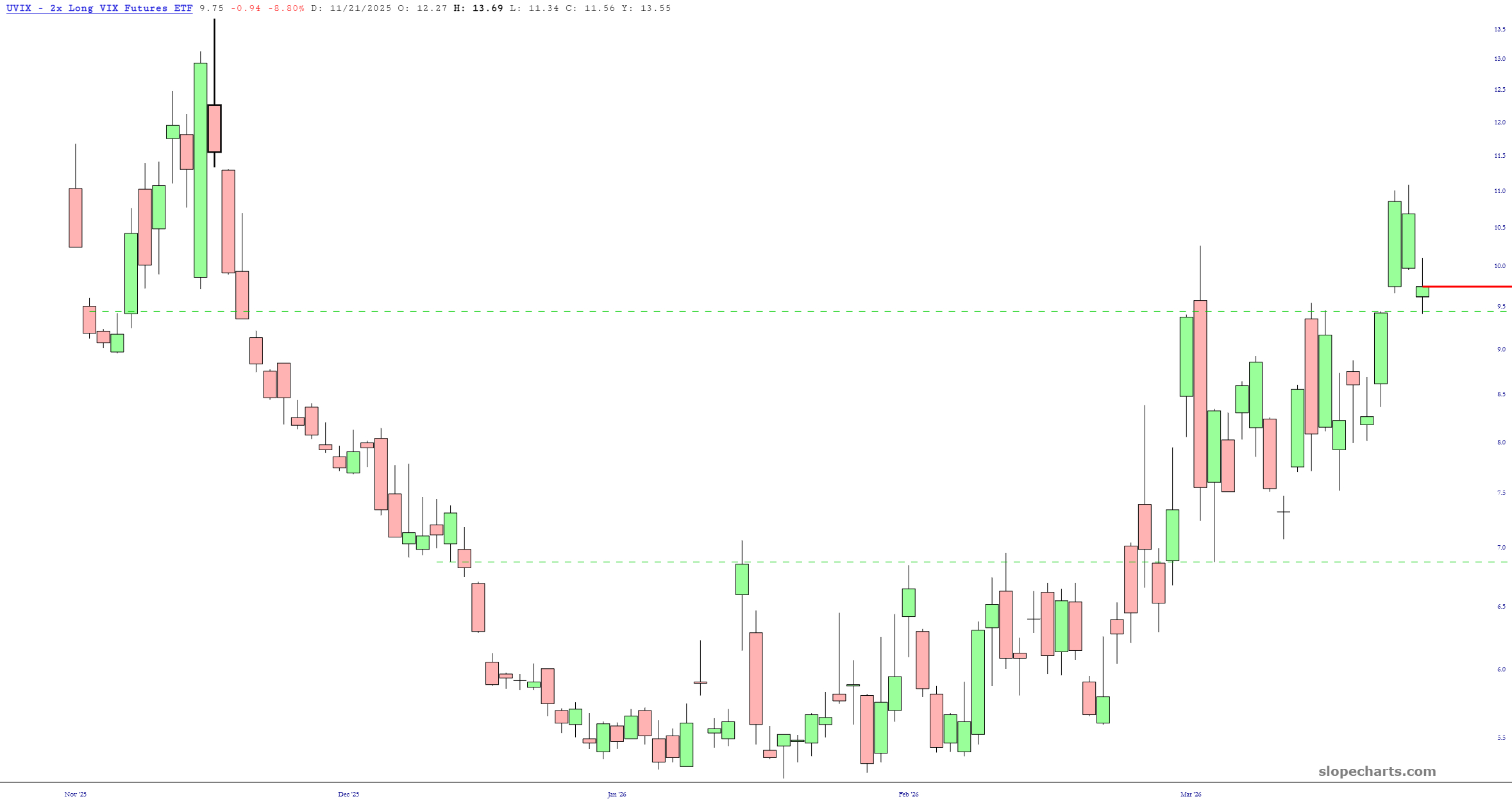
Every day, we’re told the war is over. This volatility ETF doesn’t seem so sure.
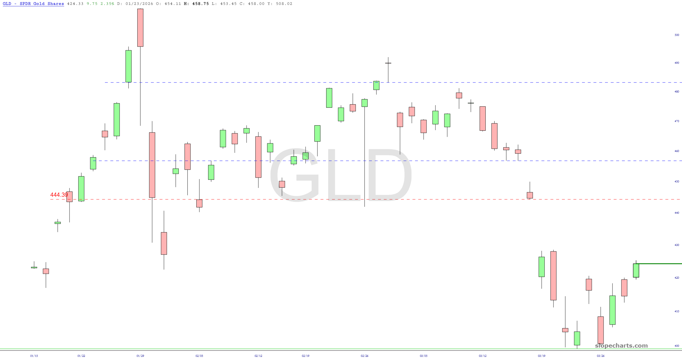
In SlopeCharts, you can automatically show the price value of a horizontal line. I’ve done so below so you can easily see the dollar figures of the various price gaps which I believe constitute resistance for these precious metals-related ETFs. As always, click on any chart for a much larger version.