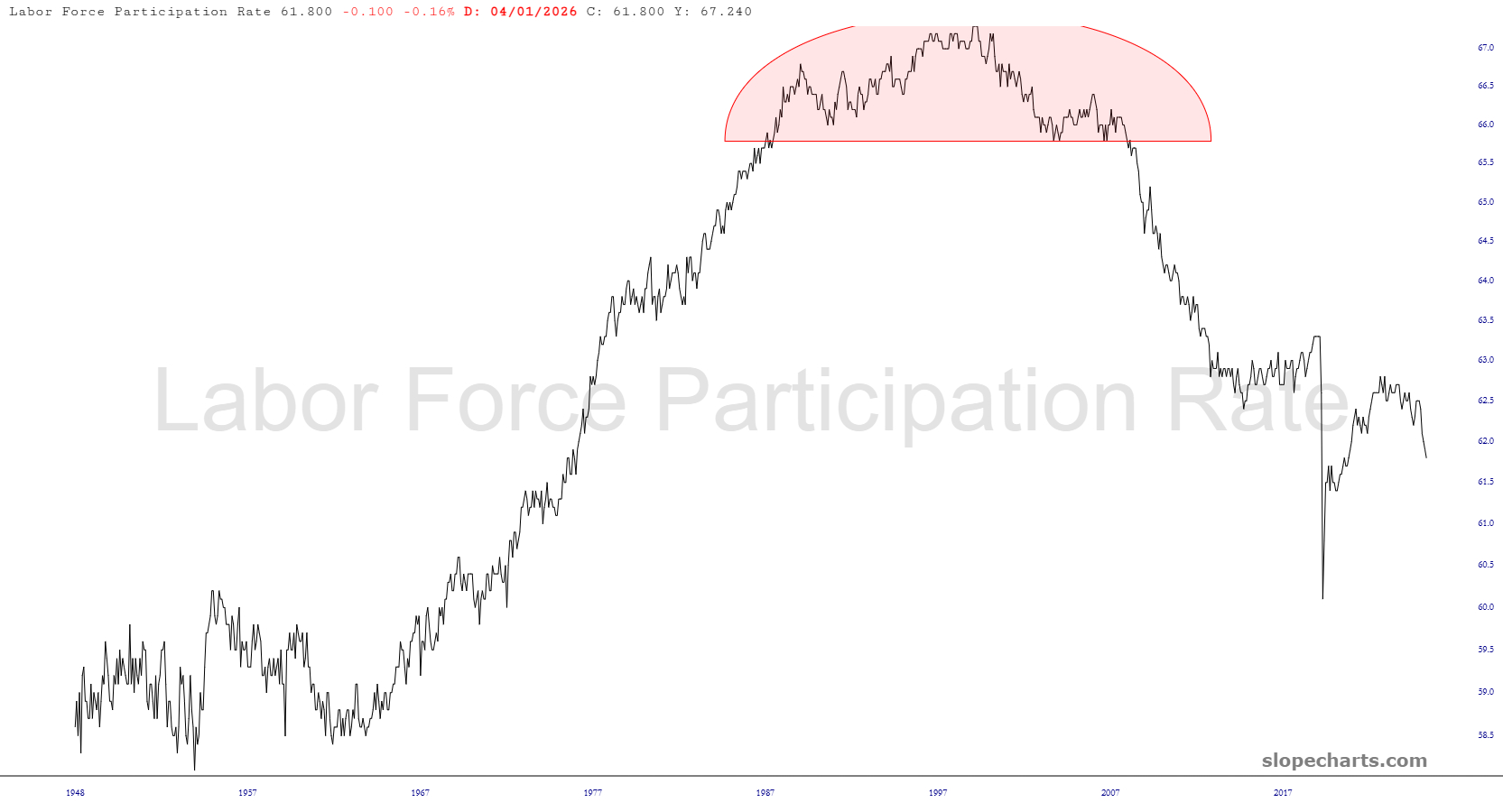
Having thumbed through some of the charts from Slope’s marvelous economic chart database, I wanted to share a few that jumped out at me. First up is the labor force participation rate, which is slumping like a SAAS stock. This is an alarming trend; I guess our fellow citizens are losing interest in work, eh?
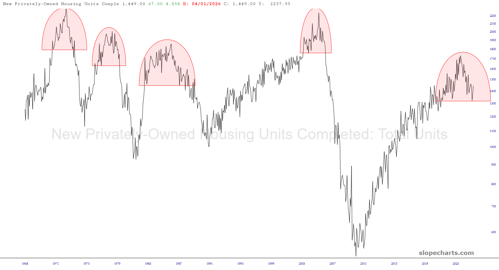
The graph of new housing units being constructed seems to have a reliable “climb, top, then drop” pattern to it. We are just about done with an impressive topping pattern, and in 100% of prior instances, this same pattern has produced a substantial plunge.
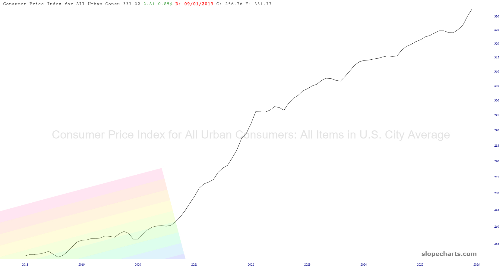
Oh, and if you think inflation has been zeroed out, you might want to glance at this. The data actually goes back for about eighty years, but I’ve homed in on recent history, showing that prices are lustily leaping higher still.
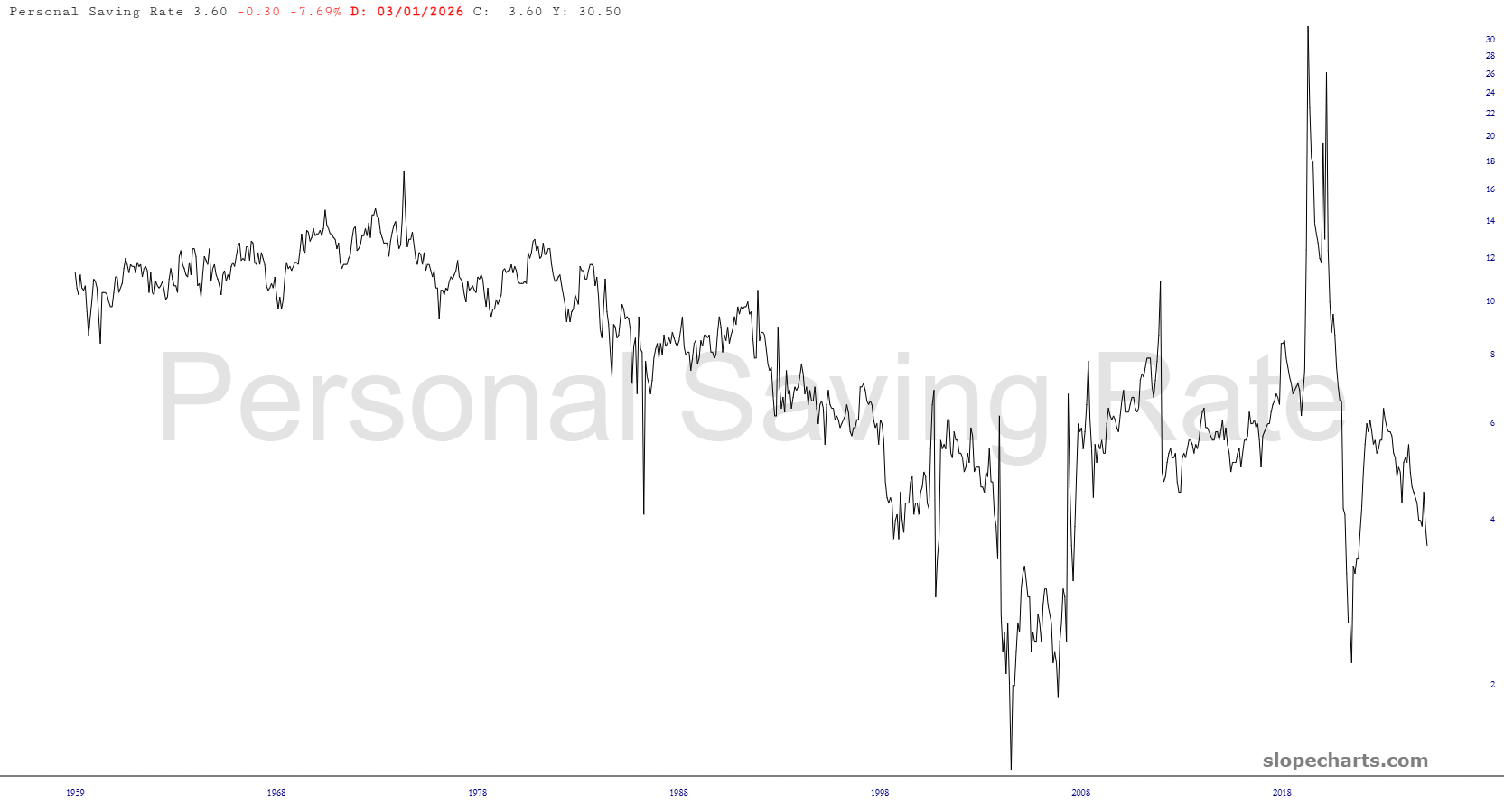
At the same time, and not surprisingly, the amount folks save is shrinking by the month. Before the 1970s, Americans saved around 14% with little variance year to year. This has withered away to just a few percent, which might explain why so many millions of households couldn’t afford a surprise $400 expense if it popped up.
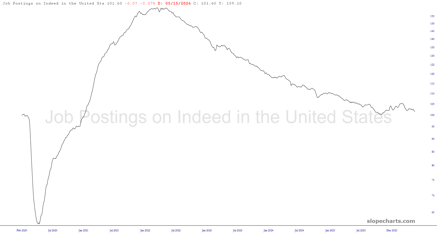
As for that shrinking labor participation rate, maybe one of the reasons is that the opportunities available is slipping away as well.
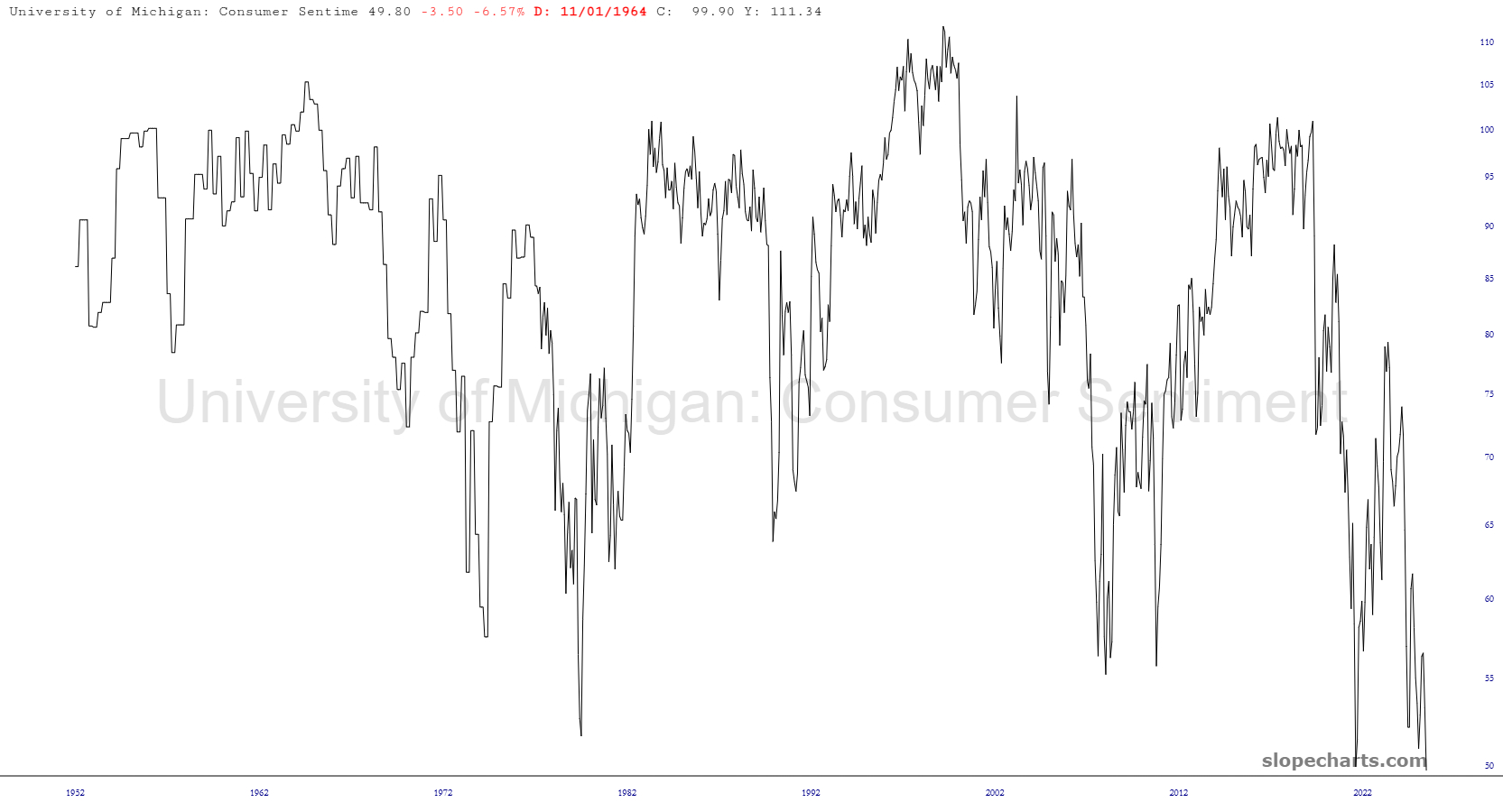
Lastly, we just got the latest data point from the University of Michigan about consumer sentiment, and with the equity markets at never-before-seen highs we have………………..a never-before-seen low. Wall Street is high as a kite, yet Main Street is ready to jump off the highest building it can find. Keep in mind, this sentiment data goes back farther than most of us have been alive, and it has never been so depressed.