
Good morning, everybody. Well, hey, how about that, some red on the screen. What a nice way to get things going. What I wanted to explore in this post is the persistent, and crucial, horizontal lines that are laid flat in just about every important index.
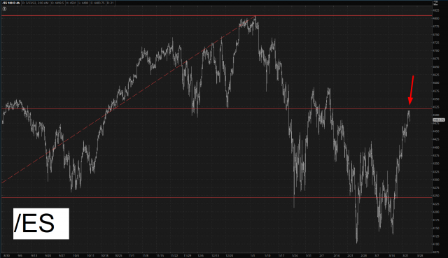
In spite of my utter exasperation with the mega-rise over the past nine days, I still consider this market to be very chart-friendly and, frankly, acting As God Intended. So let’s start to survey the scene, shall we? We begin with the /ES, which approached, and then sank away from, an extraordinarily important level for any surviving bears out there.
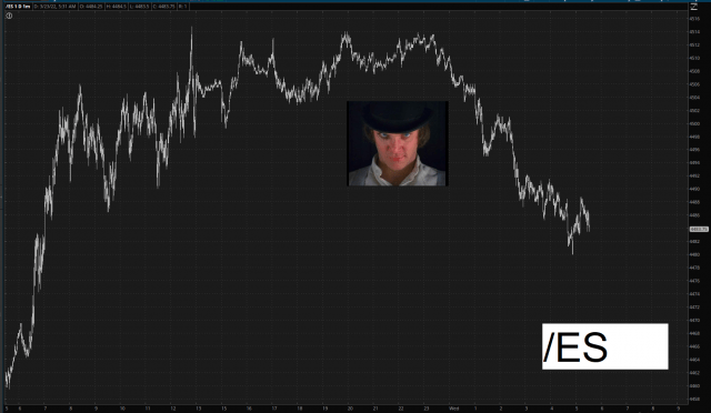
The line I am referring to is shown below. Indeed, we got very close to it, but didn’t quite get there (which is why it doesn’t even appear in the Alex de Large minute bar chart above), but what the line represents is – – roughly – – the dividing line between the mass (and I do mean gargantuan mass) of overhead supply above the 4515 level and the drop-zone beneath it. I emphasize “roughly” because if, God forbid, we actually push above this area, it isn’t absolutely the end of the world. It would merely suck.
But the point I am trying to make is that the mass of overhead supply isn’t precise to the hundredth of a decimal point, although I would be quite content if last night’s peak represented the high for this stupid counter-trend bounce, if you don’t mind very much.
I am feeling extra-super-grateful to my subscribers right now, so the remainder of this post, which is a bunch of other important charts, is visible to all paying members.
OK, I’m back on the other side of the protected content. I just wanted to wish you – – and myself – – a good trading day ahead. Time to go. These dogs aren’t going to walk themselves.
