
Taking a tidy sum from the markets is our goal.
Talking recently with a longtime Sloper, he commented, “It’s just a trade to make a living. To get some.”
That’s what we’re here to do: Get some.
There are hundreds of ways, different strategies, to try and extract money from the markets. Have it Your way. The best strategy is the one you’ve determined for yourself. Do that.
Hard to do perhaps, but if you are able to see your way clear to remove any bias, outside influence, even news, Do That. Instructive words are, Only Price Pays.
In the spirit of All-That-Matters-Is Support-and-Resistance, these charts are offered in the hope that they help you get sum.
First up is Match, the dating site. The company’s chart was recently posted here on Slope, along with the basic sentiment, “Geez, I got some early on, but look what I’ve missed since then!”
Me, too. With so many to choose from… this one slipped off my radar. It’s back on now.
Does this look like it’s about to turn around and rally in the opposite direction?
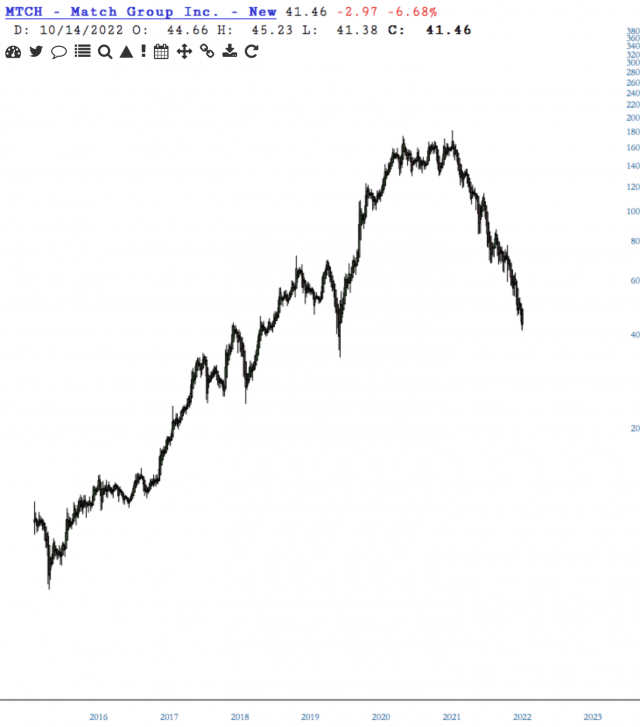
We’re only halfway thru the month, but so far, price has lost support of the purple trendline from the 2015 high and that means (more) downside risk, perhaps to be contained by the blue trendline.

What Mr. Wizard said the other evening bears repeating:
“The funny thing about MTCH, I know a lot of people that use one of their many services, and some got married. You’d think that would matter, but apparently success isn’t translating into profits. The PE is 121, so IMO realistically income could stay where it is, while the price drops to where the PE is a more rational 30. That would make it a $10 stock. Or the company has to figure out a way to cut expenses and increase profits – they only have 2500 employees, which isn’t even a large building by my standards, so I’ll guess it’s spent in places like advertising and customer acquisition. Competition? Sure, anybody that can code an app. Where’s MTCH? Between a rock and a hard place, despite their stable of dating sites.”
The next chart is chosen to help LZ never “…forget that McDonald’s is doomed”.
Where you around in 1961? Dad was a trust officer with BofA at the main branch in Los Angeles, California, when he managed the deal of Ray Kroc buying McDonald’s. I was ten years old.
As a look-how-stupid-we-are-as-a-culture side note […before even considering their it’s-not-real-food burgers…], realize that McDonald’s is the world’s biggest toy distributor. WhoopTDo.
If MCD is going down, that journey has only just begun.
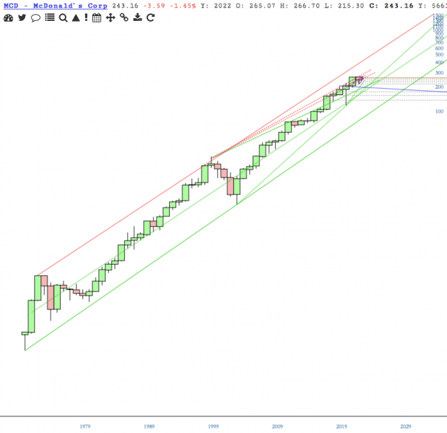
A mass of convergent support around 220ish, which, if lost, may be guided by the blue trendline.

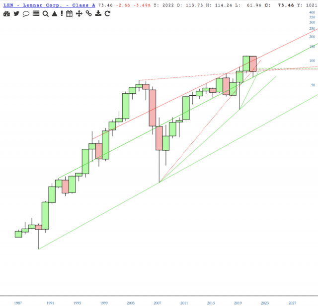
Recently brought to our attention by NYCGrad is LEN, a homebuilding and mortgage financing company with a market cap of 20,865,677,602. Wow. Their company summary states that the mortgage loans they originate “…are secured primarily by commercial real estate properties throughout the U.S.” Given the current economic climate, that sounds more risky than not.
First the yearly chart, which has lost support from 1998, 2005 and 2008.
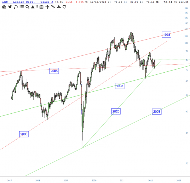
Coming right up is support from the 1993 high.
I love this chart of EL. It just looks too easy. So maybe it’s wrong, deceiving…? I say, not.
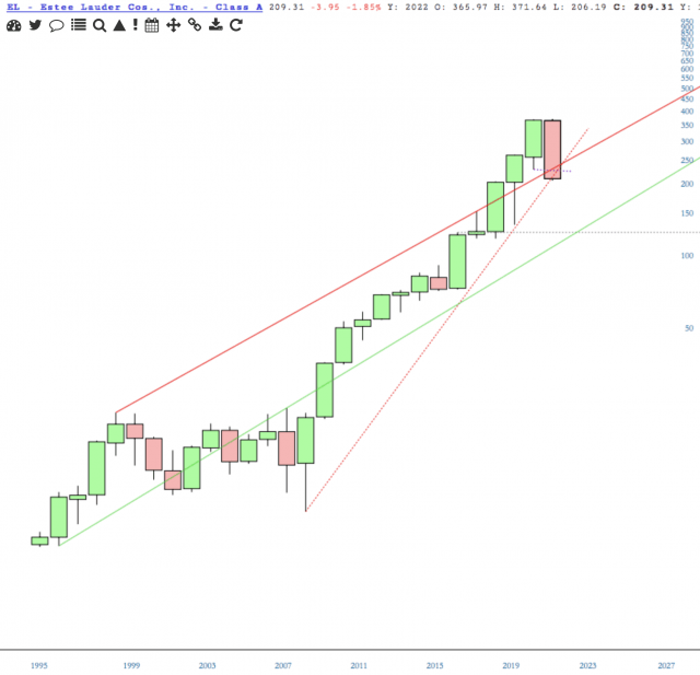
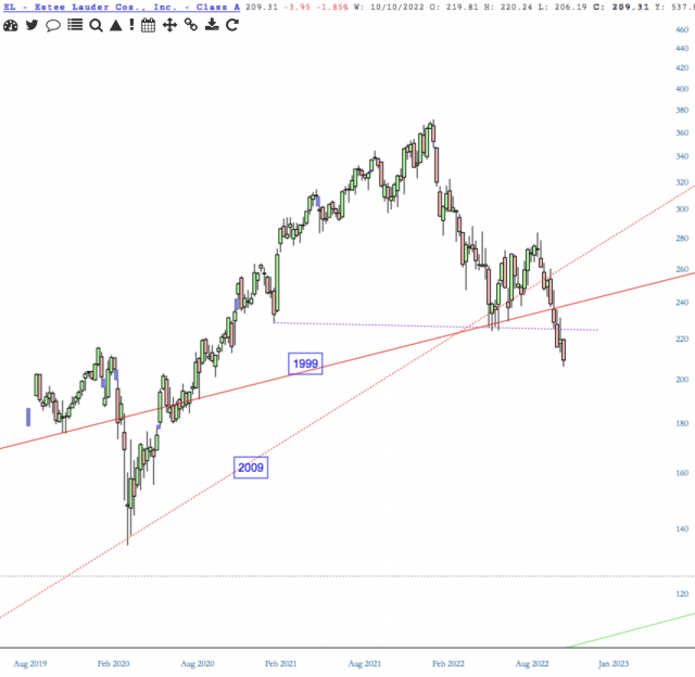
I initially held that no other chart [other than yearly] of EL was required. But here’s the weekly with an additional line of resistance [dotted purple] which has potential to cap an upside move.
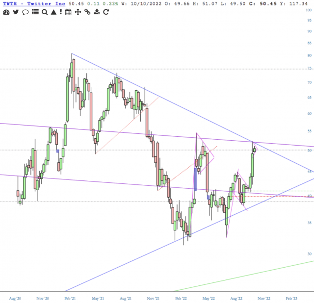
While the other charts I’ve shown have risk to the downside, Twitter’s risk is to the upside. Perhaps only because Musk is involved, TWTR will defy a downside pull.
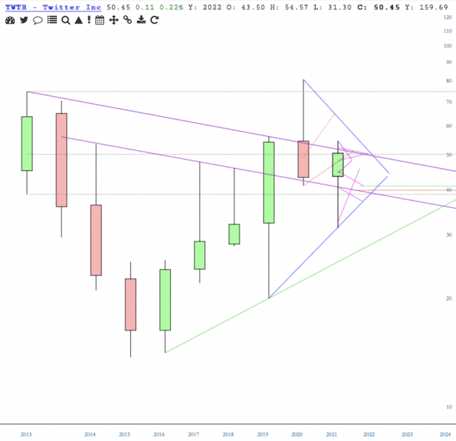
Price is above the 200ema and high above the Cloud. Top purple and blue trendlines of resistance are the next tell-tale indicators.
More power to any of us that Get Some.
