
The ratio charts below offer three general themes.
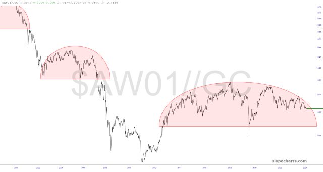
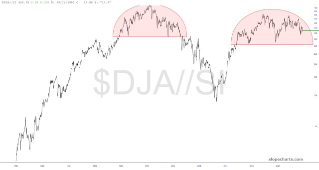
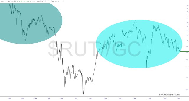
The first group, which are some very of an equity index divided by a precious metal, concludes that (a) equities will be going down (b) precious metals will be going up, or (c) both. In real money terms (real money being defined as, let’s say, gold) – – and I know this is tough to believe – – equities are PEAKED in value way back in 1999. Everything since then has been a fiat-induced illusion.
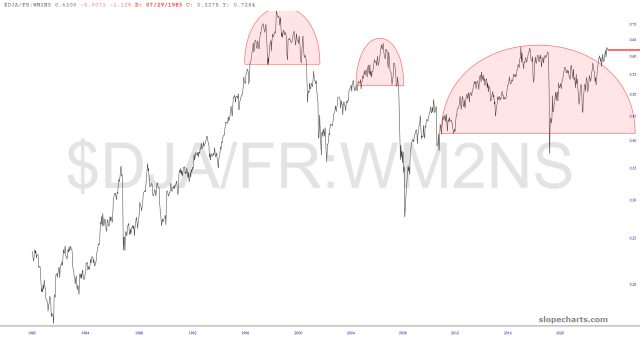
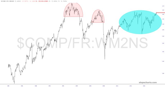
Strangely, and unexpectedly equities have defied their topping patterns with respect to the M2 money supply Things were looking good here until about a couple of months ago, but now the patterns have been wrecked.
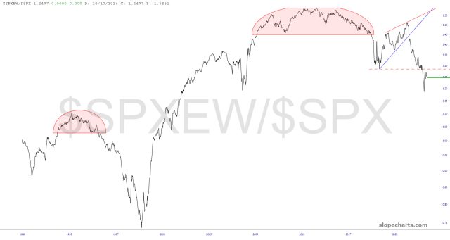
Lastly, the bad breath that persisted for so many months has temporarily abated. The equal-weighted S&P 500 has, in recent weeks, managed to outperform the regular S&P 500, illustrating the better-distributed strength of the market. Judging from the overall behavior of this chart, however, I suspect this is going to change very swiftly, and once again a handful of stocks are going to be doing all the heavy lifting.
Special Note: I’ve got a VERY important video for premium members published. If you’re not a subscriber already, this one post is well worth you trying a subscription, even for just a month.
