Looking awfully quiet for a long while, people. It’ll be all about earnings.
Slope of Hope Blog Posts
Slope initially began as a blog, so this is where most of the website’s content resides. Here we have tens of thousands of posts dating back over a decade. These are listed in reverse chronological order. Click on any category icon below to see posts tagged with that particular subject, or click on a word in the category cloud on the right side of the screen for more specific choices.
ETFs Before Earnings
Leftovers
Special Note: I’ve got a VERY important video for premium members published. If you’re not a subscriber already, this one post is well worth you trying a subscription, even for just a month.
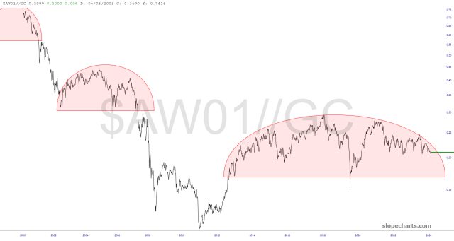
Ratio Charts of Note
The ratio charts below offer three general themes.
The first group, which are some very of an equity index divided by a precious metal, concludes that (a) equities will be going down (b) precious metals will be going up, or (c) both. In real money terms (real money being defined as, let’s say, gold) – – and I know this is tough to believe – – equities are PEAKED in value way back in 1999. Everything since then has been a fiat-induced illusion.
Reviewing Positions
Special Note: I’ve got a VERY important video for premium members published. If you’re not a subscriber already, this one post is well worth you trying a subscription, even for just a month.
