As we all await to see how the actual market (not weekend guesses) responds to the Iran situation, let’s do something we haven’t done in a long while and check out some key ratio charts.
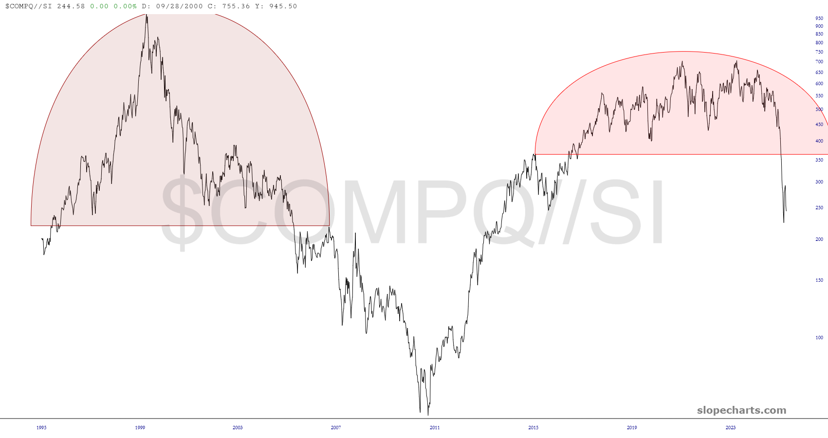
My long-held thesis that precious metals were going to massacre equities is in full swing, with the NASDAQ collapsing when denominated by the price of silver.
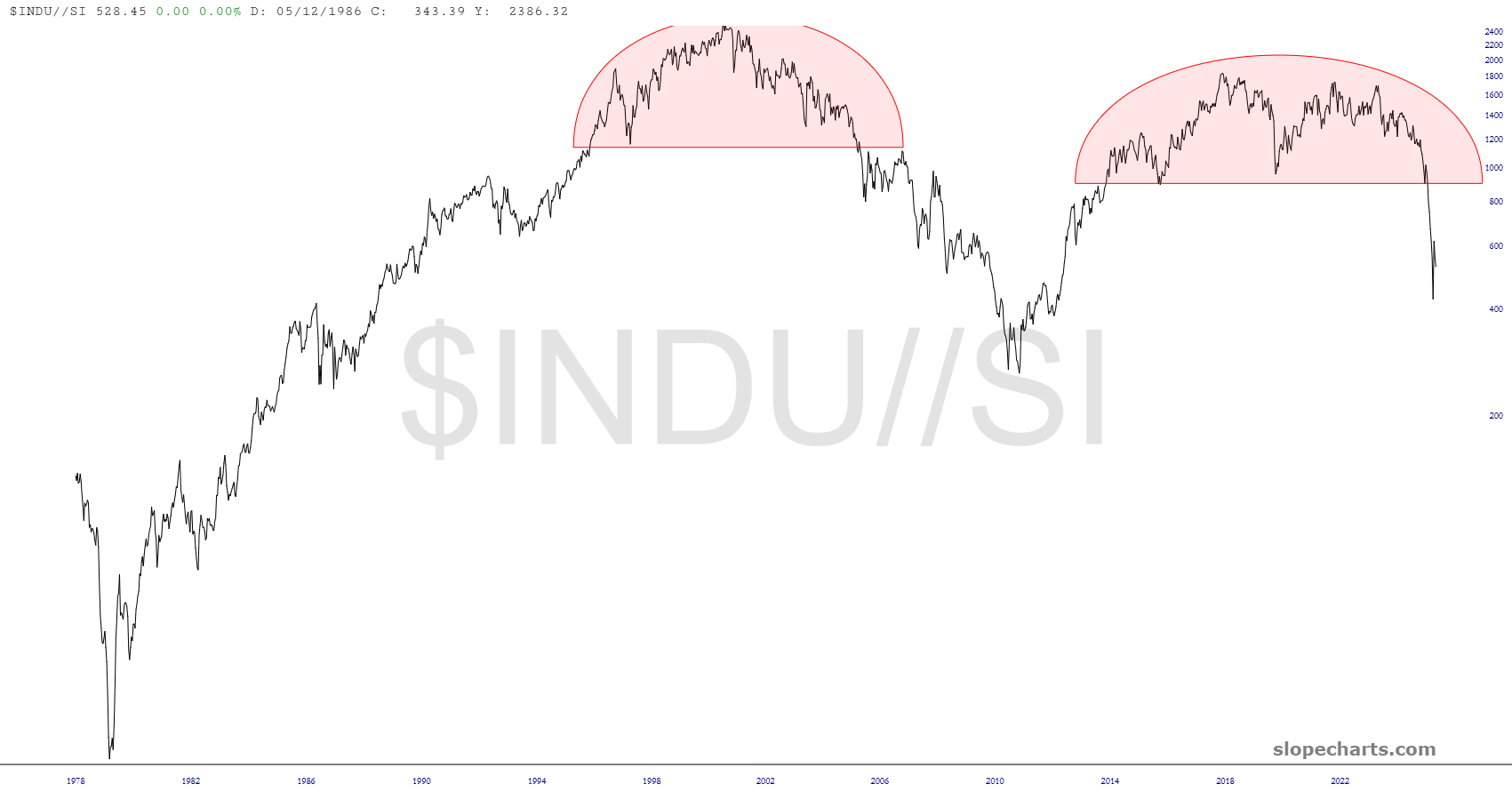
The Dow Industrials is suffering the same fate, with plenty of potential downside to go.
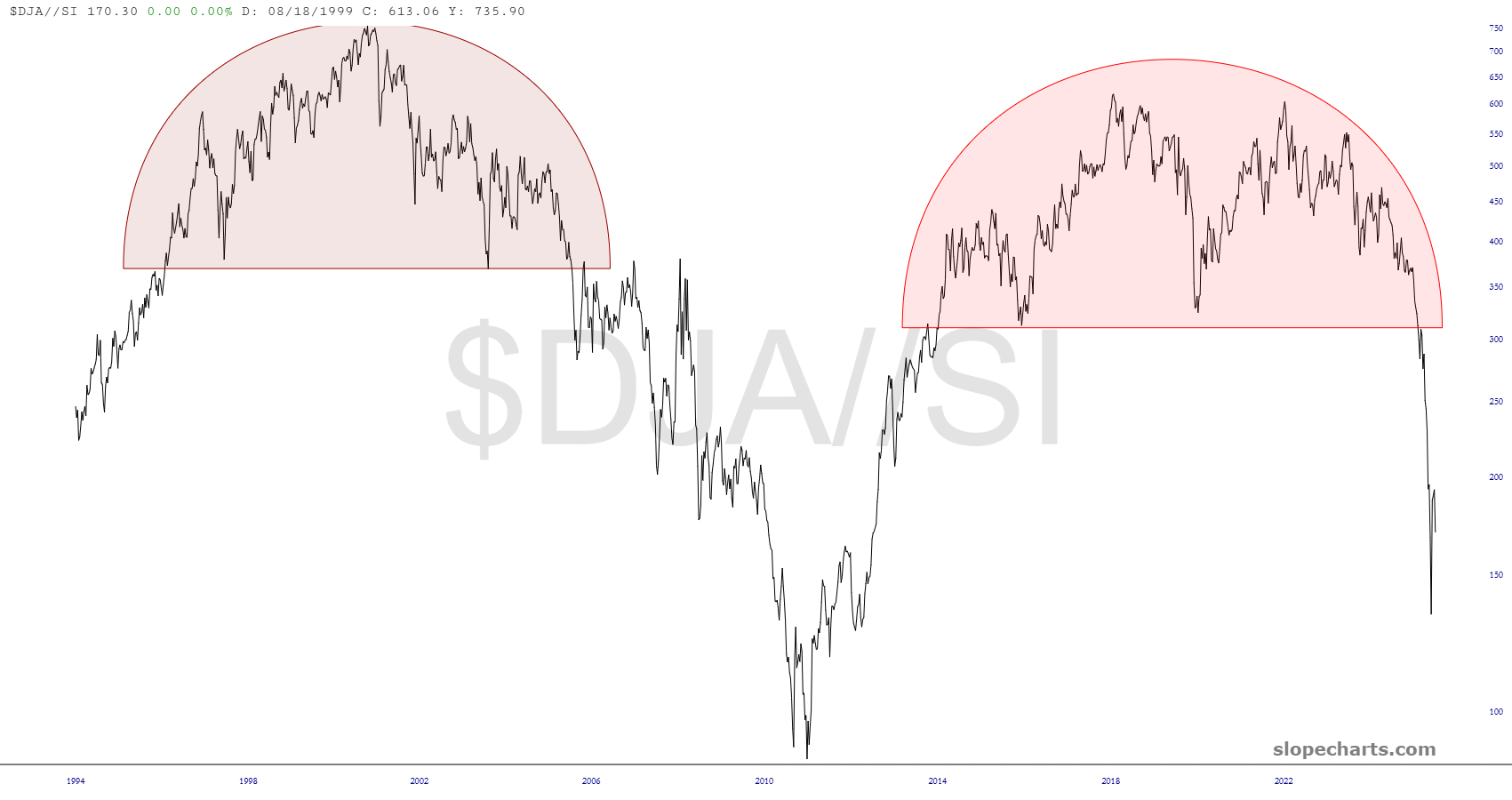
The Dow Composite versus silver is likewise in a free-fall.
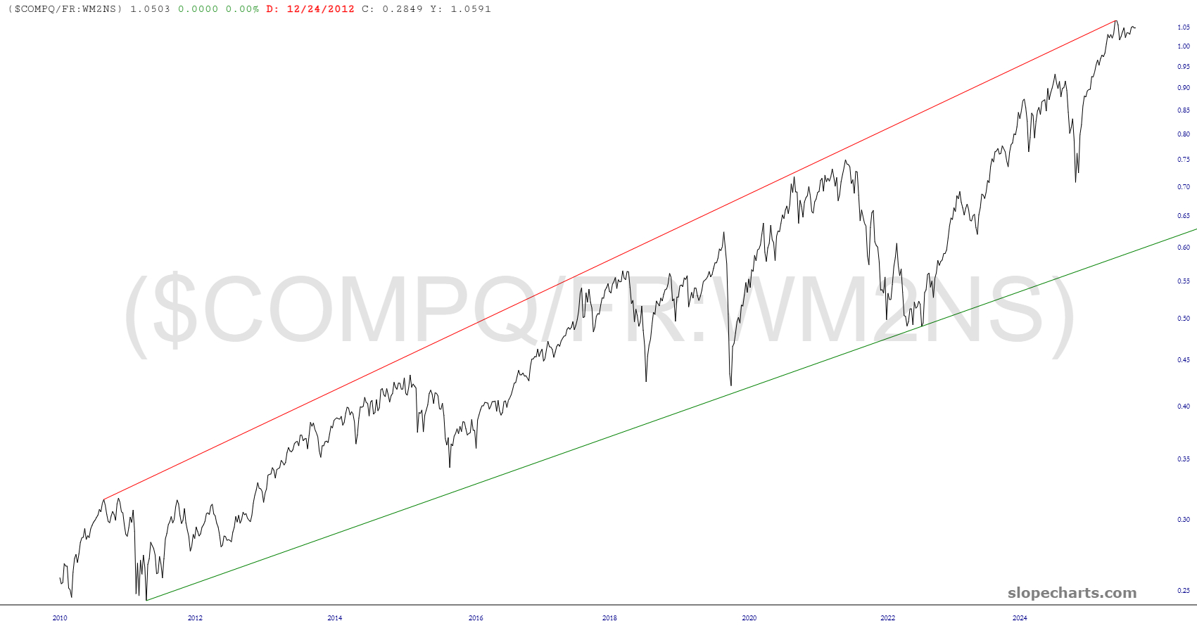
A different metric – the M2 money supply – tells the same story in a different way. This pattern goes back for decades, and you can plainly see how, on a relative basis, the NASDAQ Composite is exceptionally overvalued based on historical data.
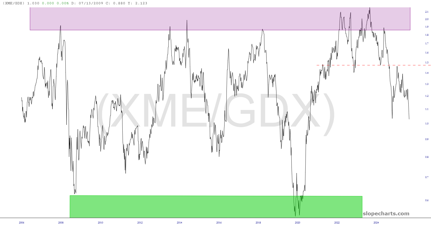
As strong as metals have been, the long-term chart of the metals and miners ETF (XME) compared to precious metals miners (GDX) predicted a strong trend downward. I’d say this was spot-on, wouldn’t you agree?
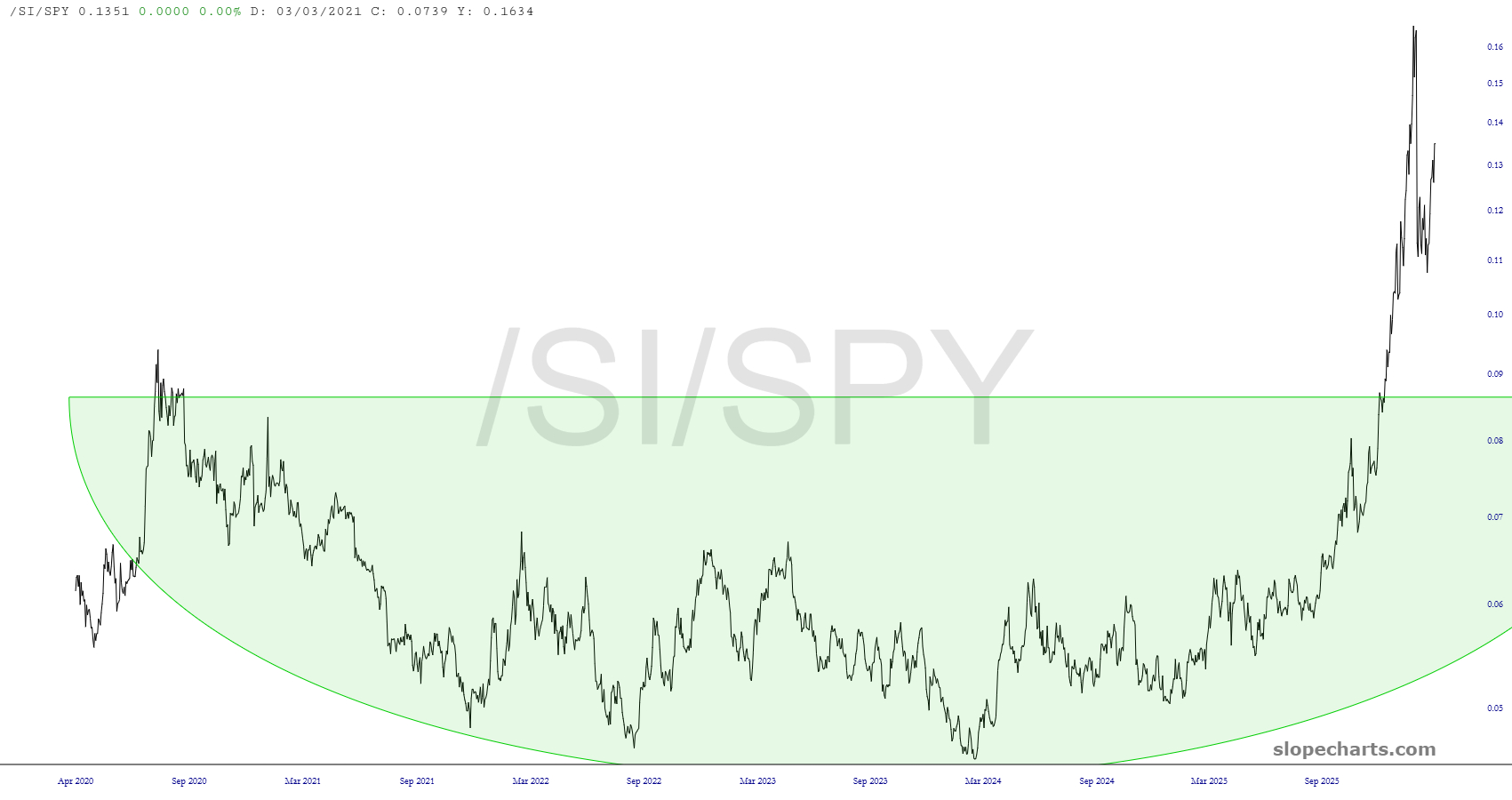
The basing pattern of silver versus the S&P 500 predicted a big rally. Again, this was quite prescient.
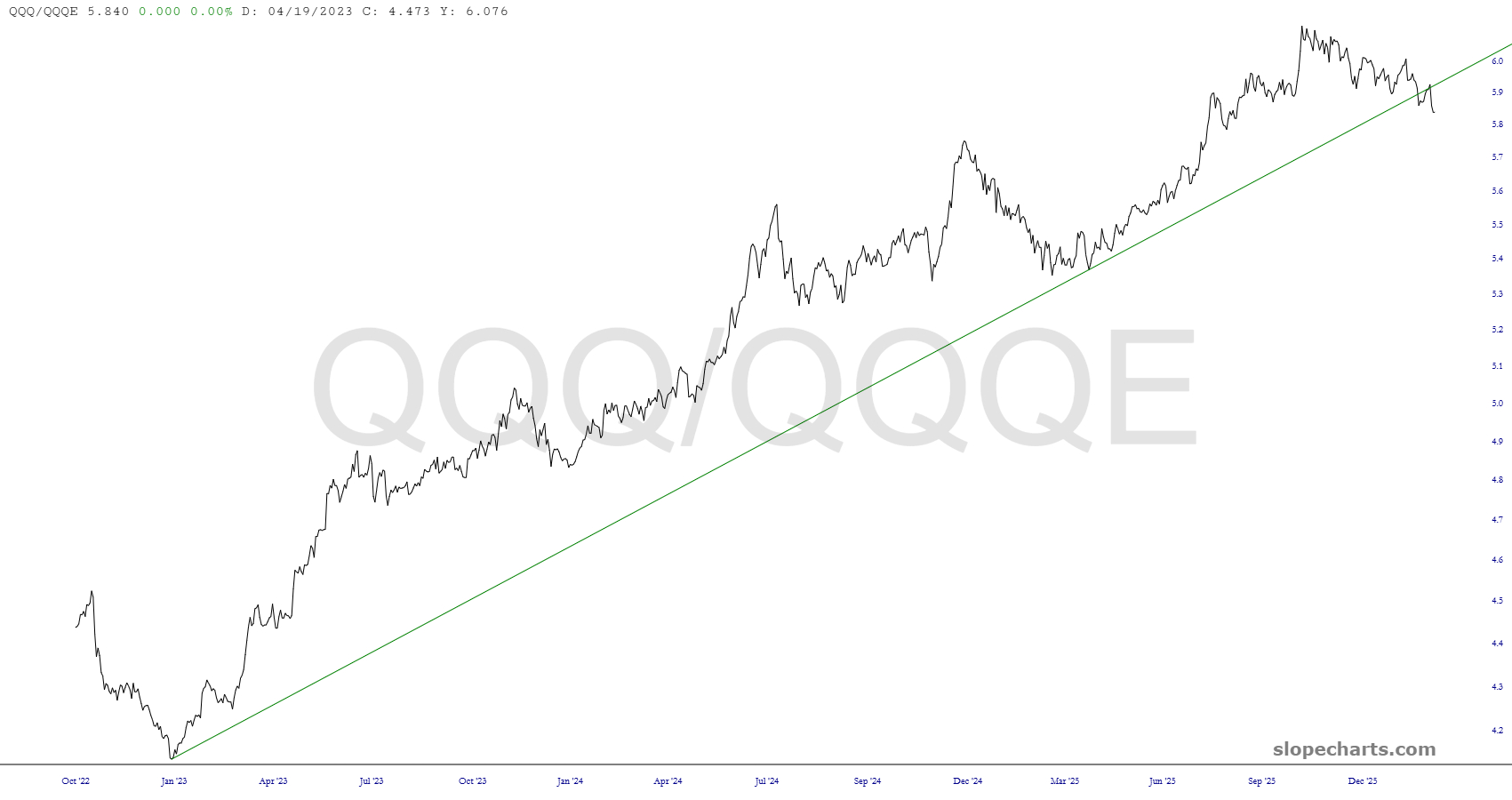
One subtle shift which has taken place has been the NASDAQ 100 (weighted average) divided by the equally weighted NASDAQ. This uptrend has broken for the first time in years, and the reason is that the mega-caps like MSFT are faltering.
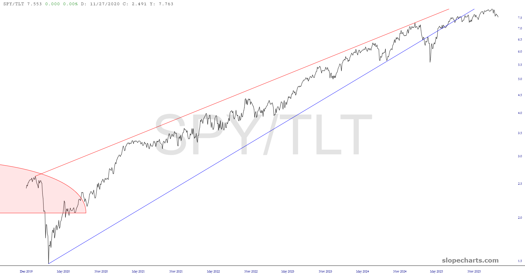
I’ll close with a favorite, which is the equities versus bonds. This wedge was broken quite some time ago, and you can see how it is curving away from an ascent to a reversal top. The sheer length and size of this breakdown suggest to me that bonds are going to have their vengeance against stocks for many, many years to come.