Slope of Hope Blog Posts

Slope initially began as a blog, so this is where most of the website’s content resides. Here we have tens of thousands of posts dating back over a decade. These are listed in reverse chronological order. Click on any category icon below to see posts tagged with that particular subject, or click on a word in the category cloud on the right side of the screen for more specific choices.

Does This VIX Make My Tail Look Fat?

By -

I’m sure most people have not noticed this and may even roll their eyes at it because apparently we shouldn’t do technical analysis on the VIX.

I say, if it works, use it.

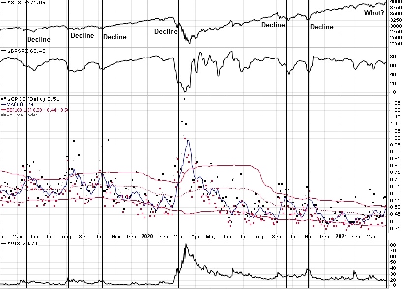
Personally, I use bollingers on the VIX and find them helpful. A recent observation,however, is what prompts this post. Specifically, that when the weekly bands get about as tight as they ever do, the probabilities of a weekly upper bollinger touch increase significantly and the chances of a weekly upper band overthrow (as what happens in crash-like moves) have a much higher chance of occurring. It appears to me that this forewarned of a potential serious depreciation for nearly every major drawdown over the entire timespan (nearly 25 years). It missed the major declines in the 2008 bear market as the weekly bollingers only squeezed to around the 50% mark, but I feel an adept trader could make this work as well.

I went back to 1998 for this study encompassing two bear markets and two bull markets. The information I’m going to share may work even better as a volatility play rather than a short index play if you can find a way to do it relatively safely (I’m open to suggestions if anyone has some ideas as I don’t play VIX futures or options as yet).

(more…)

The Problem with Shorting Strength

By -

Something I’ve been noting over the past few weeks is the steadily rising Equity Put/Call Ratio 10MA. As a signal alone, a CPCE near its upper weekly Bollinger is one of the better breadth conditions I have found that can put me on alert to buy when the main DTL is breached. The vast majority of the time, Equity PCR rises during a pullback or correction, but it very rarely gets near the upper weekly bollinger when price has not pulled back a few percentage points first. In fact, in all the data I could view back to 2004, it has only happened five times. These occurrences have a few characteristics in common.

  1. High numbers of stocks that are trading above their 200 day MA’s
  2. Tends to follow some kind of extended run up.

After the S&P500 has had a good run, it’s only natural to start thinking that price has come so far that it’s getting a bit long in the tooth and perhaps a correction is right around the corner. The problem is that when too many traders and investors start considering hedging their bets and putting on some put protection most of you know what happens when there are too many leaning towards one opinion. Of course, it has a lower probability of happening. Especially when you consider these hedges decaying and keeping a passive bid under SPX where most hedging occurs.

(more…)

GEX Says “Hammertime”

By -

For those who don’t know, GEX stands for Gamma Exposure. It is an options-based LEADING indicator that is derived through a calculation of all the gamma at all strikes and expirations on any given day in the S&P500 Index. The chart is free to access and can be found here.

High Gamma = high pushback against selling and Low Gamma = low pushback against selling.

As of Friday’s close, Gamma Exposure hit a very low point. A key point in a couple of ways.

The first is that it was less than 1.5B. When gamma gets this low it tends to be associated with falling prices and increased volatility.

The second is that GEX broke its uptrend line. I’m the only one I know of that uses it this way. You see, a little while back, I was doing some ongoing testing and analysis of the GEX and noted that it seemed to trend along with the SPX. Out of curiosity, I drew some UTL’s and plotted what happened when they broke down. I was surprised and amazed at the results. It was consistent going all the way back to the start of the data in 2011. Red dots are when GEX is <1.5B (GEX above, SPX below).

(more…)