Slope of Hope Blog Posts

Slope initially began as a blog, so this is where most of the website’s content resides. Here we have tens of thousands of posts dating back over a decade. These are listed in reverse chronological order. Click on any category icon below to see posts tagged with that particular subject, or click on a word in the category cloud on the right side of the screen for more specific choices.

U.S. Markets…On The Cusp of Chaos

By -

Special note from Tim – – we’ve entered into a formal relationship with the oh-so-cool options brokerage tastyworks – – click here to check it out!

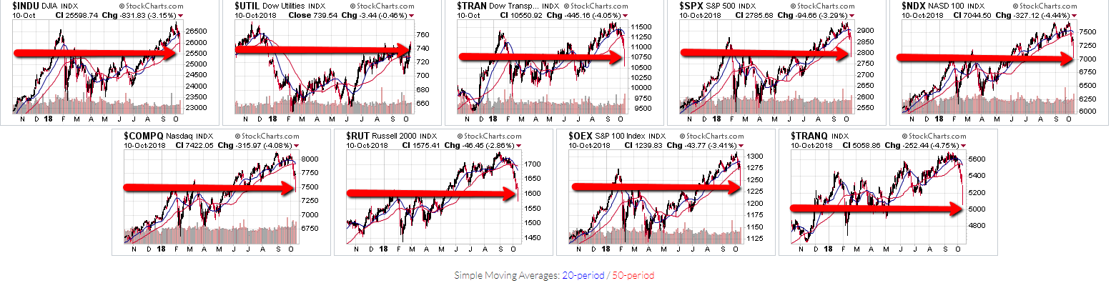
Further to my observations outlined in my posts of August 6 (where I noted that 2900 represented a major Fibonacci resistance level for the SPX), September 29 (where I mentioned the possibility of equity weakness for the first part of Q4 ahead of the November 6 mid-term elections), and October 7 (where I discussed price on four of the Major Indices being embroiled in a technical chaos formation amid downside accelerating rate-of-change), I’d note that after today’s (Wednesday’s) dramatic drop in U.S. markets, they are now sitting on or close to near-term major support, as shown on the following daily charts of the nine Major Indices.

(more…)

Q3 2018 Ends On A High Note For U.S. Equities

By -

Each candle on the following three charts of the S&P 500 Index represents:

  • a period of one month (Chart #1)
  • a period of one quarter (Chart #2)
  • a period of one year (Chart #3)

Each of the last candles on all three time frames closed higher than its prior time-period candle.

The most notable feature of the Yearly chart, in particular, is that price could, in fact, reach a resistance target of 3033 (as I described in my post of August 6th) by the end of this year. Such a price level would end up producing a candle range for 2018 on the Yearly timeframe that equals or slightly exceeds the candle range of each of the prior two years. It would also complete a very bullish cycle for this year.

(more…)

Nine-Year U.S. Bull Market Money Flow

By -

The first three of the following graphs depict percentages gained for the Major U.S. Indices during three time periods, namely:

  • since March 6, 2009 (the bottom of the 2008/09 financial crisis),
  • since November 8, 2016 (the Presidential election), and
  • year-to-date.

Generally, traders/investors have favoured technology, small-cap, and transportation indices over the large-cap and utilities indices…indicating a stronger preference for risk over value, which continues to today.

(more…)

A World Financial Battle Approaches

By -

The first three ratio charts show:

  1. the U.S. Financial ETF (XLF) compared with the SPX,
  2. the European Financial ETF (EUFN) compared with the STOX50, and
  3. the Chinese Financial ETF (GXC) compared with the SSEC.

Each one’s Financial ETF is weaker than its country’s major index, and in the case of the EUFN and GXC ratios, are sitting at a major support level, while the XLF ratio is approaching major support.

(more…)