You can see from the Daily chart of the SPX below that the recent long-tailed hammer off the 200 MA failed to confirm the beginning of a new bull market trend.
Slope initially began as a blog, so this is where most of the website’s content resides. Here we have tens of thousands of posts dating back over a decade. These are listed in reverse chronological order. Click on any category icon below to see posts tagged with that particular subject, or click on a word in the category cloud on the right side of the screen for more specific choices.
We may see a turnaround sometime soon on this USD:CDW forex pair.
A break and hold below 50 on the RSI could signal a retest of the 1.250 price level, or lower at the 50 MA at 1.223. The bearish crossovers on the MACD and Stochastics are forecasting lower prices for this forex pair.
Lumber and the Homebuilders ETF (XHB) traded, essentially, in the same directions from mid-2010 until October 2014 — when Lumber suddenly took a nosedive down to major support at 240, while XHB broke out and rallied — as shown on the following 5-Year Daily comparison chart.
At the moment, it looks as though that support level will be retested, once more. A drop and hold below 240 could very well be the catalyst that breaks XHB’s slightly-sloping (tight) uptrend. And, a drop and hold below 220 could see a very quick, sizable plunge in XHB…possibly slicing through 34.00 down to retest major support around 28.00, or lower.
I last wrote about the Fed Monetary Stimulus “Canaries” in my post of December 16, 2014. As a reminder, I chose six of them (ETFs) in order to determine their relative strength/weakness against their respective Stock Market Index, since they may have held clues for further accumulation in riskier assets due to respective Central Bank stimulus programs.
So that we can compare their current relative strength/weakness, I’ve provided the following 5-Year Daily ratio charts for each “Canary.”
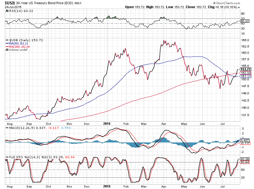
The following 1-Year Daily chart of 30-Year U.S. Bonds ($USB) shows that a bearish moving average Death Cross has recently formed — warning that lower prices may be in store. However, the rising RSI indicates building strength from May through July.