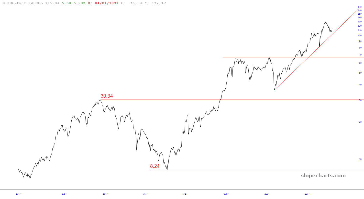
When I was a lad, the Cold War was still humming along as it had been for decades. Even as a child, I had a strong sense of what was going on and what I felt was right and wrong. I perceived my native United States as a place of individual freedom and open choices. I perceived the USSR as an evil prison housing hundreds of millions of poor souls who were under the thumb of an oppressive government. When Reagan described them as “An Evil Empire”, I was in total agreement.
What was particularly nauseating to me was how the Soviet government would shameless and persistently lie to its own people. They would always offer assurances that everything was under control, everything was going to plan, and everything was going to be fine. They were able to sustain that lie from 1919 until 1989, but then it all came crashing down. At the time, it seemed the world had finally come to its senses.
(more…)