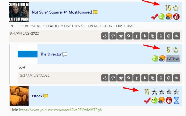
Slope of Hope Blog Posts

Slope initially began as a blog, so this is where most of the website’s content resides. Here we have tens of thousands of posts dating back over a decade. These are listed in reverse chronological order. Click on any category icon below to see posts tagged with that particular subject, or click on a word in the category cloud on the right side of the screen for more specific choices.

Economic DB Features Upgrade

By -

This is only relevant for Platinum members, since they have exclusive access to it, but I wanted everyone to know, especially those toying with the idea of a premium membership.

The Economic Database portion of SlopeCharts is one of my favorite features, but it’s also one I have found frustrating for a few reasons:

  • I kept being presented with data series that had been discontinued long ago and were therefore no longer useful (keep in mind, there are literally HUNDREDS OF THOUSANDS of charts available);
  • There was no control over granularity so that, for instance, if I really wanted finely-grained daily data, I had no interest in, let’s say, yearly or quarterly data, but I had to hack through it anyway;
  • I didn’t have a way to tease out long-term data, which is always my favorite;
  • When I made a selection, I had to close the dialog box and see if the graph was useful to me. If I wanted a different graph, I’d have to go through the entire process again with the dialog box of hacking my way through different dropdowns.

We have addressed every one of these problems.

(more…)

Divergent Layers

By -

My ceaseless fondness for our Layered Charts feature is well known, and I took the time this weekend to put together a number of them to share with you. They all pretty much say the same thing in one way or another: one important financial instrument is going to drag down another one which hasn’t quite received the memo yet. Here we go……….

SPY and LQD (the latter being corporate bonds)
(more…)