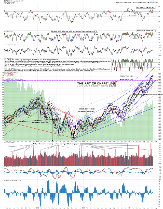
The symbol $SPX200MA in SlopeCharts, which displays the percentage of stocks above their 200-day moving average, is deliciously close to completion. If we can get beneath this pattern, I’m expecting an amazing July.

Slope initially began as a blog, so this is where most of the website’s content resides. Here we have tens of thousands of posts dating back over a decade. These are listed in reverse chronological order. Click on any category icon below to see posts tagged with that particular subject, or click on a word in the category cloud on the right side of the screen for more specific choices.
The symbol $SPX200MA in SlopeCharts, which displays the percentage of stocks above their 200-day moving average, is deliciously close to completion. If we can get beneath this pattern, I’m expecting an amazing July.

Creeeeeeeeeeek! The percentage of stocks above their 200-day moving average is steadily declining, and what might be a powerful topping pattern in this indicator is getting close to completion.

Excerpted from last weekend’s edition of Notes From the Rabbit Hole, NFTRH 815:
A subscriber sent me analysis calling for a “Monster [bullish] reversion trade for the ages” based on the extreme under-performance of the Equal Weight SPX (RSP) to the Headline SPX. The writer’s conclusion is that after such an extreme divergence the spring back in RSP vs. SPY/SPX is strong and the broader market is the place to be for out-performance.
Can’t argue with that.
(more…)Here is the equal-weighted S&P 500 divided by the “standard” (and warped) S&P 500. Notice something? I sure do. This sucker is on its last freakin’ legs.

Here is the ratio chart of the NASDAQ 100 divided by the Russell 2000. It has never been higher. Not even during the Pets.com Internet bubble days. This. Will. Not. Sustain.
