Slope of Hope Blog Posts

Slope initially began as a blog, so this is where most of the website’s content resides. Here we have tens of thousands of posts dating back over a decade. These are listed in reverse chronological order. Click on any category icon below to see posts tagged with that particular subject, or click on a word in the category cloud on the right side of the screen for more specific choices.

QE Correlation

By -

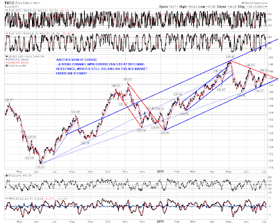
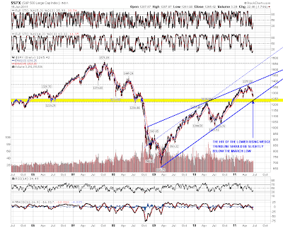
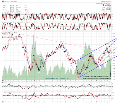
Springheel Jack’s post yesterday (UUP Breaks Up) got me thinking about the correlation between the dollar (UUP) and the S&P.  Apparently, Tim was thinking along the same lines this morning with his Forex post (The Euro and the ES).  I am trying to look at the long-term picture of what/how the various Fed “efforts” have moved the market.  The story of [Ben turns on the presses = goosed market] is already known, but I’m looking to determine the extent of the correlation during the different periods.

Quick history: In late November 2008, the Fed started buying $600 billion in Mortgage-backed securities.  By March 2009, it held $1.75 trillion of bank debt, MBS, and Treasury notes, and reached a peak of $2.1 trillion in June 2010.  After a relatively short break and a coincidental 20% drop in the market as QE1 ended, the Fed decided to renew quantitative easing because “the economy wasn't growing robustly”. Its goal was to keep holdings at the $2.054 trillion level by replacing maturing debt. To maintain that level, the Fed bought $30 billion in 2-10 year Treasury notes a month. In November 2010, the Fed announced it would increase quantitative easing, buying an additional $600 billion of Treasury securities by the end of the second quarter of 2011.

UUPSPX 

The correlation between UUP and the SPX since March 2007 is -.35; not exactly investment-worthy in my book.  However, I broke out the correlation during the aforementioned periods:

Pre-QE                       -.27

Since QE1 started      -.83

During QE1          -.68

Between 1&2       -.94

During QE2          -.67

A couple things jumped out at me here… First, that since QEs started, the market now dances to the Fed’s tune (duh); but more importantly, the correlation data says it is by a significant- and therefore investable- amount.  Second, the -.94 is a surprisingly extreme number… it was only for a 4 month period, but I cannot say with any certainty why.  I would imagine that by not knowing if there was going to be a QE2, traders followed Forex more closely.  On the other hand, the Forex and equity markets could have been reacting to, as I recall, a tremendous amount of chatter back then speculating that QE2 was coming.

Now that QE2 has “ended,” I bring up these points because in a speech to Congress, Bernanke said the Fed is preparing for another round of Treasury bond buying (y’know- just in case this “soft patch” isn’t as temporary as Washington would like voters to believe) and the QE3 chatter seems to have increased (e.g., Why Bernanke And Pals Will Soon Need a New Pair of Pants, Stocks Rise Amid Hopes for Further Stimulus). 

I’m neither an economist nor a political commentator, but with an election next year, I think they will throw everything they have at keeping the market propped-up… including some creative way to implement QE3.  So, if recent history is any indication, we should now be in a period similar to the one between QE1 and QE2; where there is a high inverse-correlation between the dollar and the market.

Consolidation or Correction? (by Springheel Jack)

By -

The more that I look at market action the last few days the grimmer it looks for the bears here in my view. They're not out of the game yet, and with earnings season starting next week they may yet be rescued by bad earnings, but equally they may not be. 

The real hope of the bears here is that equities fall in the absence of fresh QE. There's still a bit of QE coming into the market of course, with the Fed reinvesting treasury capital as they mature at the rate of (I understand) about $250bn a year, but the overall level of Fed treasury holdings will stay flat unless there's a QE3, and that therefore raises why in my view are the real questions about QE's impact on the market, which is whether equities can rise much with a trillion dollars or more of US deficits every year being financed with capital that would otherwise be going into other markets, and what long term interest rates would have to rise to to pull in that kind of money away from other markets and into treasuries? Those may be longer term questions though, and the impact of that sucking out of funds away equities and other investments could well take a few months to have a real impact. 

For the moment the bears' main hope here is obviously the H&S forming on the SPX daily chart. I haven't annotated this chart much since I posted it at the lows and you can see that SPX hasn't yet quite reached my ideal target at the February highs for the top of the right shoulder, and that we have reached this current level a lot faster than I was expecting. I have added to the chart my preferred target if we see a retracement here which is the daily 50 SMA currently at 1317.29 SPX:

In terms of whether we see that retracement I'm using the 15min charts, as that's the only way to properly show the now decent quality channels that have formed on the equity indices since the start of last week. First up is SPX, where SPX has formed a rising channel and broke it yesterday. What's worth noting here though is the little rectangle that has formed at the top. These are a 69% bullish pattern of course, and we could see a last little push up into 1347 to make the rectangle target. I've used EURUSD as the background to this chart to show how SPX has merely traded sideways while EURUSD has been retracing. That is something that is generally seen during a bull wave up on equities rather than a corrective move:

On NDX the rising channel is actually a slowly narrowing rising wedge, though in practical terms I would regard it as a channel. NDX has been the strongest of the three indices and is not yet testing channel support:

On RUT the rising channel is again a slowly narrowing rising wedge, though as with NDX I would treat it as a channel, as a rising wedge this hesitant rarely seems to play out to target on a break down. RUT was testing rising support on this channel yesterday:

EURUSD is already correcting. You can see from this (market hours) XEU chart that it is failing at declining resistance, though that has broken on the 24hr forex charts and I'm not expecting that to hold as resistance. What is interesting on this XEU chart though is that EURUSD may be in a large rising channel that could carry it into the 1.55 area on a break up. Something to watch if that declining resistance breaks during market hours on the next move up:

Silver has been testing the broken support trendline and broken back up over it briefly overnight on the futures chart. It has reached my secondary declining channel target and reversed there for the moment. Seasonality favors more correction/consolidation for silver for the next few weeks. The picture looks similar on the SLV daily chart and I'm leaning short on SLV for the next few days:

Oil futures broke back and closed above my bull / bear line at 96.2 yesterday. It's back below there again now but oil now looks a much more dangerous short:

The last chart for today is my AAPL weekly chart, where I've been wondering for a year or more whether this chart is a proxy view for the likely duration and extent of the current bull market. I had AAPL in a rising channel with an unproven lower trendline, and it broke that channel support trendline on the last move down. However the low delivered a much better looking support trendline with three touches that has now turned the current pattern into an (ultimately bearish) broadening ascending wedge. The really interesting thing about this chart though is the longer term resistance trendline that would see AAPL peaking in the 410-30 area (depending on when it is reached) at the end of this third wave up. Definitely something that I will be watching, and if we see new highs on the equity indices then I'll be watching it very closely:

We might well see some retracement on equities today. On ES the key level that needs to break to deliver that retracement is 1330 on an hourly close below it. My expectations for any retracement are modest unless EURUSD can break 1.43 with confidence, and I'll be watching the daily 50 SMA on SPX at 1317.29 as my preferred support level for that retracement. If that is broken I'd be looking for support in the 1300 SPX area and would be very surprised to see that broken with confidence in the next few days.

Downside Targets (by Springheel Jack)

By -

It's a shame that I'm not trading much this week as I've really been nailing it the last few days. ES fell heavily in a trend day down and isn't far off the 1245-50 target I gave in my morning post yesterday. Here's how that broadening descending wedge is looking now:

On the bigger picture SPX is approaching rising support for the bull market rising wedge (and possible rising channel), which is within the larger strong support zone between 1220 and 1250. A fairly exact hit of this support trendline is important, as the trendline has only two touches so far and really needs three to confirm it. I'm not expecting a move below it. A move below 1219 would most likely signal the end of this bull market, but even if we are to see that this year, I'm expecting to see a strong bounce from this support zone first:

On NQ Brinkley at BlueChipBulldog posted a very nice looking declining channel yesterday which I have incorporated into my chart:

On TF the high this week has confirmed a matching declining channel on TF. The lower channel trendline is currently at 742, which looks overambitious, but a break of the upper channel trendline should at the least be confirmation that this down move is over as and when we see it. Two other things worth mentioning on the TF are the possible (but sloppy) continuation H&S that would target 753 if it plays out, and that as yet TF has not made a new low for this week, and is therefore not confirming the new lows on ES and NQ:

Vix broke up out of the 11 week range yesterday which is excellent news. I mentioned a few days ago that we should really see a break up on Vix before we saw a real low made and Vix is now out of both the range and the daily bollinger bands. I've marked up the two open gaps above from March as the obvious targets for this breakout:

EURUSD broke the H&S neckline yesterday morning and has made it over halfway to the 1.39 target already:

There is some support at the current level though, and I've marked that up on the XEU daily chart. There's a double trendline test here with rising support from the Jan 2011 low, and a retest of broken declining resistance from the 2008 high:

I have a slight problem today as there are so many interesting charts this morning. Anything over seven charts posted and Tim starts muttering darkly about posts that can be seen from space, so I'll just post the other two charts as links. The first chart is the oil chart, where the open gap support zone was filled yesterday, and the ugly H&S is now fully formed. On a break of 94 I'll be looking for a move to some big support trendlines in the mid-80s & the chart is here. Copper reversed where I was suggesting it should yesterday and I have downside targets at 400 and 395. The copper chart is here. 

After a trend day down we normally see some retracement and that's what I've been expecting to see today, though apart from some positive divergence on the 60min RSIs, there's little sign of that so far. If we do see that retracement today then ES could hit the wedge support trendline in the 1240-3 area tomorrow, which should deliver the exact hit of SPX rising wedge support that I'm looking for. We'll see how that goes today.

Bear Case and Historical PE Ratios

By -

From a Sloper this morning………

I know most Slopers lean towards the bear side, and for good reasons.  Many of of the reasons I have had for leaning to the bearish side has been proven over time to be false in the near term which has cost me dearly.  Longer term however, the truth is that no sustainable bull market ever began while the PE was over 20.  It will simply be difficult for me to become a bull until the PE fell below 10.  No sustainable bull market ever began without the PE dipping below 10.

What I have attempted to do below is to show what prices have done since the depression when the PE reaches extremes.  The top chart is the S&P and the bottom chart is the PE chart.  Obviously, when the PE’s are high it pays to invest in a much more guarded fashion while when the PE’s are low, it pays to become much more bullish.  

0530-1

Where would prices need to pull back to bring the PE back below 10?  When the S&P bottomed in 2009 at 666, the PE ratios bottomed at 15.  Assuming we are entering a new bear market now at the end of QE2, and the market drops over the course of the next year or a little longer, the next touch of the trend line would be somewhere between 700 and 750.  The chart below depicts what this could look like.
0530-2

Back in 2002, the S&P was around 800 and PE's were about where they are now in the 23.5 area.  My guess is that should prices come to the trend line, you will see PE's close to a bullish bottom but not quite.  It depends on how well you can interpolate the data.