Slope of Hope Blog Posts

Slope initially began as a blog, so this is where most of the website’s content resides. Here we have tens of thousands of posts dating back over a decade. These are listed in reverse chronological order. Click on any category icon below to see posts tagged with that particular subject, or click on a word in the category cloud on the right side of the screen for more specific choices.

Secular Bear Markets 101 (by Springheel Jack)

By -

Some people regard private enterprise as a predatory tiger to be shot. Others look on it as a cow they can milk. Not enough people see it as a healthy horse, pulling a sturdy wagon. 

Winston Churchill

I'm sleeping badly this week and I'll probably skip trading today though I have some equity longs I'll leave on as I'm leaning bullish. I'll keep the post relatively short too as I've started late and the market prospects today can easily be summed up in a couple of charts. First though I've been meaning to talk about a popular myth that I often see referred to, and that is the myth that stock market performance is unrelated to economic performance. 

Over shorter timeframes, as with some other popular myths, this can be true, but the apparent lack of correlation vanishes over longer timeframes, as you would expect logically of course. Those longer timeframes are of course the generally 15 to 20 year periods of the secular bull and bear markets.

There's a reasonable (and concise) view of these periods since 1906 in an article here, and it's well worth a look to give the overall context of the current period that we are trading through now. Looking at the last 60 years though, the secular bull market period 1950-1966 was a very strong period for equities at the same time as a period of strong economic growth. During the secular bear market 1966-82 economic performance was weak and equities lost value in real terms. In the secular bull market 1982-2000 we saw another very strong period for equities at the same time as a strong period for economic growth. That growth was slower than earlier bull cycles but it is a fact that economic growth slows down in more mature economies, possibly because of the higher proportion of government spending and consequent crowding out of the private sector. In the ongoing secular bear market from 2000 growth has been weak and fitful and equities have again lost value in real terms. The chances are that will continue until this secular bear market ends, most likely in the 2015-2020 period. 

What's also interesting are the reasons that economies and equities have peaked and then corrected. My favorite book on this subject is Galbraith's The Great Crash 1929, which also has a very illuminating foreword written near the peak of the 1950-66 secular bull market. Galbraith talks there about the role of leverage in the great bubble of the 20s, and then talks about the rediscovery of the power of leverage in the late 50s, a key factor in the bubble that culminated in the mid-60s, and the painful deleveraging period that followed during the next secular bear market. You could reasonably assume reading this book that not only do these cycles look fairly similar, but the causes of the booms and bust look rather similar as well.

Those who cannot remember the past are condemned to repeat it. – George Santanaya

What we have learned that is new in this current cycle though, is that even with famous scholars of previous cycles (Ben Bernanke), in key policymaking positions, all policymakers are managing to do is find new ways to make the same old mistakes. A slightly dispiriting refutation of the implication of George Santanaya's quote above, which is that if you study your history, you have less chance of repeating previous mistakes. Perhaps by the time the next secular bull cycle is peaking in the 2130s policymakers will have managed to learn something useful.

So how does this apply to us today? Well the first thing to note is that of the three secular bear market periods since 1906, the shortest lasted 16 years and the longest lasted 20 years. Realistically therefore, there is no good reason to think that this current secular bear market will be any shorter, not least because we can easily see around us that the policy response to overleveraging has been denial and a 'pretend and extend' policy based on the idea that if the problem can be brushed under the carpet long enough, it will somehow resolve itself. That seems unlikely, current policies look likely to end in a major sovereign debt crisis, which will lead to austerity and/or inflation, which should end the secular bear market cycle after another major downswing in equities. 

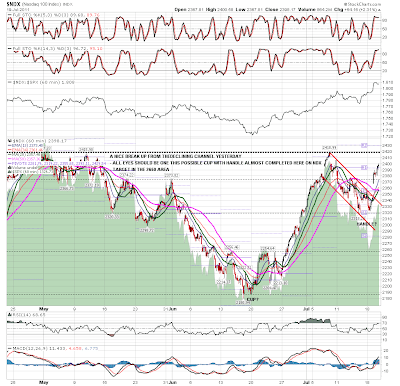
Anyway, that's economic cycles history 101 concluded for today so let's see how the markets are looking in the short term.

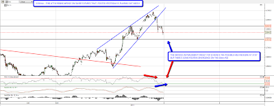
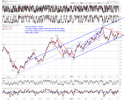
A very key chart for today and the next few days is the EURUSD chart. Overnight EURUSD made the target just under 1.43 that I gave on Tuesday morning and reversed hard there. A significant inflection point then came an hour ago when EURUSD hit the rising support trendline from the recent low. EURUSD bounced hard there and my suspicion that an ascending triangle might be forming on EURUSD was confirmed. Looking at the chart the next target is triangle resistance at 1.427 – 1.4285, but the important thing to note about these triangles is that they break up 70% of the time. If and when this triangle breaks up that should give equities a decent boost and carry ES up with it to the next resistance level in the mid-1340s. Here's how that looks on the 60min chart and you can read more about ascending triangles at Bulkowski's site here:

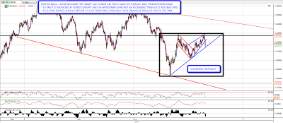
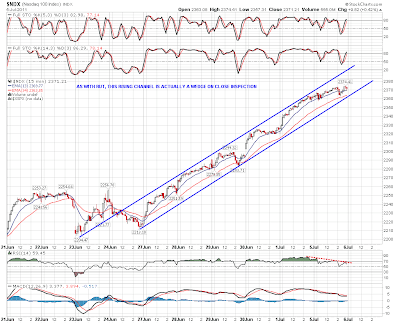
ES has respected the established support / resistance levels well. I marked in the current key levels at 1329.5 and 1315.5 a couple of days ago and was happy to see the high at the upper level yesterday and a double test of the lower level overnight. If 1329.5 can be broken today then I'm looking for a move to the next level up at 1343. If support fails at 1315.5, I'd be looking for a retest of support at 1302.25:

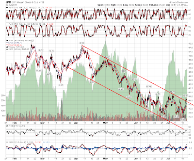
I haven't posted the XLF chart much lately, and that's because apart from a worrying support break and some positive divergence on the daily chart, it isn't really saying much to me. I did post the JPM charts the other day showing the potentially stellar long setup there on a break up from the declining channel on the 60min chart, and yesterday JPM broke up from that channel. I've taken a spec long at 41 and it was trading under that at the close yesterday for anyone thinking of joining me:

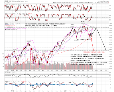
That's it for today, apart from adding that I'm doubtful about this current move being the start of a big bull wave up like the one we saw last summer. I think there's a good chance of ES recovering the 1343 area, but after that I'll be watching support trendlines and patterns to signal a reversal which I suspect may not be long in coming. Meanwhile I'm enjoying the bull side here.

Wedges and AAPL (by Springheel Jack)

By -

Rising and falling wedges are some of my favorite patterns, not because they reliably reach target, because they don't, and as a result they aren't rated particularly high by Bulkowski and others, but because they really are good at signalling reversals. The falling wedges on Dow and SPX and the rising wedge that I posted on silver yesterday were excellent examples of that. They seem to perform better for me that for others, but that may well be because I'm more particular about exact touches to establish trendlines, and because I don't give the classical wedge targets much weight. A vague trendline often isn't a usable trendline at all in my experience, though I know a lot of others like them. The SPX wedge I posted yesterday broke up very nicely and the target there is just under 1345:

The same on the Dow, with another potential IHS neckline pencilled in just above the closing level yesterday. I'm not really expecting that to form but it's worth noting:

NDX broke up from the declining channel and I'm very much looking at the almost fully formed cup with handle pattern there. The target would be in the 2650 area, which should carry SPX well over 1400 if it is made:

RUT also broke out of the declining channel there, and a small IHS formed indicating to the significant resistance level at 845:

Here's a close up of that little RUT IHS. I posted this on twitter yesterday afternoon:

I posted the little rising wedge on silver yesterday that obligingly broke down in the afternoon. The obvious target to my eye is the potential H&S neckline at 37.87, though there's some positive divergence on the 60min RSI now and it may not make it that far:

Oil is at a critical level this morning. I posted a possible triangle developing on oil the other day and the low this week overthrew the lower trendline slightly,suggesting a break up soon. There's some stiff resistance below 100, but if CL can clear 100 with any confidence then a run to 105 at least looks likely:

I'd normally post a EURUSD chart here to close the post, but it hasn't done much since yesterday and still just seems poised to go to 1.43 and possibly higher. Instead I'll post one of the most important charts for this cyclical bull market and that is the AAPL chart. I've been watching this develop since the April high last year and we are now near (what could be) the climax of the huge broadening ascending wedge I have for AAPL, which should be at double trendline resistance in the 410-20 area. AAPL is trading at just under 400 overnight and yesterday's earnings were obviously stellar. My target may well be reached this week and the question is what happens then? Does AAPL break up and lend enormous weight to that NDX cup with handle? Or do we see a big reversal at resistance which would effectively kill any big bull move up on NDX and probably on the other equity indices as well? This is a major inflection point approaching on a massively influential stock, and anyone who doubts the power of these longer term trendlines should check out my post on BP in June last year, calling the low on the basis of a 13 year old pattern a day or two below the low was made. You can see that here. Food for thought and something to watch closely:

In the short term today there is strong resistance at 1329.50 ES and ES is stalling there at the moment. The Gap Guy is saying that the odds of a gap filling today are excellent. If that resistance level on ES can be cleared I'll then be watching the 845 target on RUT for the next possible reversal level.

QE Correlation

By -

Springheel Jack’s post yesterday (UUP Breaks Up) got me thinking about the correlation between the dollar (UUP) and the S&P.  Apparently, Tim was thinking along the same lines this morning with his Forex post (The Euro and the ES).  I am trying to look at the long-term picture of what/how the various Fed “efforts” have moved the market.  The story of [Ben turns on the presses = goosed market] is already known, but I’m looking to determine the extent of the correlation during the different periods.

Quick history: In late November 2008, the Fed started buying $600 billion in Mortgage-backed securities.  By March 2009, it held $1.75 trillion of bank debt, MBS, and Treasury notes, and reached a peak of $2.1 trillion in June 2010.  After a relatively short break and a coincidental 20% drop in the market as QE1 ended, the Fed decided to renew quantitative easing because “the economy wasn't growing robustly”. Its goal was to keep holdings at the $2.054 trillion level by replacing maturing debt. To maintain that level, the Fed bought $30 billion in 2-10 year Treasury notes a month. In November 2010, the Fed announced it would increase quantitative easing, buying an additional $600 billion of Treasury securities by the end of the second quarter of 2011.

UUPSPX 

The correlation between UUP and the SPX since March 2007 is -.35; not exactly investment-worthy in my book.  However, I broke out the correlation during the aforementioned periods:

Pre-QE                       -.27

Since QE1 started      -.83

During QE1          -.68

Between 1&2       -.94

During QE2          -.67

A couple things jumped out at me here… First, that since QEs started, the market now dances to the Fed’s tune (duh); but more importantly, the correlation data says it is by a significant- and therefore investable- amount.  Second, the -.94 is a surprisingly extreme number… it was only for a 4 month period, but I cannot say with any certainty why.  I would imagine that by not knowing if there was going to be a QE2, traders followed Forex more closely.  On the other hand, the Forex and equity markets could have been reacting to, as I recall, a tremendous amount of chatter back then speculating that QE2 was coming.

Now that QE2 has “ended,” I bring up these points because in a speech to Congress, Bernanke said the Fed is preparing for another round of Treasury bond buying (y’know- just in case this “soft patch” isn’t as temporary as Washington would like voters to believe) and the QE3 chatter seems to have increased (e.g., Why Bernanke And Pals Will Soon Need a New Pair of Pants, Stocks Rise Amid Hopes for Further Stimulus). 

I’m neither an economist nor a political commentator, but with an election next year, I think they will throw everything they have at keeping the market propped-up… including some creative way to implement QE3.  So, if recent history is any indication, we should now be in a period similar to the one between QE1 and QE2; where there is a high inverse-correlation between the dollar and the market.

Consolidation or Correction? (by Springheel Jack)

By -

The more that I look at market action the last few days the grimmer it looks for the bears here in my view. They're not out of the game yet, and with earnings season starting next week they may yet be rescued by bad earnings, but equally they may not be. 

The real hope of the bears here is that equities fall in the absence of fresh QE. There's still a bit of QE coming into the market of course, with the Fed reinvesting treasury capital as they mature at the rate of (I understand) about $250bn a year, but the overall level of Fed treasury holdings will stay flat unless there's a QE3, and that therefore raises why in my view are the real questions about QE's impact on the market, which is whether equities can rise much with a trillion dollars or more of US deficits every year being financed with capital that would otherwise be going into other markets, and what long term interest rates would have to rise to to pull in that kind of money away from other markets and into treasuries? Those may be longer term questions though, and the impact of that sucking out of funds away equities and other investments could well take a few months to have a real impact. 

For the moment the bears' main hope here is obviously the H&S forming on the SPX daily chart. I haven't annotated this chart much since I posted it at the lows and you can see that SPX hasn't yet quite reached my ideal target at the February highs for the top of the right shoulder, and that we have reached this current level a lot faster than I was expecting. I have added to the chart my preferred target if we see a retracement here which is the daily 50 SMA currently at 1317.29 SPX:

In terms of whether we see that retracement I'm using the 15min charts, as that's the only way to properly show the now decent quality channels that have formed on the equity indices since the start of last week. First up is SPX, where SPX has formed a rising channel and broke it yesterday. What's worth noting here though is the little rectangle that has formed at the top. These are a 69% bullish pattern of course, and we could see a last little push up into 1347 to make the rectangle target. I've used EURUSD as the background to this chart to show how SPX has merely traded sideways while EURUSD has been retracing. That is something that is generally seen during a bull wave up on equities rather than a corrective move:

On NDX the rising channel is actually a slowly narrowing rising wedge, though in practical terms I would regard it as a channel. NDX has been the strongest of the three indices and is not yet testing channel support:

On RUT the rising channel is again a slowly narrowing rising wedge, though as with NDX I would treat it as a channel, as a rising wedge this hesitant rarely seems to play out to target on a break down. RUT was testing rising support on this channel yesterday:

EURUSD is already correcting. You can see from this (market hours) XEU chart that it is failing at declining resistance, though that has broken on the 24hr forex charts and I'm not expecting that to hold as resistance. What is interesting on this XEU chart though is that EURUSD may be in a large rising channel that could carry it into the 1.55 area on a break up. Something to watch if that declining resistance breaks during market hours on the next move up:

Silver has been testing the broken support trendline and broken back up over it briefly overnight on the futures chart. It has reached my secondary declining channel target and reversed there for the moment. Seasonality favors more correction/consolidation for silver for the next few weeks. The picture looks similar on the SLV daily chart and I'm leaning short on SLV for the next few days:

Oil futures broke back and closed above my bull / bear line at 96.2 yesterday. It's back below there again now but oil now looks a much more dangerous short:

The last chart for today is my AAPL weekly chart, where I've been wondering for a year or more whether this chart is a proxy view for the likely duration and extent of the current bull market. I had AAPL in a rising channel with an unproven lower trendline, and it broke that channel support trendline on the last move down. However the low delivered a much better looking support trendline with three touches that has now turned the current pattern into an (ultimately bearish) broadening ascending wedge. The really interesting thing about this chart though is the longer term resistance trendline that would see AAPL peaking in the 410-30 area (depending on when it is reached) at the end of this third wave up. Definitely something that I will be watching, and if we see new highs on the equity indices then I'll be watching it very closely:

We might well see some retracement on equities today. On ES the key level that needs to break to deliver that retracement is 1330 on an hourly close below it. My expectations for any retracement are modest unless EURUSD can break 1.43 with confidence, and I'll be watching the daily 50 SMA on SPX at 1317.29 as my preferred support level for that retracement. If that is broken I'd be looking for support in the 1300 SPX area and would be very surprised to see that broken with confidence in the next few days.