Yeah, yeah, the downgrade, I know. An article on biofuels doesn't speak to its urgency. But I was on a plane. To explain:
I'm a bit of a nervous flier. I guess, being somewhat of a control freak (ahem…….), it's unsettling to be in any situation in which I have absolutely no control over what's going on. After all, if an airplane gets into trouble, the most I can do is chat with God and work out the terms of the life of charity I shall lead in exchange for not plummeting to earth in a metal cylinder.
So as I was flying from Chicago to Denver yesterday evening, there was a large thunderstorm positioned directly – and I mean directly – over the Colorado Springs airport. The woman next to me, whom I guess had been through this kind of thing before, said, "we're going to be up here a while." And she was right.
We made a huge circle around the storm for half an hour, spending about half the time violently shaking as the air buffetted us. It was the worst plane right I had ever been on, and all I could think about was how nice it would be to get us safely landed on the ground. The shaking and the flying seemed interminable, and I kept worrying who would NEW POST this site for the rest of eternity if I were to perish at such a youthful and surprisingly handsome age.
Well, I obviously made it, and my pact with God was amorphous enough that my spending time sharing my thoughts on the market for no charge strikes me as adequately charitible that I think God will approve. So I resume to the struggle.
So the big news is that S&P has declared that, in a nutshell:
+ The United States and its future does not present the most unquestionable credit risk
Not to do S&P's job, but I'd like to supplement their findings with some other equally salient facts:
+ Ophra Winfrey is, and always will be, on the fat side;
+ Julia Roberts and Anne Hathaway have unnecessarily gigantic teeth;
+ Barack Obama enjoys making public speeches
So how will the market react? I'm not sure. I've become so accustomed to perverse market reactions that I would not be surprised at all – in fact, I would be kind of pleased – if the market wound up closing higher on Monday.
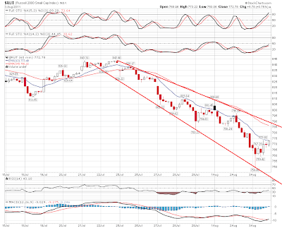
As a bearish sort (perhaps I should have added Tim is a Bear to the bullet points above), I am obviously pleased with the market action we've seen lately. But – as a perpetually dissastisfed sort as well – I keep having two contrary, bummer-like thoughts:
+ I sure wish I had even more shorts on;
+ I wonder how long it'll be before we get the big bounce I need to go 200% short
I mean, I've been almost purely net short for a while, and last week was beneficial for me, but many stocks that I wanted to short at better prices still got clobbered by 15%, and I was not there to partake.
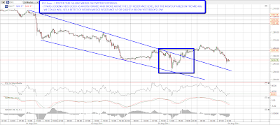
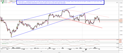
I tend to have a "bottoms-up" approach to my analysis, and the preponderence of evidence tells me that the shorting opportunity of the decade is coming up, but it requires a substantial bounce to make the risk/reward worthwhile. By "substantial", I don't mean new recovery highs – – but a 4% to 6% push higher on the big indexes would do the trick (which, for some stocks, would mean a 20%+ rise).
As for the Fibonacci time series, I remain blown away that the video I did on May 2nd (which, conicidentally, was the recovery high) specifically mentioned August 5th as the bottom for the cycle. What's the next bottom? It looks like February 3, 2013 – – which would make a certain amount of sense, since whoever President we wind up with in November 2012 will probably start off with a market that's in a death-spin.
In any event, I remain totally short, but only lightly committed, and Monday bears very close watching. Have a good Saturday.